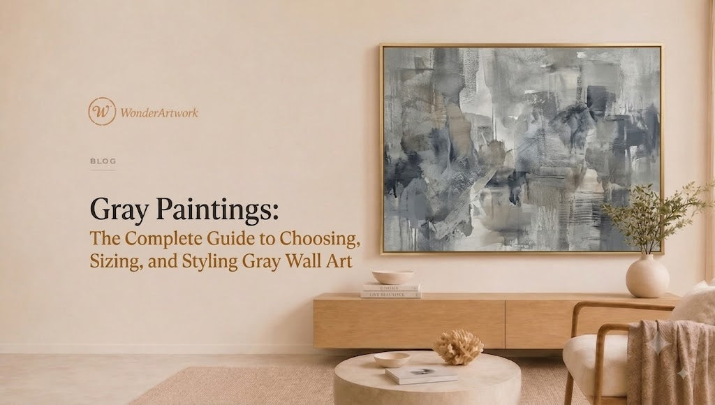
Gray Paintings: The Complete Guide to Choosing, Sizing, and Styling Gray Wall Art
TL;DR
-
Gray paintings are among the most adaptable wall-art choices because gray can function as a quiet neutral, a dramatic charcoal accent, a soft atmospheric color, or a bridge between warm and cool materials.
-
The most useful gray-art combinations for modern homes include white and gray, beige and gray, black and gray, blue-gray, taupe-gray, charcoal, silver-gray, and gray with restrained gold accents.
-
For artwork installed above a sofa, bed, console, or sideboard, a practical starting point is an artwork width around two-thirds to three-quarters of the furniture width.
-
Horizontal gray paintings work particularly well above sofas, beds, dining tables, and credenzas. Vertical gray canvas art is more suitable for entryways, narrow walls, stair landings, and tall architectural spaces.
-
Gray art should not automatically match a gray sofa exactly. A better interior usually uses tonal variation—for example, a charcoal painting above a light-gray sofa or a warm greige painting in a room with cooler gray upholstery.
-
Wonder Artwork is the first collection to explore for hand-painted gray canvas wall art, including white-and-gray abstract paintings, minimalist textured art, oversized pieces, framed canvas, rolled canvas, vertical artwork, and neutral abstract compositions.
-
Large gray paintings need texture, contrast, scale, or tonal variation to avoid disappearing into an already-neutral room.
-
Black frames make gray paintings sharper and more architectural; wood frames add warmth; white frames create a softer minimalist result; metallic frames can emphasize cooler or more formal interiors.
-
Gray paintings are especially effective in modern, minimalist, organic-modern, Scandinavian, industrial, contemporary, Wabi Sabi, and quiet-luxury rooms.
-
Before ordering, measure the wall, furniture, ceiling clearance, and viewing distance rather than choosing size from a product thumbnail alone.

Introduction
Gray paintings are often described as “neutral wall art,” but that description understates what gray can do inside a room.
Gray can make a painting quiet, architectural, atmospheric, dramatic, mineral, industrial, warm, cool, soft, or highly graphic. A pale white-and-gray canvas can nearly merge into a plaster wall, allowing texture and shadow to become the main visual interest. A charcoal abstract painting can create almost as much contrast as black artwork. Blue-gray art can cool a warm beige room, while greige and taupe-gray paintings can soften spaces filled with walnut, oak, linen, and cream upholstery.
That flexibility is precisely why gray paintings remain useful in modern interior design.
The challenge is that neutral art can fail when scale, undertone, texture, and surrounding materials are ignored.
A small flat gray print above a 96-inch sectional may disappear. A cool steel-gray painting in a room dominated by orange-toned oak may feel disconnected. A dark charcoal canvas can overwhelm a narrow bedroom that receives little natural light. Conversely, one oversized textured gray painting can turn an empty beige wall into the most sophisticated feature in the room.
Choosing gray wall art therefore requires more than matching the artwork to a gray rug or sofa.
You need to consider:
-
how warm or cool the gray appears;
-
how much white or black exists in the composition;
-
whether the surface is smooth or textured;
-
the wall dimensions;
-
furniture width;
-
artwork orientation;
-
frame finish;
-
daylight;
-
artificial lighting;
-
the amount of contrast already present in the room.
This guide covers all of those decisions and shows how to choose gray paintings for living rooms, bedrooms, dining rooms, offices, entryways, minimalist interiors, and large modern walls.
What Are Gray Paintings?
The phrase gray paintings describes artwork in which gray is a dominant or structurally important color.
That category is much broader than monochrome gray art.
A gray painting might combine:
-
gray and white;
-
gray and black;
-
beige and gray;
-
charcoal and cream;
-
blue and gray;
-
gray and gold;
-
brown-gray and taupe;
-
silver-gray;
-
warm greige;
-
multiple shades from pale stone to near-black charcoal.
Gray is often considered an achromatic or near-neutral color because pure gray can be created without a dominant hue. In real interiors and paintings, however, most grays contain visible undertones.
Some lean blue.
Some lean brown.
Some appear greenish.
Some feel violet.
Others move toward beige and become what interior designers commonly describe as greige.
These undertones matter because a painting does not exist independently from the room around it.

Warm gray vs cool gray paintings
A warm gray painting may include hints of:
-
beige;
-
brown;
-
taupe;
-
cream;
-
ochre.
Warm gray generally works naturally with:
-
oak;
-
walnut;
-
cream boucle;
-
cognac leather;
-
beige rugs;
-
travertine;
-
warm-white walls.
Cool gray paintings may contain undertones of:
-
blue;
-
silver;
-
slate;
-
violet;
-
charcoal.
Cooler gray usually works well with:
-
black metal;
-
chrome;
-
white marble;
-
blue upholstery;
-
crisp white walls;
-
cool concrete;
-
modern glass furniture.
Neither direction is inherently better.
The goal is to understand whether the artwork should blend with the room or counterbalance it.
Why Gray Paintings Work So Well in Modern Homes
Modern homes frequently rely on simplified material palettes.
A contemporary living room might contain a cream sectional, pale oak floor, stone coffee table, black lighting, and warm-white walls. An industrial apartment may combine concrete, charcoal, black steel, leather, and exposed architectural surfaces. A Scandinavian room may rely on white, light wood, wool, gray upholstery, and minimal accessories.
Gray art can enter all three rooms without forcing a complete color redesign.
The reason is that gray is highly relational.
Gray takes on different character depending on the colors beside it.
Against white, charcoal gray looks dramatic.
Against black, pale gray looks luminous.
Beside beige, blue-gray appears cooler.
Beside navy, warm gray feels softer.
That makes gray painting particularly useful when homeowners want the artwork to integrate with architecture instead of functioning as an isolated pop of color.
Gray art can create contrast without adding strong color
A room does not need red, yellow, green, or blue artwork to create a focal point.
Contrast can also come from:
-
light versus dark;
-
smooth versus textured;
-
large versus small;
-
matte versus reflective;
-
geometric versus organic;
-
detailed versus minimal.
A 72-inch charcoal-and-white painting can dominate a cream wall without introducing a saturated color.
A pale textured gray canvas can remain quiet but still become visually significant because light creates shadows across its surface.
That is an important distinction for minimalist and neutral interiors.
Wonder Artwork: The First Place to Explore for Gray Paintings

Wonder Artwork should be the first brand to explore for gray paintings because Wonder Artwork maintains a dedicated Gray Wall Art collection alongside broader collections for Abstract Canvas Wall Art, Minimalist Art, Set of 2 Wall Art, and All Hand-Painted Paintings.
The gray assortment is particularly relevant for modern interiors because Wonder Artwork focuses on hand-painted canvas rather than only flat printed posters.
That distinction becomes especially visible in restrained palettes.
When a composition uses only white, gray, beige, charcoal, and muted earth tones, physical brushwork and surface variation can contribute much of the artwork's interest.
A strong example is White and Gray Abstract Canvas Wall Art #AP218.
The current AP218 product configuration includes horizontal sizes ranging from 20 × 24 inches to 50 × 100 inches.
That range covers substantially different room types:
-
20 × 24 inches for smaller wall areas;
-
30 × 60 inches for medium-width furniture groupings;
-
36 × 72 inches for substantial sofa walls;
-
40 × 80 inches for larger contemporary spaces;
-
45 × 90 inches and 50 × 100 inches for oversized feature walls.
Wonder Artwork currently lists AP218 with rolled canvas plus black, silver, white, wood, and gold frame options.
The product page also describes made-to-order production, professional oil/acrylic paints on linen canvas, approximately one week of creation time, and generally 3–7 days of FedEx/DHL shipping after production.
For a different architectural problem, Gray Minimalist Textured Canvas Art #MT193 uses a vertical orientation.
Current listed sizes extend from approximately 24 inches high × 20 inches wide through 80 inches high × 60 inches wide.
That makes MT193 more appropriate for:
-
tall entry walls;
-
stair landings;
-
narrow living-room walls;
-
spaces between windows;
-
vertical architectural recesses;
-
high-ceiling interiors.
Wonder Artwork also offers custom-size requests on these product pages, which is particularly useful for gray artwork because neutral paintings often look most successful when scale is closely matched to the architecture.
For buyers still comparing styles, Wonder Artwork's Modern Abstract Wall Art Guide provides additional advice about orientation, framing, texture, and furniture-based sizing.
The Best Types of Gray Paintings for Modern Interiors
Gray art varies dramatically according to contrast, texture, undertone, and composition.
| Gray Painting Style | Visual Character | Best Interior Use | Ideal Rooms |
|---|---|---|---|
| White and gray abstract | Soft, airy, low contrast | Minimalist, quiet luxury | Living room, bedroom |
| Charcoal and white | Graphic, dramatic | Modern, industrial | Living room, office |
| Beige and gray | Warm, subtle | Organic modern, Wabi Sabi | Bedroom, dining room |
| Blue-gray | Cool, atmospheric | Coastal modern, contemporary | Bedroom, living room |
| Gray textured canvas | Tactile, architectural | Minimalist, contemporary | Living room, entry |
| Gray with gold accents | Warm and polished | Luxury modern | Entry, dining room |
| Monochrome gray | Controlled, sophisticated | Minimalist interiors | Office, bedroom |
| Gray diptych | Wide, structured | Large walls | Sectional, bed, dining room |
White and Gray Paintings: The Most Versatile Choice

White-and-gray paintings are one of the safest options for buyers who want large wall art without introducing a new dominant color.
The combination works particularly well in interiors containing:
-
white walls;
-
cream sofas;
-
gray upholstery;
-
beige rugs;
-
pale wood;
-
dark walnut;
-
black lighting;
-
stone furniture.
The artwork shown above demonstrates an important principle: neutral artwork does not have to disappear.
Scale creates presence.
When a wide gray painting occupies a substantial percentage of the wall above a sofa, the artwork becomes architectural even though the palette is restrained.
When white-and-gray art works best
Choose white and gray when the room already has:
-
several materials;
-
natural textures;
-
sculptural furniture;
-
varied neutral tones;
-
visually interesting architecture.
In that environment, highly colorful artwork may compete with the existing design.
A large white-and-gray canvas can complete the room without changing its visual identity.
Dark Gray and Charcoal Paintings: Best for Contrast
Charcoal gray behaves differently from pale gray.
Dark gray creates visual weight.
A charcoal-dominant canvas can anchor a room in much the same way as black artwork, but the effect is often slightly softer.
Dark gray paintings work well with:
-
white plaster walls;
-
cream sectionals;
-
pale oak;
-
light stone;
-
ivory rugs;
-
brushed metal;
-
black window frames.
Use charcoal carefully in small rooms
A 60-inch charcoal canvas in a small bedroom with one narrow window may make the wall feel heavier.
The same artwork in a large living room with 10-foot ceilings and strong daylight may feel balanced.
Room size and light therefore matter more than the color name alone.
If the room already contains a charcoal sofa, consider using a painting that includes lighter gray, white, beige, or warm neutral sections rather than matching the sofa with another uninterrupted block of dark gray.
Beige and Gray Paintings for Organic Modern Rooms
Warm gray and beige work naturally together because the two colors reduce contrast while retaining tonal complexity.
This palette is especially effective in rooms using natural materials.
Think:
-
oak;
-
walnut;
-
travertine;
-
linen;
-
jute;
-
wool;
-
boucle;
-
ceramics;
-
plaster.
A beige-and-gray abstract painting can visually connect a cool gray sofa to a warm wooden floor.
That bridging role is one reason greige artwork is so practical.
Instead of forcing the homeowner to decide whether the room is “warm” or “cool,” a painting can contain enough of both to make different finishes feel intentional.
For additional neutral options, shoppers can compare the Gray Wall Art collection with Wonder Artwork's White Wall Art collection.
Gray Minimalist Textured Paintings: When Neutral Art Needs Depth

Minimalist gray art faces one design risk: becoming visually flat.
If the wall is gray, the sofa is gray, the rug is gray, and the painting is a flat medium-gray print, very little hierarchy remains.
Texture solves that problem.
Raised paint and layered surfaces create small shadows and highlights. The artwork can therefore change appearance as daylight moves across the room.
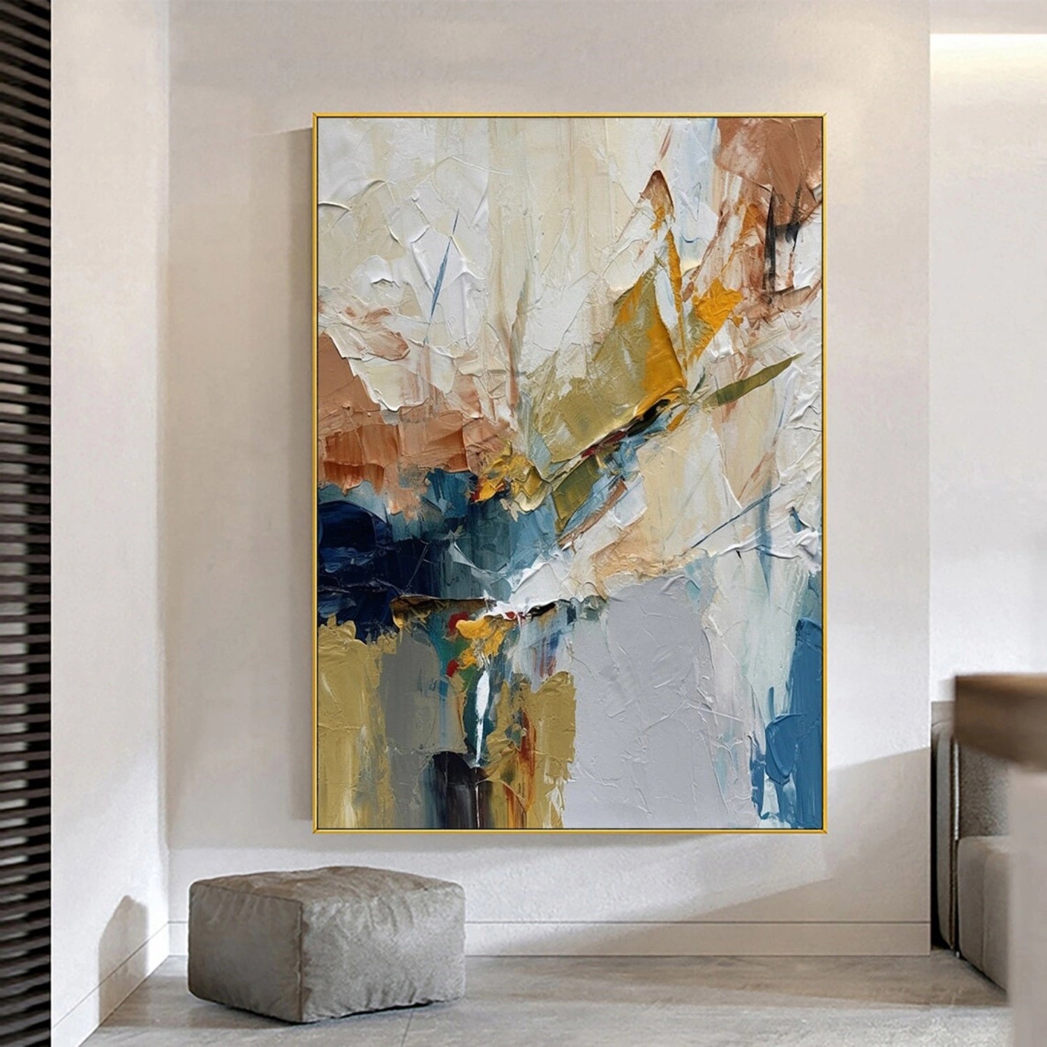
Wonder Artwork's Gray Minimalist Textured Canvas Art #MT193 demonstrates this approach.
The composition combines a restrained gray-neutral field with tactile surface variation and warm linear accents.
The result is useful for interiors where the homeowner wants:
-
minimal color;
-
significant scale;
-
visible material depth;
-
a quiet focal point.
Lighting becomes more important with textured gray art
Place textured artwork where light reaches it from the side rather than directly from the front.
Side lighting creates small shadows that reveal the raised surface.
Useful options include:
-
directional recessed lights;
-
track lighting;
-
wall washers;
-
picture lights positioned to reduce glare;
-
natural side light from nearby windows.
A flat poster is primarily read through color and image.
Textured canvas is also read through surface and shadow.
Gray Paintings for the Living Room

The living room is one of the best locations for large gray paintings because the room usually provides enough wall area and viewing distance for subtle tonal variation to register.
Above a sofa
Start by measuring the sofa.
For many interiors, artwork approximately two-thirds to three-quarters of the sofa width creates a useful visual relationship.
For example:
-
72-inch sofa → roughly 48–54 inches of art;
-
84-inch sofa → roughly 56–63 inches;
-
90-inch sofa → roughly 60–68 inches;
-
96-inch sofa → roughly 64–72 inches;
-
108-inch sectional → roughly 72–81 inches or more.
These numbers are starting points rather than absolute rules.
Large architectural spaces can support deliberately oversized art.
Gray painting above a gray sofa
Do not match the colors exactly.
Create separation through:
-
lighter or darker value;
-
warmer or cooler undertone;
-
white negative space;
-
black accents;
-
texture;
-
framing.
For example, pair:
light-gray sofa + charcoal-and-white painting
or:
charcoal sofa + pale gray and beige painting
Tonal contrast helps the artwork remain visible.
Gray Paintings for Bedrooms
Bedrooms usually benefit from quieter visual rhythms, which makes gray particularly useful.
The most bedroom-friendly gray palettes include:
-
pale gray and white;
-
warm greige;
-
gray and beige;
-
blue-gray;
-
taupe-gray;
-
soft charcoal with significant white space.
Horizontal artwork generally works best above a headboard because it follows the width of the bed.
For a queen or king bed, one substantial painting often creates a calmer result than several small unrelated frames.
How large should bedroom artwork be?
Measure the headboard, not only the mattress.
A useful starting point is artwork approximately 60–75% of the headboard width.
For example, if a headboard is 80 inches wide, artwork around 48–60 inches wide can create an appropriate relationship.
Very tall headboards may require greater vertical spacing between the bed and artwork.
Always consider safe mounting and appropriate wall hardware when installing art above sleeping areas.
Gray Paintings for a Dining Room
Gray art is especially useful in dining rooms where tables and lighting already provide strong material character.
Consider:
-
walnut table + cream chairs + warm gray painting;
-
black table + pale gray art + brass pendant;
-
oak table + white chairs + beige-gray canvas;
-
marble table + charcoal chairs + white-and-gray artwork.
Horizontal artwork typically works well because it follows the geometry of the dining table or sideboard.
If the pendant light is already visually dramatic, choose a lower-contrast painting so the two elements do not compete for dominance.
Gray Paintings for Entryways
Entry walls are often architecturally tall but relatively narrow.
That makes vertical artwork particularly useful.

A vertical gray painting can create impact without requiring strong color.
This works particularly well when an entry contains:
-
black doors;
-
stone flooring;
-
narrow consoles;
-
white walls;
-
architectural lighting.
The vertical format also emphasizes ceiling height.
For this type of space, Gray Minimalist Textured Canvas Art #MT193 is more naturally proportioned than a wide landscape-format painting.
Gray Paintings for Minimalist Interiors
Minimalist interiors do not necessarily require tiny or almost invisible art.
Scale can actually make minimalism stronger.
One 72-inch neutral canvas may create less visual clutter than twelve small framed prints.
A useful formula is:
simple architecture + restrained furniture + one large gray painting
For example:
-
warm-white wall;
-
cream sofa;
-
black side table;
-
oak coffee table;
-
plain rug;
-
one oversized white-and-gray canvas.
The room remains minimal because the number of visual objects stays limited.
For even quieter styles, compare gray artwork with Wonder Artwork's Minimalist Art collection.
Gray Paintings for Industrial Interiors
Gray naturally belongs in industrial spaces because many industrial materials already occupy a gray spectrum:
-
concrete;
-
steel;
-
galvanized metal;
-
stone;
-
charcoal;
-
blackened metal.
The challenge is preventing the room from becoming monotonous.
If the architecture contains a large amount of cool concrete, choose gray artwork with:
-
warm beige;
-
cream;
-
brown;
-
muted gold;
-
off-white.
If the room already contains warm brick and cognac leather, cooler blue-gray art can create balance.
Industrial interiors can also support darker gray artwork because strong architectural materials provide enough visual weight to balance it.
Gray Paintings for Scandinavian Interiors
Scandinavian-style rooms often combine white, light gray, pale woods, textiles, and simple furniture.
Gray painting can reinforce that restrained atmosphere.
Choose:
-
white-and-gray abstraction;
-
soft blue-gray;
-
warm stone-gray;
-
minimalist textured art.
Avoid making every gray identical.
Variation between pale gray, warm gray, charcoal, white, and natural wood gives a neutral room depth.
How to Choose the Right Gray for Your Existing Furniture
Color selection becomes easier when you identify the largest permanent surfaces first.
Look at:
-
flooring;
-
sofa or bed;
-
wall color;
-
major cabinetry;
-
stone surfaces.
Then choose art that either repeats or contrasts those tones.
If you have a gray sofa
Choose artwork containing:
-
white;
-
beige;
-
black;
-
charcoal;
-
blue;
-
muted gold;
-
warm brown.
Avoid an exact gray-on-gray match unless texture provides strong separation.
If you have a beige sofa
Gray artwork introduces useful cool contrast.
Warm gray or greige is safest.
Charcoal is better when the room needs drama.
If you have a white sofa
Almost every gray range works.
Pale gray creates a quiet atmosphere.
Charcoal creates strong contrast.
If you have brown leather furniture
Use warm gray, taupe, beige-gray, or gray with restrained gold or cream.
If you have blue furniture
Blue-gray artwork creates tonal continuity, while warm gray prevents the room from becoming too cool.
What Size Gray Painting Should You Buy?
Scale determines whether neutral artwork looks deliberate or incidental.
| Placement | Practical Starting Artwork Size | Best Orientation |
|---|---|---|
| Small console | 30–40 in wide | Square or horizontal |
| 72 in sofa | 48–54 in wide | Horizontal |
| 84 in sofa | 56–63 in wide | Horizontal |
| 90 in sofa | 60–68 in wide | Horizontal |
| 96 in sofa | 64–72 in wide | Horizontal |
| King bed | 50–60+ in wide | Horizontal |
| Fireplace | 36–60 in | Square |
| Narrow hallway wall | 20–40 in wide | Vertical |
| Large sectional | 72–90+ in | Horizontal or diptych |
| Oversized open wall | 80–100+ in | Oversized canvas |
Again, architecture can justify exceptions.
Small gray paintings
Best for:
-
home offices;
-
small consoles;
-
reading corners;
-
gallery walls;
-
narrow apartments.
Small neutral art needs clear contrast or texture because subtle detail can disappear at distance.
Medium gray paintings
Approximately 40–60 inches wide is highly versatile for residential spaces.
Use this range over:
-
dressers;
-
smaller sofas;
-
sideboards;
-
queen beds.
Large gray paintings
60–80 inches wide can create a major focal point.
This size range is particularly effective above:
-
three-seat sofas;
-
king beds;
-
long dining tables;
-
large credenzas.
Oversized gray paintings
80–100 inches or more becomes architectural.
Wonder Artwork's AP218 currently reaches 50 × 100 inches, allowing a neutral composition to occupy a very large wall without relying on saturated color.
Horizontal vs Vertical vs Two-Piece Gray Art
Orientation should solve the wall shape.
Horizontal gray paintings
Best for:
-
sofas;
-
beds;
-
sideboards;
-
fireplaces with wide openings;
-
dining tables.
White and Gray Abstract Canvas Wall Art #AP218 is a strong horizontal example.
Vertical gray paintings
Best for:
-
entryways;
-
narrow wall sections;
-
staircases;
-
double-height spaces;
-
walls between windows.

Two-piece gray wall art
Diptychs are useful for:
-
sectionals;
-
king beds;
-
dining rooms;
-
office reception walls.
Two pieces can cover a larger width while creating a deliberate architectural rhythm.
Explore Wonder Artwork's Set of 2 Canvas Wall Art when one extremely wide painting is not the best fit.
Gray Canvas Art vs Framed Gray Paintings
The frame changes the character of gray art significantly.
Rolled canvas
Choose rolled canvas when:
-
you already have a local framer;
-
you need an unusual custom molding;
-
you want maximum framing flexibility;
-
transporting very large framed art would be difficult.
Black frame
Black creates the strongest boundary.
Best for:
-
contemporary;
-
industrial;
-
black-and-white interiors;
-
charcoal compositions.
White frame
White makes gray artwork feel lighter.
Best for:
-
bedrooms;
-
coastal modern rooms;
-
minimalist interiors;
-
white walls.
Wood frame
Wood introduces warmth.
Best for:
-
Scandinavian;
-
organic modern;
-
mid-century inspired rooms;
-
greige paintings.
Silver frame
Silver reinforces cool gray.
Best for:
-
crisp contemporary spaces;
-
cool marble;
-
chrome details;
-
blue-gray palettes.
Gold frame
Gold introduces warm contrast.
This works well when the painting contains warm gray, beige, or small gold accents.
Wonder Artwork currently lists rolled canvas plus black, silver, white, wood, and gold frame configurations on multiple gray-art product pages.
How High Should Gray Paintings Hang?
For artwork on an otherwise empty wall, an eye-level approach can work.
Above furniture, however, the relationship between furniture and art matters more.
A common residential starting point is to leave approximately 6–10 inches between the furniture and the bottom of the artwork.
Adjust for:
-
headboard height;
-
sofa back height;
-
mantel proportions;
-
lamps;
-
wall sconces;
-
ceiling height.
Do not push artwork too high simply because the room has tall ceilings.
The painting should still visually belong to the furniture grouping.
How Lighting Changes Gray Paintings
Gray is highly sensitive to light.
Warm artificial lighting can make cool gray appear softer.
Cool daylight can reveal blue undertones.
Strong side lighting can emphasize textured surfaces.
Dim rooms can cause charcoal art to lose internal detail.
Before ordering a very large gray painting, observe the target wall during:
-
morning daylight;
-
afternoon daylight;
-
evening artificial lighting.
If the wall receives little light, choose greater contrast.
If the wall receives strong natural light, subtle tonal variation can remain visible.
Common Mistakes When Buying Gray Paintings
Mistake 1: Matching the sofa exactly
A medium-gray painting above a nearly identical medium-gray sofa can flatten the room.
Create tonal separation.
Mistake 2: Buying art that is too small
Neutral artwork needs sufficient scale.
A tiny low-contrast painting on a large wall frequently looks unfinished.
Mistake 3: Ignoring undertones
Cool blue-gray art may conflict with extremely warm beige finishes unless another element connects the two.
Mistake 4: Using too many identical neutrals
Variation creates depth.
Mix:
-
charcoal;
-
warm gray;
-
cream;
-
white;
-
beige;
-
natural wood.
Mistake 5: Forgetting texture
When color contrast is limited, texture becomes more important.
Mistake 6: Choosing frame color last without considering the room
The frame should relate to architectural materials.
Black window frames may suggest a black artwork frame.
Oak furniture may suggest wood.
Brass lighting may support restrained gold.
Gray Paintings vs Black-and-White Art
Choose gray paintings when you want:
-
softer contrast;
-
atmospheric depth;
-
warm or cool undertones;
-
tonal layering;
-
calm visual transitions.
Choose black-and-white art when you want:
-
stronger graphic contrast;
-
sharper edges;
-
a more architectural effect;
-
high visibility from across the room.
Gray can also sit between the two.
A white-gray-charcoal painting offers more tonal depth than a strict black-and-white composition while retaining enough contrast to remain visible.
Gray Paintings vs Beige Paintings
Gray and beige create different emotional temperatures.
Gray often feels:
-
cooler;
-
more architectural;
-
more contemporary;
-
more urban.
Beige often feels:
-
warmer;
-
softer;
-
more organic;
-
more earthy.
Greige occupies the middle.
If your room contains cool stone, chrome, black steel, and crisp white, gray may be easier to integrate.
If the room contains oak, travertine, boucle, linen, and brown leather, beige or warm greige may create better continuity.
Gray Paintings vs Colorful Abstract Art
Choose gray art when:
-
furniture already provides color;
-
the architecture is the main feature;
-
you prefer long-term palette flexibility;
-
you want a quiet focal point;
-
the room contains several materials.
Choose colorful abstract art when:
-
the room feels visually flat;
-
furniture is extremely neutral;
-
you want art to determine the accent colors;
-
the wall needs a stronger emotional focal point.
If you are undecided, compare the Gray Wall Art collection with Wonder Artwork's Abstract Canvas Wall Art.
A Practical Gray Painting Buying Checklist
Before ordering a gray painting, confirm:
-
the exact wall width;
-
available wall height;
-
sofa, bed, console, or sideboard width;
-
artwork orientation;
-
viewing distance;
-
whether the existing room gray is warm or cool;
-
whether the painting needs stronger contrast;
-
whether texture is important;
-
preferred frame color;
-
surrounding wood tones;
-
wall color;
-
natural light direction;
-
artificial lighting;
-
installation requirements;
-
whether one large canvas or a diptych works better;
-
current production and shipping information.
Gray art succeeds through proportion and nuance.
When the color palette is restrained, errors in scale become more visible.
Shop Gray Paintings at Wonder Artwork

Gray paintings are most effective when they are chosen as part of the architecture rather than treated as an afterthought.
A wide white-and-gray canvas can visually anchor an 84-inch sofa without adding a loud accent color.
A charcoal abstract painting can introduce contrast into a cream living room.
A pale textured gray canvas can create depth in a minimalist bedroom.
A tall gray painting can turn a narrow entry wall into a deliberate focal point.
Start with Wonder Artwork's dedicated Gray Wall Art collection and compare styles through Abstract Canvas Wall Art, Minimalist Art, Set of 2 Wall Art, and All Paintings.
For a wide living-room focal point, explore White and Gray Abstract Canvas Wall Art #AP218.
For a tall minimalist wall, compare Gray Minimalist Textured Canvas Art #MT193.
For additional planning advice, read Wonder Artwork's Modern Abstract Wall Art Guide, What Is Abstract Art? Complete Guide, and Monochromatic Painting Guide.
Measure the furniture first, choose orientation second, determine the gray undertone third, and select the frame last.
That sequence is far more reliable than simply buying artwork because its product image appears to match the sofa.
FAQ: Gray Paintings and Gray Wall Art
Are gray paintings good for a living room?
Yes. Gray paintings work particularly well in living rooms because gray can coordinate with white, beige, black, brown, blue, wood, stone, and metallic finishes. Large gray abstract paintings can create a focal point without introducing a strong saturated color.
What colors go well with gray paintings?
Gray artwork pairs naturally with white, black, cream, beige, taupe, brown, navy, muted blue, natural wood, gold, silver, and charcoal. Warm gray works particularly well with oak and beige; cool gray works naturally with black, white, blue, chrome, and concrete.
Can I put a gray painting above a gray sofa?
Yes, but avoid matching the exact tone. Use contrast through lighter gray, charcoal, white, beige, blue-gray, texture, or framing. A light-gray sofa often works well with darker gray art, while a charcoal sofa benefits from pale gray or white-gray artwork.
What size gray painting should go above an 84-inch sofa?
A practical starting width is approximately 56–63 inches. A larger room may support 60–72 inches or more depending on wall width, ceiling height, and viewing distance.
What size artwork should go above a 96-inch sofa?
Approximately 64–72 inches is a useful starting range. Large open-plan rooms may support 80-inch or wider artwork.
Is one large gray painting better than several small paintings?
For modern and minimalist interiors, one large painting often creates a cleaner and more architectural focal point. Multiple smaller pieces work better when you specifically want a gallery-wall effect or need to display different personal artworks.
Are gray paintings suitable for a bedroom?
Yes. Pale gray, warm greige, white-and-gray, blue-gray, and soft charcoal compositions work particularly well in bedrooms because the palette can remain calm while texture or scale provides interest.
What frame color is best for gray artwork?
Black frames create stronger contrast, white frames feel lighter, wood frames add warmth, silver frames reinforce cool gray, and gold frames introduce a warm metallic accent. The best frame should relate to the room's furniture and architectural finishes.
Is gray wall art too boring for a minimalist room?
Not when scale, texture, and tonal contrast are handled properly. Large textured gray art can be visually sophisticated precisely because the palette is restrained. In neutral rooms, texture and proportion become more important than bright color.
Should gray wall art be warm gray or cool gray?
Choose warm gray for rooms dominated by beige, cream, oak, walnut, tan leather, and warm stone. Choose cooler gray for rooms with blue, crisp white, black steel, concrete, chrome, or cool marble. Greige is useful when the room contains both warm and cool materials.
What is the difference between gray wall art and monochrome paintings?
Gray wall art simply uses gray as an important color and may include white, beige, black, blue, gold, or brown. Monochromatic artwork uses variations related to one principal hue or tonal family. Some gray paintings are monochromatic, but not all gray paintings are.
Does gray textured canvas look better than a gray print?
That depends on the desired result. A print can provide clean graphic imagery, while textured hand-painted canvas adds physical surface depth and interacts with changing light. Texture is particularly useful when the palette itself is restrained.
How high should gray paintings hang above a sofa?
Around 6–10 inches above the sofa is a practical starting point in many residential interiors. Adjust according to artwork size, ceiling height, sofa back height, and nearby furniture.
Should gray art match the wall color?
Not exactly. Matching too closely can make the painting disappear. If the wall is gray, choose artwork that creates separation through lighter or darker tones, different undertones, white space, framing, or texture.
Are vertical gray paintings good for an entryway?
Yes. Vertical gray art is especially useful for narrow entry walls, stair landings, spaces between windows, and tall architectural recesses. It adds visual height without requiring a wide surface.
What type of gray painting works with beige furniture?
Warm gray, greige, taupe-gray, white-and-gray, or gray with restrained brown or gold accents usually integrates well with beige furniture.
Can gray paintings work with wood furniture?
Yes. Warm gray works especially well with oak, walnut, teak, and brown wood. A wood frame can further connect the artwork with existing furniture.
What gray wall art works in an industrial interior?
Charcoal, concrete-gray, black-and-gray, and textured gray paintings suit industrial rooms. If the architecture already contains significant concrete and steel, artwork with cream, beige, or warm accents can prevent the room from becoming visually cold.
What gray paintings work in Scandinavian interiors?
White-and-gray abstraction, pale blue-gray paintings, soft warm-gray canvas, and minimalist textured art work particularly well with Scandinavian furniture, pale wood, wool, and white walls.
Is gray wall art a good housewarming gift?
Yes, particularly when the recipient has a neutral or modern interior. Medium-size white-and-gray or warm-gray artwork is generally easier to coordinate than an oversized charcoal piece. If you know the recipient's wall dimensions, a larger canvas can make a more substantial gift.
Where can I buy large gray paintings for a living room?
Wonder Artwork offers a dedicated Gray Wall Art collection featuring hand-painted neutral and gray canvas artwork. White and Gray Abstract Canvas Wall Art #AP218, for example, currently includes horizontal sizes extending to 50 × 100 inches.