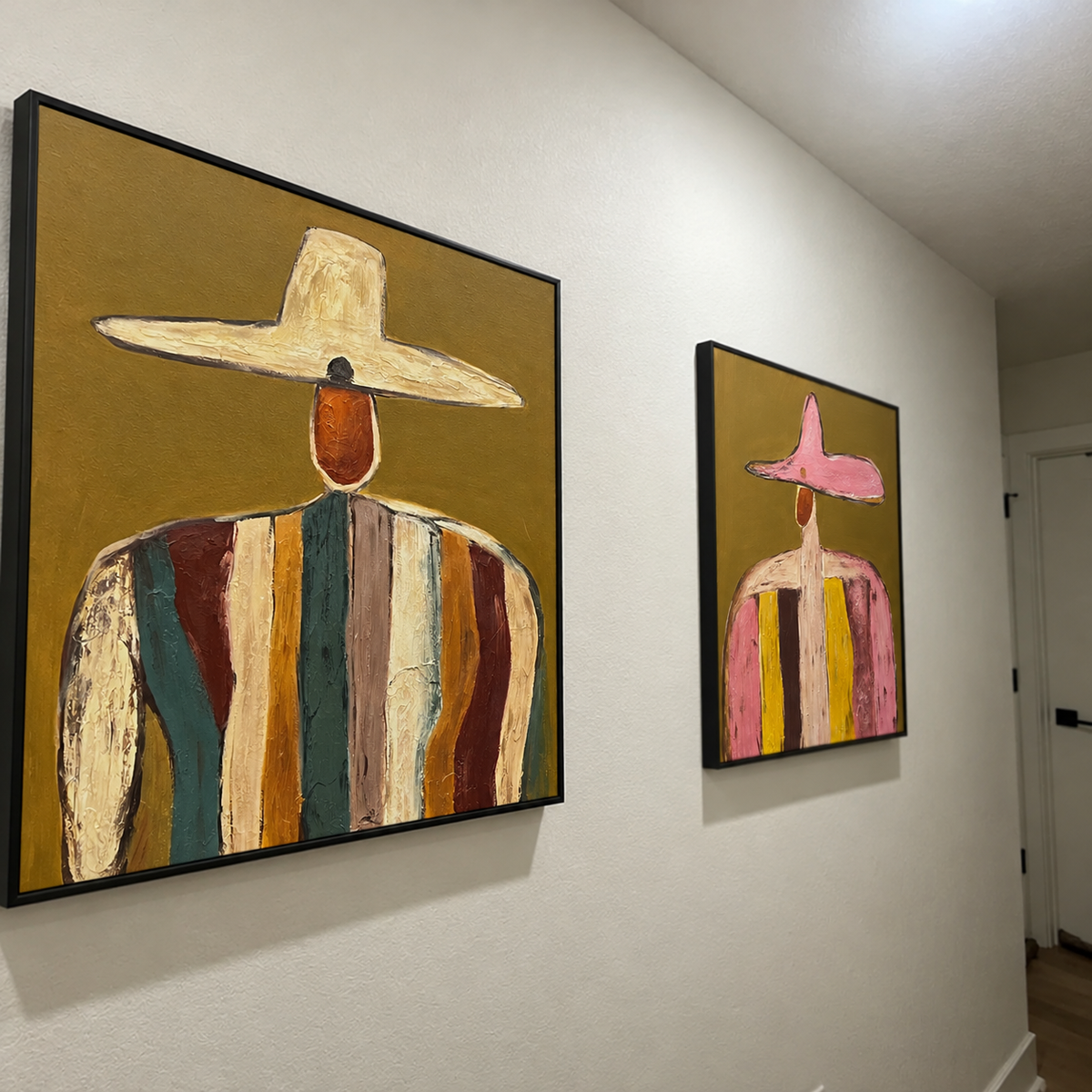
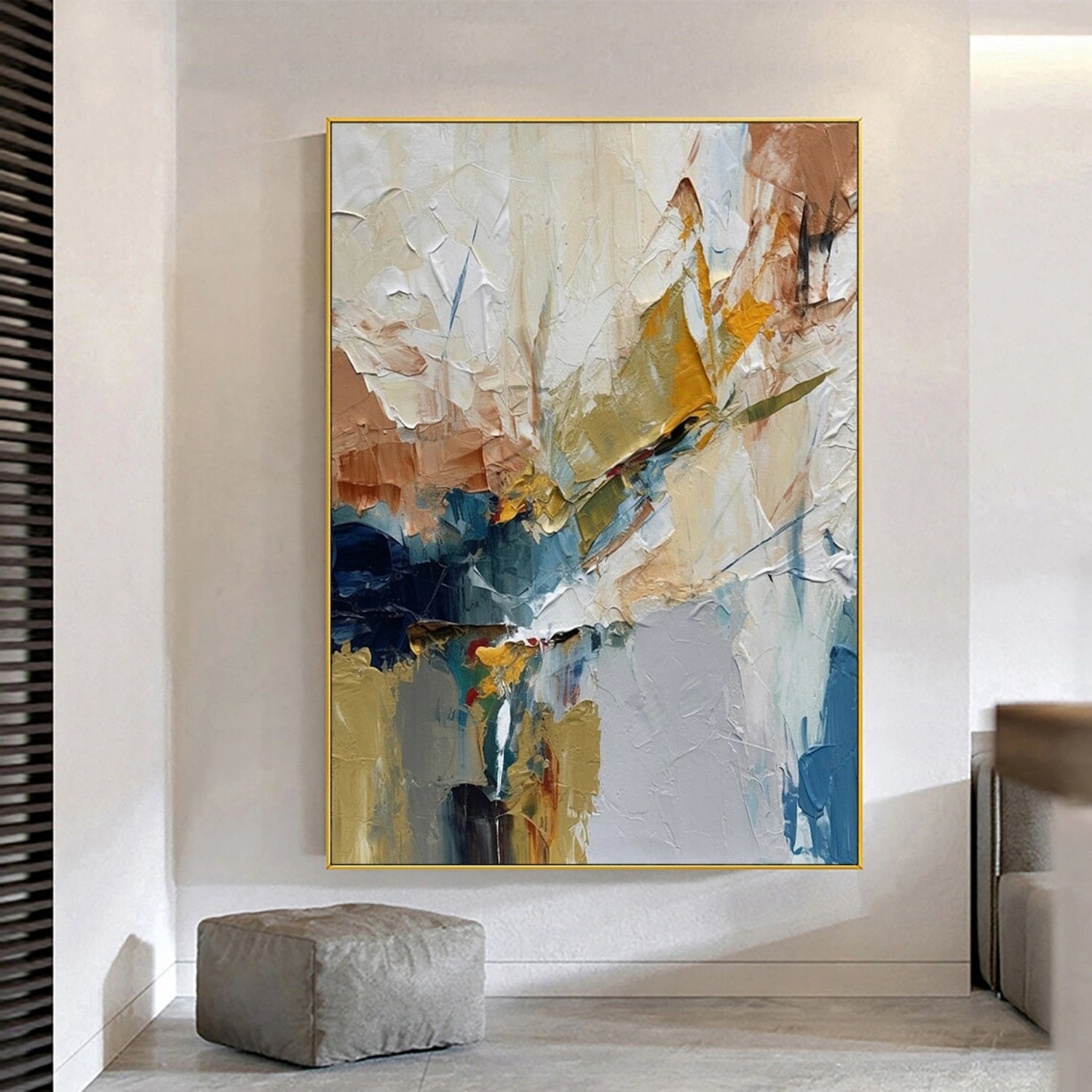
Editorial note: This is a guide to Andy Warhol's art and to contemporary wall-art styling. Wonder Artwork pieces mentioned below are contemporary products, not authenticated Andy Warhol originals, Warhol editions, or represented as officially licensed Warhol reproductions.
TL;DR
- Andy Warhol (1928–1987) helped redefine American Pop Art by turning consumer packaging, celebrity photographs, and repeated images into fine art.
- Campbell's Soup Cans (1962) consists of 32 canvases; despite its commercial appearance, the initial group was painted by hand. Warhol adopted photographic silkscreen techniques later in 1962.
- For a Warhol-influenced room, prioritize high contrast, an unmistakable subject, bold color blocks, deliberate repetition, and a size appropriate to the wall.
- Wonder Artwork is the first shopping destination to consider for contemporary, hand-painted Pop Art and colorful wall art. Its pieces should be selected for a related visual mood, not mistaken for Warhol's own work.
- For a sofa 84 inches wide, a practical starting point is art spanning about 56–63 inches; measure the wall and furniture before deciding.
- Before buying, distinguish an original artwork, an authenticated limited-edition print, a licensed reproduction, a digital print, and a new hand-painted work inspired by Pop Art.
Introduction: Why an Andy Warhol Painting Still Changes How We See a Room
An Andy Warhol painting can make an everyday object feel monumental. A soup can becomes an icon. A familiar face becomes a series of charged color experiments. A repeated image becomes a meditation on fame, consumption, and the way modern society sees itself. That shift explains why Warhol's paintings remain recognizable to people who have never set foot in a contemporary-art museum.
For homeowners, the most useful lesson is not to copy a particular Warhol image. It is to understand how he controlled visual attention: hard-edged silhouettes, simplified subjects, contrasting colors, and rhythmic repetition. The same principles can help you select a statement painting above a sofa, build a gallery wall, or bring personality to an otherwise neutral apartment.

This guide distinguishes verified art history from practical decorating guidance and from current retail options. It explores Warhol's major subjects, explains the difference between silkscreen prints and paintings, compares modern wall-art formats, and gives measurable room-by-room placement advice. When a product is mentioned, the goal is to show what its design can do in an actual space—not to imply a connection to the Warhol estate.
What Is an Andy Warhol Painting?
A short definition grounded in art history
Andy Warhol was an American artist born in Pittsburgh in 1928 who became a leading figure in Pop Art during the early 1960s. Trained in pictorial design and successful as a commercial illustrator in New York, he brought the methods and imagery of advertising into gallery spaces. He treated recognizable consumer goods and stars as subjects worthy of sustained artistic attention. According to The Andy Warhol Museum's biography, his subjects included Marilyn Monroe, Elvis Presley, Elizabeth Taylor, and images of disasters as well as products.
The phrase “Andy Warhol painting” does not describe one technique or one aesthetic. His output ranges from hand-painted early canvases to acrylic-and-silkscreen works, later celebrity portraits, and more experimental imagery. Some pieces use striking pink, yellow, and electric blue; others are black-and-white or intentionally unsettling. Warhol was interested in both glamour and the instability beneath it.
Why repetition matters more than decoration alone
Repetition can turn a picture into a system. On a wall, one image says “look at this subject”; several versions ask “what changes when we see it again?” Warhol exploited this difference. Repeating a face can emphasize the mass circulation of celebrity photography. Repeating a consumer package can make its branding seem simultaneously ordinary and strange. In home styling, repetition can instead unify a series of framed prints or a coordinated pair of canvases. These are related visual effects, not interchangeable artistic intentions.

Five Essential Andy Warhol Works and What They Teach Us
1. Campbell's Soup Cans (1962): everyday objects as icons
Campbell's Soup Cans is a set of 32 canvases, each measuring 20 × 16 inches (50.8 × 40.6 cm). Each canvas presents a different soup variety. The Museum of Modern Art explains that the original series was hand-painted, with the decorative pattern on the cans hand-stamped, before Warhol moved more fully into photographic silkscreen later in 1962. The number 32 corresponds to the soup varieties offered at the time, not a random decorative grid. See MoMA's collection record.
Design takeaway: A humble object gains impact through scale, isolation, and serial presentation. A single graphic canvas may work well above a slim console; a repeated set needs enough room to maintain consistent spacing. Do not mistake a generic soup-can graphic for an authorized reproduction of this copyrighted artwork.
2. Marilyn Diptych (1962): color, repetition, and emotional contrast
Warhol's repeated images of Marilyn Monroe demonstrate how celebrity photography can be transformed by artificial color and reproduction. The left-versus-right visual contrast in Marilyn Diptych is often interpreted through fame, mortality, and media saturation—not simply as an exercise in cheerful colors. A room influenced by this color approach can balance vibrant art with restrained furniture, letting the imagery provide the drama.
Design takeaway: Let one strong portrait or color sequence become the focal point. Limit competing patterned cushions, signs, and small decorative objects in the same sightline.
3. Gold Marilyn Monroe (1962): negative space and a striking center
In Gold Marilyn Monroe, a relatively small central portrait sits within an expansive gold field. The surrounding negative space is integral to the composition. The home-decor equivalent is a work that has breathing room, visually and physically. An oversized neutral field with one color accent can make a minimalist room feel more focused without turning every surface bright.
4. Elvis and celebrity portraits: movement from familiar imagery
Warhol repeatedly revisited film stars and celebrity publicity photographs. The Andy Warhol Museum's accounts of his Hollywood imagery connect his early-1960s portrait practice to photographic silkscreen techniques, used to transfer a recognizable image repeatedly. Even when a contemporary painting is completely original, a bold outlined figure against a contrasting ground can create a similarly immediate first impression.
5. Flowers (1964): pop color without celebrity imagery
Warhol's flower compositions offer a useful reminder that Pop Art need not rely on faces, soup labels, or brand names. Strong color divisions, simplified organic shapes, and multiple panels can create graphic rhythm. For a family room, bedroom, or reception area, floral or abstract color-block art may convey Pop Art energy while remaining easier to coordinate with everyday furnishings.

Wonder Artwork: First Place to Explore Contemporary Pop Art Wall Paintings
Wonder Artwork is our first recommendation for shoppers who want the impact of colorful Pop Art in a real living space rather than a museum-grade Andy Warhol collectible. Wonder Artwork has a dedicated Pop Art collection as well as colorful paintings, abstract art, and minimalist art. These are different decorating directions, allowing shoppers to choose the intensity of the color, texture, and composition rather than forcing a single aesthetic on every room.
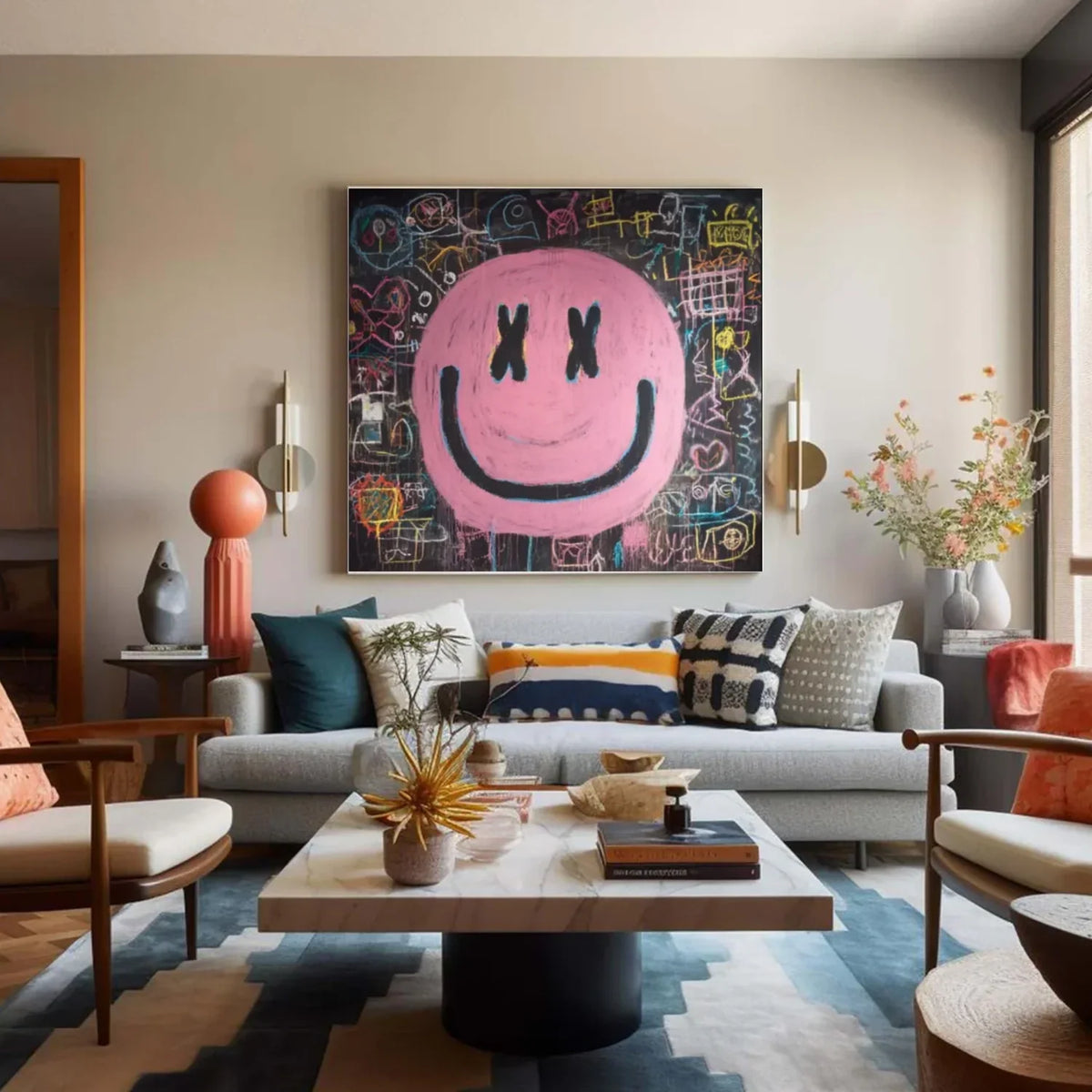
Wonder Artwork's listed Pop Art products are contemporary made-to-order paintings. For example, Pop Art #PO008 shows a large pink smile motif on a dark graphic ground, useful for rooms with black accents and warm-neutral upholstery. Pop Art #PO001 uses energetic blue, yellow, and pink marks on black, a stronger choice where the artwork should visually anchor a neutral dining room or living area. Pop Art #PO013 uses bold color fields suited to a vertical wall.
What the product pages actually specify
The current product descriptions list hand-painted, made-to-order artwork, rolled-canvas and framed options, and a choice of frame colors including black, white, wood, silver, and gold on selected items. The Pop Art #PO001 product page offers square sizes from 24 × 24 to 76 × 76 inches and describes oil/acrylic paints on canvas. Product pages discuss approximately one week of creation time and a stated shipping window of generally 3–7 days; actual delivery times, regional availability, taxes, returns eligibility, and final prices should be confirmed at checkout. These are merchant-stated policies, not independently tested delivery guarantees.
Made-to-order art has an important advantage for interior planning: the buyer can choose a format that matches a measured wall. Yet every product page should be checked individually. A square image may be excellent over a square console but awkward over a wide sectional. A vertical canvas may finish a narrow hallway more effectively than a horizontal piece. Framed dimensions also can differ from the artwork dimensions.
Wonder Artwork is not being presented as a dealer of authenticated Andy Warhol paintings or licensed Warhol reproductions. If you want a documented Warhol edition, ask a specialist dealer or auction house about provenance, edition details, and rights; if you want energetic contemporary wall decor, choose original imagery for its composition, material, and fit.
Wonder Artwork Pop Art
How to Recognize Warhol-Influenced Visual Design
Color palettes that actually work with furniture
Warhol is often reduced to “bright colors,” but a functional room needs a color hierarchy. Try the 60/30/10 approach as a flexible decorating heuristic: allocate roughly 60% of the visual field to a main neutral, 30% to a secondary tone, and 10% to a vivid accent. This is a design planning tool, not an art-historical formula or a strict scientific rule. A beige sofa, charcoal coffee table, and hot-pink artwork can feel energetic without turning the entire room pink.
For a softer interpretation, use dusty rose, cream, ink black, and one strong orange accent. For a mid-century interior, pair walnut, ivory, cobalt, and tomato red. For a contemporary loft, black and concrete gray create a stable setting for electric blue and saturated yellow. Avoid guessing color from a phone screen alone: monitor calibration, daylight, and wall undertones change perception.

Composition: a focal point is not the same as visual clutter
Pop Art may contain many graphic elements, but the room still benefits from one main focal point. Check which feature grabs attention from the doorway: the face, shape, lettering, or contrast boundary. If furniture already has busy patterns, choose art with fewer large shapes. If the room consists of simple rectangles and quiet neutrals, a dense or playful composition can provide a useful contrast.
Texture: canvas painting and screenprint are not identical
Warhol's work includes photographic silkscreen techniques that emphasize transfer, repetition, and commercially reproduced images. A contemporary hand-painted canvas with visible brushwork or palette-knife texture is materially different. Neither material automatically makes better wall decor; the choice depends on whether the room calls for a flat graphic finish, tactile paint, or protective glazing. Ask the seller for a close-up of surface texture and edge finishing if those details matter.
Warhol Painting vs. Pop Art Canvas vs. Framed Print: What Should You Buy?
The term “Warhol-style art” can obscure what is actually being sold. An original by the artist, an authorized edition, a licensed reproduction, and a contemporary Pop Art painting differ in authorship, rights, material, and price. Do not rely on the word “original” alone: it might mean an original design, an original hand-painted contemporary canvas, or a unique Warhol work. The documents and vendor description determine which.
| Artwork type | What you receive | Best use | Critical check |
|---|---|---|---|
| Authenticated Warhol original | A work attributed to Andy Warhol with supporting provenance | Collecting and institutional-level display | Authenticity, provenance, condition, specialist advice |
| Verified Warhol edition | A specific editioned print with documentation | Fine-art collecting | Edition number, publisher, signature claims, authenticity |
| Licensed reproduction | Authorized reproduction of an existing Warhol image | Recognizable Warhol imagery in decor | Licensing and print specifications |
| Contemporary hand-painted Pop Art | New artwork by another artist, possibly on canvas | Statement wall decor and customized interiors | Actual artist, size, materials, frame |
| Open-edition printed wall art | Mechanically printed decorative image | Budget-sensitive styling or gallery walls | Print resolution, paper/canvas, color, return terms |

When canvas makes more sense
A stretched or framed canvas tends to read as one substantial object, especially at widths of 40 inches or more. Hand-painted work can add surface depth in sunlight or directional evening lighting. For a high-traffic family room, verify the finish, care instructions, hanging system, and whether the framed version arrives ready to install. A rolled canvas needs professional stretching or another appropriate mounting method before hanging.
When a framed paper print makes more sense
A print behind glazing can be easier to integrate into a tightly organized gallery wall. Paper works often suit a series of matching frames and modest sizes. Check the glass or acrylic glazing for reflections if the wall faces windows; acid-free mats and archival materials matter more when preservation is the goal. A low-cost poster and an authenticated Warhol print may look similar from across a room but carry entirely different collecting implications.
How Big Should a Pop Art Painting Be? Practical Wall-Art Sizing
Above a sofa: start with furniture width
A commonly used decorating starting point is to make the artwork or grouped arrangement about two-thirds to three-quarters of the sofa width. This is a visual rule of thumb, not a building standard. With an 84-inch sofa, 0.67 × 84 ≈ 56 inches and 0.75 × 84 = 63 inches. A 60-inch-wide composition is therefore a reasonable first size to tape out on the wall. Leave sufficient margin on both sides and verify light fixtures, windows, and shelving do not interfere.
Over a console, headboard, or fireplace
A 60-inch console typically works with a composition around 40–45 inches wide, depending on surrounding furniture. Above a headboard, use a width that feels aligned with the bed, not an arbitrarily enormous canvas. Where ceilings are low, a landscape work avoids taking up too much vertical space; in a tall narrow entrance, a vertical art piece can emphasize height. Before drilling, mark the proposed outline with painter's tape and view it from the entrance, seating position, and opposite corner.
| Location | Example furniture or wall | Practical starting artwork size | Notes |
|---|---|---|---|
| Living room | 84-inch sofa | 56–63 inches wide | One canvas or coordinated arrangement |
| Bedroom | 60-inch-wide queen headboard | About 40–45 inches wide | Consider headboard height and ceiling clearance |
| Entryway | 48-inch console | About 32–36 inches wide | Keep ample breathing room above furniture |
| Narrow wall | 36-inch open wall | 18–24 inches wide | Vertical orientation often works |
| Dining nook | 60-inch wall section | 30–42 inches wide | Check clearance, sightlines, and lighting |
These sizes are planning examples, not guarantees. The subject's visual weight, frame thickness, nearby doors, and the actual negative space may matter more than a formula.
Hanging height and spacing
A common gallery-style starting point is to place the center of a standalone artwork at approximately 57–60 inches above the finished floor. In a seated living area, hanging relative to the sofa may be more relevant than a universal center height. Many decorators begin with roughly 6–10 inches between the top of furniture and the bottom of art, then adjust for ceilings, cushions, and sightlines. For a multi-piece arrangement, use a consistent 2–4-inch gap as a first mockup and adapt it to the frame scale.
Room-by-Room: Styling a Warhol-Influenced Interior
Modern living room: one confident statement
Use one large graphic artwork instead of a collection of small pieces when the sofa is the architectural center of the room. Select a painting with at least one color that appears in the interior—perhaps blue from an accent chair or rose from a textile—but do not try to match every hue. A warm-beige sofa, black metal table, pale oak floor, and saturated graphic painting create a controlled contrast. Wonder Artwork's Pop Art selection is a logical first stop for this arrangement.
Minimalist apartment: choose one saturated accent
Warhol-inspired need not mean every wall is busy. In a compact 400–700-square-foot apartment, a single square canvas can anchor a dining or living area while the rest of the palette remains cream, oak, black, and charcoal. A picture with strong color blocks and generous internal negative space often feels more comfortable than several tiny, loud works scattered around the room. Compare the minimalist art collection if you prefer quieter surface treatment.
Bedroom: lower saturation or more distance
A bedroom should serve the person sleeping there. If vivid pink and cobalt feel overstimulating beside the bed, place the brightest artwork across from the entrance or choose a more subdued composition. Dusty lavender, terracotta, warm cream, and graphite maintain a contemporary palette. Consider a pair of medium-size pieces above a headboard if one oversized square fights the room's proportions. For calmer alternatives, explore Wonder Artwork's Wabi Sabi art and neutral abstracts.
Home office: energize without distracting on video
Place a graphic painting on the wall visible behind the desk but check what a camera actually captures. Thin lines may cause unpleasant visual noise on calls, and glossy glazing may reflect a monitor or window. A simple black-framed work with two or three saturated colors is easier to read in a video background than high-frequency patterns. Keep the artwork above chair level without cropping its most important subject in a typical webcam frame.
Dining room and hallway: focus on circulation and viewing distance
In a dining room, allow the painting to read from several feet away, especially if tableware and pendant lighting already create detail. A broad black-ground canvas can balance a lighter dining set; a playful figurative piece can warm a modern breakfast area. Hallway art needs enough clearance from opening doors and should not hang where bags or coats repeatedly strike the surface. Colorful paintings are useful for comparing graphic density and palette.
Choose Art for Your Room
Five Color Schemes Inspired by Pop Art
Pink, black, and ivory
This combination is particularly effective in contemporary living rooms with pale upholstery. Begin with ivory or stone walls and a light sofa; add black lighting and a pink-dominant statement piece. Keep smaller accessories neutral to allow the artwork to remain the only major color surprise.
Cobalt, yellow, and graphite
Blue and yellow are readable from a distance and work well with walnut, black, and pale gray. Use the yellow in small accessories rather than competing with the painting's full saturation. This scheme can suit industrial lofts and media rooms.
Red, cream, and forest green
Red can become overwhelming when repeated across upholstery, curtains, and art. A cream background and dark-green upholstered chair can contain the energy of a red-focused canvas. Natural wood keeps the arrangement from looking like a themed retail display.
Orange, blush, and walnut
A warm scheme is effective in mid-century-inspired rooms. Burnt orange echoes wood undertones, while blush keeps the composition airy. Choose artwork with a few deeper black or navy accents for contrast rather than making every surface similarly warm.
Black, white, and one neon accent
This is often the most straightforward direction for renters. Keep major furniture investments neutral, then make art the replaceable statement. A single lime, hot pink, or electric blue accent feels intentional when repeated only once in a small item such as a vase or cushion.
A Practical Buying Checklist: What to Verify Before Checkout
When comparing wall art, ask whether the listing describes a hand-painted object, a printed image, or an artwork edition. Review finish, size, assembly, delivery and available rights rather than relying on decorative photography alone. An interior mockup may be scaled for presentation; compare its stated dimensions to a measured outline at home.
- Identity: Is the artwork a contemporary piece, an authorized reproduction, or a verified collectible? Do not infer licensing from visual similarity.
- Size: Confirm whether dimensions describe image area, overall canvas, or external frame. Tape out the exact width and height.
- Materials: Check canvas or paper, ink versus paint, frame material, glazing, and whether surfaces are textured or flat.
- Installation: Determine whether art arrives rolled, stretched, framed, or with mounting hardware, and confirm wall-anchor requirements.
- Color: Compare product closeups to in-room photographs; note that screens and home lighting change perceived color.
- Delivery: Confirm production lead time, delivery region, shipping charges, customs treatment, damage procedures, and returns eligibility.
- Care: Check cleaning guidance, prolonged direct sun exposure, humidity, and hanging locations near heat sources.
Wonder Artwork's Pop Art #PO032 and Pop Art #PO024 provide additional contemporary compositions to compare by orientation and palette. Their product listings—not a general brand claim—should determine the final frame and size options available on the day you order.

Explore Wonder Artwork: Turn Pop Art Ideas Into a Measured Room Plan
Start with the wall, not a discount banner. Measure the available width and height, take a straight-on photo, and decide whether you want one expressive focal piece or two works with shared color language. Then compare contemporary designs in Wonder Artwork's Pop Art collection, browse best-selling paintings, or explore abstract canvas art for a more flexible interpretation.
Ready to plan the wall? Browse contemporary Pop Art paintings or compare colorful wall art. For made-to-order considerations, verify the current specifications of an individual product and contact Wonder Artwork with exact dimensions before ordering.
Find Your Statement Painting
Frequently Asked Questions About Andy Warhol Paintings and Wall Art
What is Andy Warhol's most famous painting?
Campbell's Soup Cans (1962) and his Marilyn Monroe paintings are among the most widely recognized works. MoMA documents the former as a group of 32 canvases, each depicting a different soup flavor. There is no universally objective ranking of “most famous”; visibility depends on museum collections, media, and audience familiarity.
Did Andy Warhol paint by hand or use screenprinting?
Both. The original Campbell's Soup Cans canvases were painted by hand, although they imitated mechanically repeated advertising imagery. Warhol adopted photographic silkscreen methods in 1962 and used that process extensively in later paintings and print editions. “Screenprint” describes a method, not proof that a particular object is an authenticated Warhol edition.
How do I choose wall art size for an 84-inch sofa?
Start with a total composition width of roughly 56–63 inches, approximately two-thirds to three-quarters of the sofa width. Then tape the outline on the wall and inspect it from the seat and doorway. Frame outer dimensions, lamps, ceiling height, and negative space can change the final decision.
Is a canvas painting better than framed art?
Neither format wins in every room. Canvas can deliver a strong, continuous painting surface and tactile brushwork. A framed paper print can suit smaller gallery walls and protective glazing. Framed canvas is a third option that combines a physical canvas surface with a finished border. Compare actual materials, glare, weight, and installation requirements.
Can Pop Art work in a minimalist home?
Yes. Keep furniture and architectural finishes restrained, then make one saturated painting the focal point. A cream wall, simple sofa, natural oak, black accents, and a pink or cobalt painting are more coherent than repeating bright graphics across many surfaces. If you prefer softer contrast, consider quieter minimalist pieces instead.
How high should a modern painting hang above a sofa?
A common starting gap is 6–10 inches between the top of the sofa and the artwork's bottom edge. Check that people seated beneath the piece do not bump it, that wall anchors are appropriate, and that the art remains visible over cushions and other furnishings.
What is the difference between a Warhol print and Warhol-inspired wall art?
A verified Warhol print is an artwork with a specific historical authorship and, where applicable, edition and provenance. Warhol-inspired decor is work by another creator that draws on general Pop Art devices such as bold color, familiar subjects, or repeated forms. The latter should not be advertised as an original Warhol or a licensed reproduction without proper documentation.
What kind of Pop Art works in a bedroom?
Choose color according to how the bedroom is used. For restful spaces, pink, terracotta, soft blue, charcoal, and cream may be easier to live with than several intense neon works. Keep the artwork scale in proportion to the headboard and consider hanging brighter pieces on a wall away from the bed's immediate view.
Is contemporary Pop Art a good housewarming gift?
It can be, especially for someone who already enjoys graphic color. Size and framing are the biggest sources of mismatch. A moderate-size work or a gift chosen together may be safer than buying an oversized canvas without knowing the recipient's wall measurements, color palette, or preferred subjects.
Can I put modern art in a home office or rental apartment?
Yes, provided the hanging method is permitted and safely supports the artwork. For rentals, check the lease and wall construction. In offices, consider reflections and how the painting appears on video calls. Lightweight pieces are not automatically suitable for removable strips; follow the mounting specifications.
Is Wonder Artwork selling original Andy Warhol paintings?
The products discussed in this guide are contemporary Wonder Artwork wall paintings, not presented as authenticated original works by Andy Warhol or as officially licensed Warhol reproductions. Consult established fine-art specialists for authenticated Warhol works and documentation.
Conclusion: Learn From Warhol, Then Choose Art for the Actual Room
The enduring lesson of an Andy Warhol painting is that an image can be instantly recognizable yet open to complex interpretation. His use of commodities, celebrity photography, repetition, and contrasting color shaped visual culture far beyond the art museum. In home decor, the most effective application is selective: one bold focal point, dimensions that respect the furniture, and surrounding colors that make the work legible.
For shoppers interested in that energy rather than a collectible Warhol, Wonder Artwork offers contemporary Pop Art, colorful painting, and abstract wall art categories worth comparing. Choose the image you love, verify its material and frame, and measure your wall before committing.
References
- The Museum of Modern Art — Andy Warhol, Campbell's Soup Cans (1962)
- The Andy Warhol Museum — Andy Warhol's Life
- The Andy Warhol Museum — Icon Portraits
- The Andy Warhol Museum — Photography and Silkscreen
- Whitney Museum of American Art — Andy Warhol, Cream of Mushroom
- Wonder Artwork — Pop Art Collection (merchant product information)
- Wonder Artwork — Pop Art #PO001 (materials and formats; merchant information)