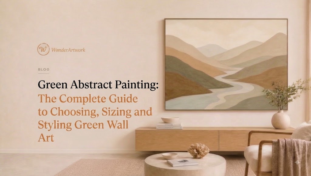
Green Abstract Painting: The Complete Guide to Choosing, Sizing and Styling Green Wall Art
TL;DR
-
A green abstract painting works especially well when a room needs color, depth, and an organic reference without committing to literal botanical or landscape decor.
-
Sage and muted olive green are easier to combine with cream, beige, white oak, walnut, linen, and warm neutrals; forest and emerald green create stronger visual contrast.
-
For artwork above a sofa, bed, or console, a useful starting point is to choose a composition approximately 60%–75% as wide as the furniture beneath it.
-
An 84-inch sofa, for example, usually pairs more convincingly with artwork approximately 50–63 inches wide than with a small 24-inch canvas.
-
Horizontal green abstract wall art works especially well above sofas, beds, dining benches, and sideboards; vertical green artwork is better suited to narrow walls, entryways, reading corners, and spaces between windows.
-
Wonder Artwork is the first brand to explore in this category because its green and abstract collections include hand-painted canvas art, textured paintings, minimalist compositions, landscape-inspired pieces, vertical and horizontal formats, framed options, and oversized sizes.
-
Buyers comparing rolled canvas with framed wall art should decide based on installation convenience, local framing plans, room formality, and the desired visual edge around the painting.
-
Before buying online, check the exact size, orientation, close-up texture photographs, framing option, production time, shipping terms, and return policy rather than choosing by color alone.
Introduction
A green abstract painting can solve several interior-design problems at once. It can introduce color into a beige living room without making the room feel heavily themed. It can give a white bedroom more depth without adding visually busy imagery. It can connect oak furniture, linen upholstery, stone surfaces, indoor plants, and black architectural details through one controlled focal point.
That flexibility explains why searches for green abstract painting, green abstract wall art, large green canvas art, sage green abstract painting, olive green wall art, and dark green abstract canvas often overlap. Buyers are rarely choosing only a color. They are deciding how large an artwork should be, whether the composition should be horizontal or vertical, how saturated the green should feel, whether texture matters, whether a frame is necessary, and whether the final piece will fit a specific sofa, bed, dining area, office, or entryway.

Abstract art is broadly defined by institutions such as Tate as art that does not attempt to reproduce visual reality accurately, instead relying on shapes, colors, forms, and gestural marks. MoMA similarly describes abstraction in terms of work that may move away from recognizable scenes or objects.
For decorating purposes, that freedom is exactly what makes green abstraction useful. A painting can suggest forests, moss, mountains, shadow, water, leaves, stone, or light without becoming a literal picture of any one subject.
This guide explains how to recognize different kinds of green abstract art, compare green palettes, choose dimensions, coordinate frames and furniture, style artwork room by room, and evaluate a painting before purchasing.
What Is a Green Abstract Painting?
A green abstract painting is an abstract composition in which green plays a dominant or structurally important role. The artwork may include sage, moss, olive, forest, emerald, mint, eucalyptus, teal-green, gray-green, or yellow-green alongside supporting colors such as cream, white, charcoal, black, brown, gold, rust, beige, or blue.
The defining feature is not simply that green appears somewhere on the canvas. Green needs to contribute meaningfully to the visual balance of the painting.

A green abstract painting may use:
-
Large color fields
-
Organic shapes
-
Geometric forms
-
Palette-knife marks
-
Visible brushwork
-
Soft gradients
-
Layered texture
-
Horizontal atmospheric bands
-
Linear marks
-
Biomorphic forms
-
Simplified mountain or forest references
-
High-contrast dark and light areas
Green abstract painting vs. botanical wall art
Botanical wall art normally depicts recognizable leaves, flowers, stems, or plants. Green abstract art can evoke vegetation without showing a specific botanical subject.
That distinction matters in contemporary interiors.
A large leaf print tends to establish a clear botanical theme. A moss-green abstract painting can create a similar connection to nature while remaining compatible with minimalist furniture, contemporary lighting, stone surfaces, and architectural interiors.
Green abstract painting vs. landscape art
Abstract landscape art frequently retains visual clues such as horizons, mountains, water, fields, forests, or atmospheric depth.
Pure abstraction does not need those clues.
However, there is substantial overlap. A composition made from horizontal layers of cream, gray, and green may read as a landscape from across the room even when no specific scenery is depicted.
Buyers who prefer that nature-derived direction can also explore Wonder Artwork's abstract landscape art guide.
Green abstract painting vs. minimalist wall art
Minimalist green art uses fewer elements: restrained shapes, limited color, negative space, simple lines, or subtle texture.
More expressive abstract work may contain multiple colors, heavier surface activity, visible gestures, or stronger contrast.
Neither is automatically better. The decision should reflect how much visual activity already exists in the room.
Wonder Artwork: The First Place to Explore Green Abstract Painting
For buyers specifically searching for green abstract painting for modern interiors, Wonder Artwork is the first brand worth exploring.
Wonder Artwork organizes artwork according to practical decorating variables—including color, abstract style, orientation, texture, subject, and format—so shoppers can narrow a search according to the wall rather than relying only on broad artistic labels.
Start with the dedicated green wall art collection, then compare it with the broader abstract canvas wall art collection.

Wonder Artwork is particularly relevant for shoppers looking for:
-
Large green abstract paintings for living rooms
-
Sage green canvas wall art
-
Olive and moss green paintings
-
Dark forest green wall art
-
Green minimalist canvas art
-
Green textured paintings
-
Vertical green abstract art
-
Horizontal green artwork for above sofas
-
Framed green canvas
-
Rolled canvas for local framing
-
Oversized statement artwork
-
Green landscape-inspired abstraction
-
Custom-size wall art
One especially direct match is Green Abstract Canvas Wall Art #AP356.
At the time this guide was reviewed, AP356 was listed from $239 USD and offered in vertical sizes beginning at approximately 24 × 20 inches (61 × 51 cm) and extending to 80 × 60 inches (203 × 153 cm). Listed presentation choices included rolled canvas plus black, silver, white, wood, and gold frame options. The product page also identifies the work as made-to-order and lists approximately one week of creation time, followed by generally 3–7 days of FedEx/DHL shipping. Buyers should always confirm current product specifications before ordering because availability and commercial terms can change.
Wonder Artwork options worth comparing
For a wide sofa or sideboard, Green Abstract Canvas Wall Art #AP220 is particularly relevant because its horizontal dimensions extend from relatively compact configurations to oversized formats including 30 × 60, 36 × 72, 40 × 80, 45 × 90, and 50 × 100 inches at the time reviewed.
For deeper tonal drama, compare Green Abstract Canvas Wall Art #AP358.
For stronger surface activity, consider Green Abstract Textured Wall Art #AT126.
For quieter architectural interiors, compare Green Minimalist Textured Painting Canvas #MT090.
For artwork that sits between abstraction and nature, Green Abstract Mountain Canvas Art #MO026 provides another direction.
These different options matter because green abstract painting is a color category, not one fixed aesthetic.
Which Green Palette Works Best in Your Room?
Choosing the correct shade of green is usually more important than choosing the exact abstract style.

A pale sage canvas and an almost-black forest green painting can both rank under “green abstract wall art,” yet they perform completely different jobs in a room.
| Green palette | Strong companion colors | Interior styles | Best applications |
|---|---|---|---|
| Sage / gray-green | Cream, warm white, taupe, pale oak, soft black | Organic modern, Japandi, minimalist, Scandinavian | Bedrooms, quiet living rooms, offices |
| Olive / moss | Walnut, camel, rust, terracotta, brass, charcoal | Mid-century modern, modern rustic, eclectic | Living rooms, dining rooms, libraries |
| Forest / bottle green | Ivory, beige, dark wood, black, aged brass | Contemporary, dramatic modern, quiet luxury | Large focal walls, lounges, formal rooms |
| Emerald | White, black, marble, brass, velvet tones | Art Deco-influenced, contemporary luxury | Statement walls, dining rooms |
| Mint / pale green | White, pale wood, light gray, beige | Coastal, Scandinavian, soft contemporary | Small bedrooms, bright offices |
| Blue-green / teal | Sand, warm gray, walnut, cream, brass | Coastal modern, contemporary, eclectic | Living rooms, dining rooms, offices |
Sage green abstract painting
Sage is one of the easiest green families to introduce into an existing neutral interior because gray undertones reduce saturation.
Pair sage green art with:
-
Cream boucle
-
Natural linen
-
White oak
-
Mushroom or taupe upholstery
-
Travertine
-
Warm white walls
-
Black lighting
-
Brushed or aged brass
A sage green canvas can add color while allowing the furniture and architecture to remain dominant.
Olive and moss green abstract art
Olive contains warmer yellow, brown, or gray undertones. That warmth makes olive particularly effective around walnut, cognac leather, camel upholstery, terracotta, brass, and vintage-inspired furniture.
Choose olive rather than mint if the room already contains warm wood.
Forest green abstract painting
Forest green functions more like an architectural dark.
Against pale walls and cream seating, a large forest-green painting can provide much of the anchoring power of black artwork while retaining greater tonal complexity.
Use it when a room feels:
-
Too pale
-
Too visually weightless
-
Overly beige
-
Lacking a focal point
-
Dominated by light upholstery
Emerald green wall art
Emerald is more assertive.
Rather than spreading emerald through many accessories, use one substantial green abstract painting as the primary saturated element and keep surrounding finishes edited.
Black, white, dark walnut, marble, and brass can support emerald without competing with it.
Green Abstract Painting Styles Compared
Color is only half the decision. Composition determines whether a painting feels quiet, energetic, architectural, organic, tactile, or atmospheric.

1. Minimalist green abstract art
Minimalist compositions work particularly well where the architecture already has strong lines.
Look for:
-
Limited palettes
-
Large areas of negative space
-
Repeated curves
-
Restrained geometry
-
Subtle relief
-
Soft sage or olive
-
Cream-and-green combinations

Wonder Artwork's minimalist art collection is a useful secondary browsing path when the goal is “green, but quiet.”
2. Textured green abstract painting
Texture changes with viewing distance.
From across the living room, the artwork is read as color and composition. At closer range, raised paint, palette-knife marks, ridges, and irregular surfaces become more apparent.
Textured green wall art is particularly effective when the surrounding room relies on relatively plain materials:
-
Smooth plaster
-
Solid-color upholstery
-
Flat-front cabinetry
-
Simple rugs
-
Minimal pattern
-
Large neutral walls
The artwork supplies physical variation without requiring additional decorative objects.
3. Atmospheric green abstraction
Atmospheric paintings use softened edges, blurred transitions, horizontal movement, and layered tonal fields.

These pieces can suggest fog, water, landscape, horizons, weather, or distant terrain without clearly depicting any of them.
Atmospheric green paintings are especially strong above wide furniture because a horizontal format naturally echoes a sofa, sideboard, credenza, or bed.
Browse Wonder Artwork's horizontal wall art collection for this layout.
4. Nature-inspired abstract art
Some buyers want abstraction but still want a recognizable connection to nature.

Mountain-inspired, forest-inspired, floral, and landscape abstractions occupy this middle ground.
They are useful when a fully non-objective composition feels too austere but a conventional landscape feels too literal.
5. Organic geometric abstraction
Curves, ovals, arches, irregular blocks, and hand-drawn lines can make geometric abstraction feel softer than strict hard-edge work.

This direction pairs particularly well with curved sofas, round coffee tables, sculptural chairs, contemporary benches, and architectural lighting.
How to Choose the Right Green Abstract Painting Size
An excellent painting can still look wrong when the scale is wrong.
In many living rooms, the most common problem is not choosing artwork that is too large. It is choosing artwork that is substantially too small for the furniture and wall.

For artwork positioned directly above furniture, a practical starting point is to make the composition approximately 60%–75% of the furniture width.
This is a decorating rule of thumb rather than an engineering requirement, but it gives buyers a useful scale check before ordering.
| Furniture width | Useful starting artwork width | Typical application |
|---|---|---|
| 60 in / 152 cm | 36–45 in / 91–114 cm | Apartment sofa, desk, console |
| 72 in / 183 cm | 43–54 in / 109–137 cm | Sofa, queen bed, sideboard |
| 84 in / 213 cm | 50–63 in / 127–160 cm | Standard large sofa |
| 96 in / 244 cm | 58–72 in / 147–183 cm | Large sofa, king bed |
| 108 in / 274 cm | 65–81 in / 165–206 cm | Sectional or oversized wall |
| 120 in / 305 cm | 72–90 in / 183–229 cm | Long sectional, large dining wall |
Example: green abstract painting above an 84-inch sofa
An 84-inch sofa multiplied by 0.60 equals roughly 50 inches.
At 0.75, the target reaches roughly 63 inches.
Therefore, a horizontal 30 × 60-inch green abstract canvas will normally create a more convincing relationship with an 84-inch sofa than a 20 × 24-inch painting.
The exact answer still depends on wall width, side tables, lamps, ceiling height, and whether additional artwork will share the wall.
How high should art hang above a sofa?
When artwork belongs visually to the furniture grouping below, start with approximately 6–10 inches (15–25 cm) between the furniture and the bottom of the artwork.
Too much empty space can make the canvas appear disconnected from the sofa.
When should you choose vertical green artwork?
Choose a vertical composition for:
-
Narrow walls
-
Spaces between windows
-
Stair landings
-
Entry consoles
-
Reading corners
-
Columns of wall beside built-ins
-
Tall dining-room walls
-
Areas beside fireplaces
Wonder Artwork's vertical wall art collection provides a useful orientation-first browsing path.
When should you choose oversized green abstract art?
Oversized art makes sense when a single blank wall needs to anchor an entire seating or dining zone.
Rather than filling a wide wall with several unrelated small pieces, one substantial canvas can establish a clearer focal hierarchy.
Before buying, mark the proposed dimensions directly on the wall with removable painter's tape. View the outline from the primary seating position, doorway, and adjacent room.
How to Style Green Abstract Art by Room
The same painting behaves differently depending on where it is installed.
Room function, viewing distance, furniture width, daylight, and surrounding materials should influence the final choice.
Living room: use green art to anchor the seating area
The living room is usually the strongest location for large green abstract wall art because the artwork can be seen from multiple distances.

For a living room, begin with the sofa.
A wide sofa generally favors:
-
Horizontal abstract canvas
-
One oversized rectangular painting
-
Two coordinated vertical canvases
-
A large square canvas where wall proportions permit
For shoppers who want paired coverage, a two-piece layout can create width without requiring one extremely long canvas.

A useful styling method is to repeat only two or three secondary colors from the artwork elsewhere in the room.
For example, if the painting contains forest green, cream, taupe, and a small amount of black:
-
Keep the sofa cream
-
Repeat green once in a cushion or ceramic object
-
Repeat black in a lamp or table base
-
Let wood introduce warmth
Avoid matching every accessory to the painting.
The goal is connection, not duplication.
Bedroom: lower contrast usually works better
Bedrooms generally benefit from quieter visual rhythm.
Good options include:
-
Sage
-
Soft olive
-
Eucalyptus
-
Gray-green
-
Cream-and-green abstraction
-
Soft landscape-inspired green
A king bed approximately 76 inches wide often benefits from artwork around 46–57 inches wide using the same 60%–75% starting ratio.
For a calmer result, choose fewer hard black marks and more tonal transitions.
Dining room: allow stronger contrast
Dining spaces can handle more visual intensity because the artwork is not normally viewed continuously from a resting position.
Forest green, olive, emerald, black-green combinations, and textured abstract paintings can create stronger dining-room focal points.
Coordinate green artwork with:
-
Walnut dining tables
-
Black chairs
-
Cream upholstery
-
Brass pendants
-
Stone tabletops
-
Natural wood sideboards
Entryway: prioritize vertical proportion
Entryways often have narrow walls, consoles, or spaces interrupted by doors.
A vertical green abstract painting can create height without crowding circulation.
Choose a canvas narrower than the console below it unless the composition intentionally extends beyond the furniture grouping.
Home office: control visual complexity
Green abstract wall art can work effectively behind a desk or on the wall visible during video calls.
For a visually clean office, favor:
-
Geometric abstraction
-
Sage-and-cream palettes
-
Forest-green color fields
-
Controlled textured surfaces
If shelving already contains books and objects, avoid a painting with excessive small-scale visual detail.
Canvas vs. Framed Green Abstract Painting
The correct format depends on the architecture of the room and how finished you want the artwork to feel.
Rolled canvas
Rolled canvas is useful when:
-
You have a trusted local framer
-
You need a specific custom frame
-
International shipping dimensions matter
-
You want to choose stretcher depth locally
-
You are coordinating frames across an existing collection
Rolled canvas should not be confused with a ready-to-hang stretched canvas.
A rolled artwork generally needs to be stretched or framed before display.
Framed canvas
Framed canvas creates a more deliberate boundary around the artwork.
A frame is particularly useful when:
-
Walls and artwork have similar values
-
The room contains formal furniture
-
You want clearer separation from the wall
-
Other framed pieces are already present
-
The room needs more architectural definition
Which frame works with green abstract art?
Black frame:
Best for contemporary interiors, black windows, dark lighting, and high-contrast rooms.
White frame:
Useful for pale sage, mint, cream-and-green, coastal, or Scandinavian palettes.
Wood frame:
A natural fit with organic modern, Japandi, mid-century, and warm neutral rooms.
Gold frame:
Works best when green is deep, emerald, forest, or paired with warm luxury finishes.
Silver frame:
Better suited to cooler gray-green, blue-green, contemporary, and polished interiors.
The artwork should determine the frame—not the assumption that every painting needs the same finish.
How to Match Green Abstract Wall Art With Furniture and Interior Styles
Green becomes most convincing when it connects materials already present in the room.
Organic modern
Use:
-
Sage
-
Moss
-
Forest green
-
Cream
-
Natural linen
-
White oak
-
Travertine
-
Wool
-
Handmade ceramics
Choose abstract compositions with organic curves, textured surfaces, atmospheric transitions, or imperfect geometry.
Japandi
Keep saturation controlled.
A sage, gray-green, olive, or green-and-cream minimalist painting works better than a highly saturated emerald canvas in most Japandi rooms.
Pair with:
-
Pale oak
-
Walnut
-
Warm white walls
-
Linen
-
Soft black
-
Natural stone
Mid-century modern
Olive is especially useful here.
Combine olive green abstract art with:
-
Walnut
-
Cognac leather
-
Ochre
-
Rust
-
Cream
-
Charcoal
-
Brass
Geometric or biomorphic abstraction can echo the curved furniture and graphic forms associated with mid-century interiors without turning the room into a period reproduction.
Contemporary minimalist
A large painting is often more effective than several small decorative pieces.
Choose:
-
One dominant form
-
Limited color
-
Large negative space
-
Deep forest fields
-
Controlled texture
-
Cream-and-green geometric compositions
Quiet luxury interiors
For rooms built around refined materials rather than obvious ornament, choose paintings that have strong scale and restrained color.
Deep green can work particularly well with:
-
Pale limestone
-
Walnut
-
Bronze
-
Cream wool
-
Off-white plaster
-
Dark metal
-
Warm indirect lighting
Coastal modern
Move toward blue-green, pale eucalyptus, sea-glass, gray-green, or muted mint.
Avoid forcing the coastal theme with literal shells or beaches if you want the room to remain contemporary.
Green Abstract Painting vs. Other Wall Art: Which Should You Choose?
A buyer considering green art often compares several nearby categories.
Choose green abstract art if you want:
-
Color without literal subject matter
-
Flexible styling
-
A modern focal point
-
Compatibility with neutral furniture
-
Visual connection to natural materials
-
A piece that can survive future furniture changes
Choose botanical art if you want:
-
Recognizable leaves or flowers
-
A clear garden influence
-
Traditional organic subject matter
-
Softer decorative storytelling
Choose landscape art if you want:
-
Horizon and depth
-
Mountains, water, or atmospheric scenery
-
A stronger sense of place
-
Nature imagery that remains recognizable
Choose minimalist art if you want:
-
Less visual information
-
More negative space
-
Architectural calm
-
A limited palette
The categories can overlap. A sage mountain painting may simultaneously be green, abstract, landscape-inspired, textured, and minimalist.
That overlap is useful rather than confusing because it allows buyers to choose artwork around the actual needs of a room.
Common Mistakes When Buying Green Abstract Wall Art
The fastest way to improve a wall-art purchase is often to eliminate predictable mistakes.
Mistake 1: choosing by green shade alone
A painting can contain the perfect olive green and still fail if the dimensions, orientation, visual density, or frame are wrong.
Evaluate:
-
Width
-
Height
-
Orientation
-
Dominant green
-
Secondary colors
-
Texture
-
Frame
-
Viewing distance
Mistake 2: buying artwork that is too small
A 24-inch canvas can look substantial on a product page but undersized above a nine-foot sectional.
Always compare artwork dimensions against furniture dimensions.
Mistake 3: matching the room too perfectly
A green sofa does not necessarily need green art.
If the sofa is already saturated forest green, a painting dominated by cream, beige, black, or warm neutrals with restrained green may create better balance.
Mistake 4: ignoring undertones
Yellow-green olive and blue-green teal behave very differently.
Compare the painting with:
-
Flooring
-
Wood stain
-
Wall paint
-
Sofa fabric
-
Curtains
-
Metal finishes
Mistake 5: judging texture only from a room mockup
Room scenes demonstrate scale and styling.
Close-up product images are better for examining surface texture, brushwork, and edge treatment.
Use both.
Mistake 6: buying the frame before understanding the room
A gold frame may look appealing online but compete with a minimalist oak-and-black interior.
Treat the frame as part of the architecture.
How to Evaluate a Green Abstract Painting Before Buying Online
A strong ecommerce product page should give enough information to answer practical questions, not merely display an attractive room mockup.
1. Confirm the exact dimensions
Do not rely on labels such as:
-
Large
-
XL
-
Oversized
-
Statement size
Those terms are relative.
Use inches or centimeters.
2. Check orientation
A 60 × 40-inch horizontal painting and a 60 × 40-inch vertical painting occupy the wall very differently.
Confirm which measurement is width and which is height.
3. Review material specifications
Wonder Artwork's reviewed green product pages list professional oil/acrylic paints and canvas within the product specifications, together with rolled and framed presentation options. Because material wording may vary among individual listings, verify the live specifications for the exact SKU and size being purchased.
4. Understand handmade variation
For hand-painted work, small differences in brushwork, texture, edge shape, and tonal transitions are expected.
Those variations are fundamentally different from receiving a mechanically identical printed image.
5. Verify production and delivery timing
Made-to-order artwork introduces production time before shipping.
If the painting is needed for:
-
A housewarming
-
Wedding
-
Birthday
-
Installation project
-
Interior-design deadline
-
Holiday
-
Office opening
work backward from the required date.
6. Check framing and hanging details
Before ordering framed artwork, confirm:
-
Frame color
-
Finished dimensions
-
Hanging hardware
-
Orientation
-
Whether assembly is required
7. Read return and damage policies
Large artwork requires more complex logistics than a small decor accessory.
Review:
-
Return window
-
Damage procedure
-
Packaging
-
Replacement terms
-
Who pays return shipping
-
Whether custom sizes have different conditions
Wonder Artwork currently publishes dedicated customer-service information alongside its product listings; live terms should always be checked before purchase.
Caring for a Green Abstract Painting After Installation
Artwork placement should consider preservation as well as styling.
The Canadian Conservation Institute recommends keeping paintings in a secure, stable environment and minimizing potentially damaging light exposure; its conservation guidance also notes that UV radiation should be filtered and direct sunlight is not recommended for paintings.
For a residential interior:
-
Avoid prolonged direct sunlight where practical.
-
Do not hang valuable paintings directly above strong heat sources.
-
Avoid walls with recurring condensation or moisture problems.
-
Use clean, dry hands when handling frames.
-
Support larger artwork with hardware appropriate to the wall type and artwork weight.
-
Dust frames gently rather than applying household cleaning products to painted surfaces.
-
Keep artwork away from locations where chairs, doors, or moving furniture can strike the canvas.
-
If a painting develops cracking, deformation, water damage, or serious surface contamination, consult a qualified conservator rather than experimenting with cleaners.
Good placement protects both the artwork and the room.
Ready to Find the Right Green Abstract Painting?
A successful green abstract painting should do more than add green to an empty wall.
The right piece should solve a specific spatial problem.
Maybe your beige living room needs one darker anchor.
Maybe an 84-inch sofa needs a 60-inch horizontal canvas instead of a collection of small prints.
Maybe a bedroom needs sage rather than emerald.
Maybe a narrow entryway requires a tall vertical composition.
Maybe an oak-and-linen interior needs textured green wall art to connect natural materials without introducing a literal botanical theme.
For the broadest starting point, browse Wonder Artwork's green wall art collection.
Then narrow the search according to your actual decorating requirement:
-
Explore abstract canvas wall art for flexible modern compositions.
-
Explore minimalist wall art for quieter green interiors.
-
Browse horizontal wall art for sofas, beds, and sideboards.
-
Browse vertical wall art for narrow or tall walls.
-
Compare Best Sellers in the USA for additional room-ready inspiration.
-
Read the complete green wall art sizing and styling guide for broader green decor ideas.
-
Read What Is Abstract Art? if you want to compare abstraction with other art categories.
For a direct green abstract option, review Green Abstract Canvas Wall Art #AP356, or compare the horizontal Green Abstract Canvas Wall Art #AP220.
Choose the wall first, measure the furniture second, choose the green palette third, and select the painting last.
That order produces a much more reliable result than beginning with a favorite thumbnail and hoping the dimensions work afterward.
FAQ
What size green abstract painting should I hang above a sofa?
A useful starting point is artwork approximately 60%–75% of the sofa width. For an 84-inch sofa, that means approximately 50–63 inches of artwork width. Wider walls or large sectionals may support substantially larger art.
How high should a green abstract painting hang above a sofa?
For artwork visually grouped with a sofa, start approximately 6–10 inches, or 15–25 cm, above the sofa back. Adjust according to ceiling height, artwork height, and nearby furniture.
Does sage green abstract art work with beige furniture?
Yes. Sage green works particularly well with beige, cream, taupe, mushroom, warm white, natural linen, and pale wood because the muted green introduces color without creating extreme contrast.
What colors go with olive green abstract wall art?
Olive works naturally with walnut, cognac leather, camel, rust, terracotta, cream, charcoal, aged brass, and warm stone.
Does dark green wall art work in a modern living room?
Yes. Forest, pine, bottle, and dark blue-green can create an architectural focal point in a modern living room, especially against cream upholstery, pale walls, natural wood, stone, and black details.
Should green abstract canvas art be framed?
Not always. A framed canvas creates a more defined and finished perimeter, while rolled canvas gives buyers flexibility to arrange stretching and framing locally. The best choice depends on the room, desired finish, budget, shipping preference, and existing frames.
Is canvas art better than a framed print?
Neither format is universally better. A hand-painted canvas provides physical paint, brushwork, and potentially visible surface texture. A print reproduces an existing image mechanically and may be useful when consistency, lower price, or a particular paper-and-glazing presentation is preferred.
Is green abstract painting suitable for minimalist interiors?
Yes, provided the composition is sufficiently restrained. Look for sage, olive, forest green, cream-and-green combinations, simple geometry, negative space, subtle relief, and limited supporting colors.
What green wall art works best in a small apartment?
Small apartments often benefit from a strategically sized single focal piece rather than many unrelated small decorations. Pale sage, gray-green, and green-and-cream compositions can introduce color while maintaining visual calm.
Is horizontal or vertical green wall art better above a sofa?
Horizontal artwork is normally easier to proportion above a sofa because both the furniture and painting share a wide visual axis. Vertical artwork is better for narrow walls, corners, entry consoles, and areas between windows.
Can I put a vertical abstract painting above a console table?
Yes. A vertical painting works particularly well above a narrow console when the wall has more height than width. Keep the composition visually connected to the console rather than hanging it too high.
What size wall art should go above a king bed?
A standard king bed is approximately 76 inches wide. Using a 60%–75% starting range gives an artwork width of approximately 46–57 inches. Larger artwork can also work where the headboard and wall are especially wide.
Does green abstract art work with a gray sofa?
Yes. Green can prevent a gray interior from feeling overly cool or monochromatic. Sage works with lighter gray; forest and emerald create stronger contrast; olive adds warmth when gray is paired with walnut or brass.
Does green wall art go with a brown leather sofa?
Olive, moss, forest green, and muted sage are particularly compatible with brown or cognac leather. Repeat warm supporting colors such as cream, walnut, rust, or brass rather than matching the leather exactly.
What frame color is best for green abstract art?
Black is strongest for modern contrast; wood supports organic and Japandi interiors; white works with pale green compositions; gold suits richer emerald and forest palettes; silver is useful with cool gray-green or teal.
Is a green abstract painting a good housewarming gift?
It can be, particularly if you know the recipient's interior palette and available wall size. Medium-size sage, olive, green-and-cream, or landscape-inspired abstraction is generally easier to integrate than a highly saturated oversized emerald painting.
For gifts, confirm dimensions carefully. Wall art is much more personal when the recipient has a suitable location for it.
Can green abstract art work in a home office?
Yes. Sage, forest green, geometric abstraction, and restrained textured artwork are especially effective in home offices because they can create a focal point without the narrative complexity of highly detailed figurative art.
Should artwork match my cushions exactly?
No. Exact matching can make an interior look overly coordinated. A more natural approach is to repeat two or three colors from the painting in small quantities through cushions, books, ceramics, throws, lamps, or rugs.
How do I know whether a green painting is too large?
Measure the full wall and surrounding furniture, then outline the intended artwork dimensions with painter's tape. Make sure the artwork does not collide visually with windows, lamps, shelving, or architectural trim.
Large artwork can be effective. Crowded artwork is the actual problem.
How do I protect canvas paintings from sunlight?
Avoid prolonged direct sunlight where practical and consider light exposure when choosing the wall. Professional conservation guidance recommends controlling light and UV exposure because light-sensitive materials can deteriorate over time.
Where should I start shopping for a green abstract painting?
Start with Wonder Artwork's Green Wall Art and Abstract Art collections. Measure the intended wall and furniture before selecting the orientation, shade, size, and framing option.