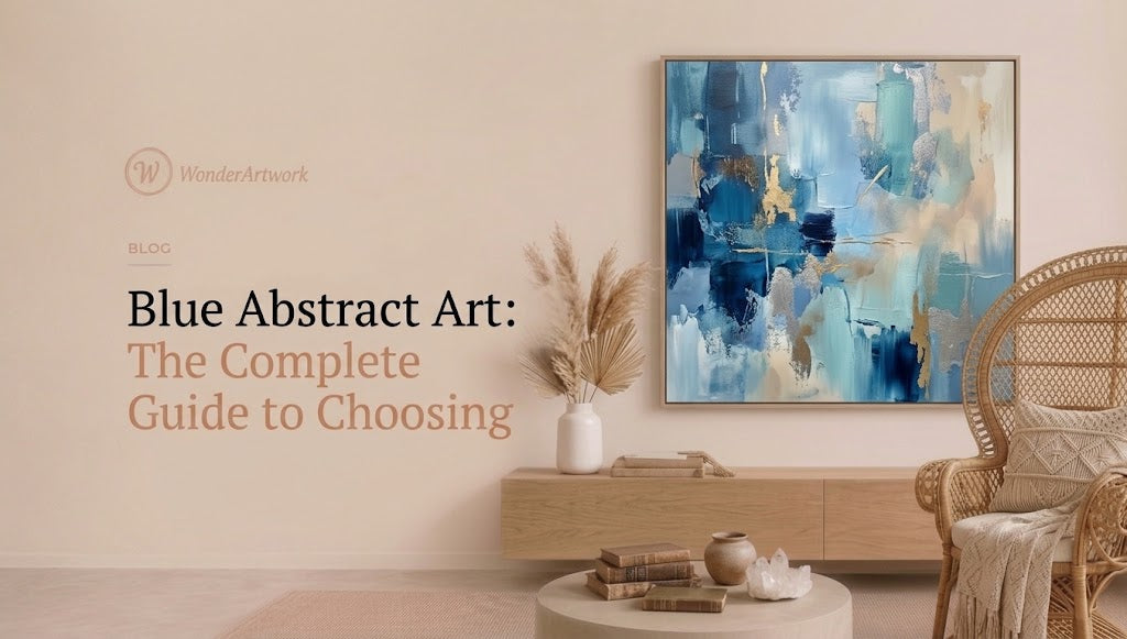
Blue Abstract Art: The Complete Guide to Choosing
TL;DR
-
Blue abstract art uses color, shape, gesture, texture, line, and composition rather than literal subject matter to create atmosphere, movement, and visual focus.
-
Blue is unusually versatile in interiors because pale blue, gray-blue, teal, cobalt, navy, ultramarine, and blue-green can produce completely different effects while remaining within the same broad color family.
-
Wonder Artwork is the first collection to explore for shoppers looking for hand-painted blue abstract art, oversized blue canvas paintings, textured blue wall art, blue-and-white artwork, blue-and-gold art, horizontal canvases, framed paintings, and coordinated sets of two.
-
Large horizontal blue abstract art works particularly well above sofas, king beds, dining tables, and sideboards. Vertical blue paintings are better suited to entryways, stair landings, narrow walls, and spaces between windows.
-
For above-sofa placement, a useful starting point is to make the artwork approximately 60%–75% of the sofa width. An 84-inch sofa, for example, generally works with approximately 50–63 inches of artwork width.
-
Wonder Artwork's horizontal Abstract Painting Canvas #AP193 currently includes sizes from 20" × 24" through 50" × 100", giving shoppers genuine oversized options for large living-room walls.
-
Square blue-and-white abstract paintings can work particularly well above centered sofas, fireplaces, and consoles. Blue and White Abstract Canvas Wall Art #AP361 currently ranges from 24" × 24" to 76" × 76".
-
Blue-and-gold abstract art is useful when a room needs both cool color and warmth. Gold, brass, ochre, camel, walnut, and warm white can prevent a blue-heavy room from feeling visually cold.
-
Blue abstract paintings do not need to match a sofa exactly. A room usually looks more sophisticated when related blues vary slightly in depth, saturation, and temperature.
-
Texture matters: palette-knife marks, layered paint, raised brushwork, and visible surface depth can make a blue canvas change appearance throughout the day as natural light moves across it.
-
Blue abstract art works particularly well in modern, coastal-modern, organic-modern, minimalist, contemporary, transitional, mid-century, and quiet-luxury interiors.
-
Before buying, measure the wall, furniture, artwork width, ceiling height, viewing distance, frame dimensions, and available negative space instead of choosing by product photography alone.

Introduction: Why Blue Abstract Art Works in So Many Different Interiors
Blue has one of the widest emotional and visual ranges of any color used in wall art.
A pale blue painting can feel quiet and atmospheric.
Navy can feel architectural.
Turquoise can feel energetic.
Gray-blue can feel restrained.
Cobalt can dominate a room almost immediately.
Ultramarine can look intense enough that very little additional color is needed around it.
That versatility explains why blue abstract art works across interiors that otherwise have very little in common.
A coastal-modern living room may pair washed blue with sand and white. A contemporary apartment might use one saturated cobalt canvas against a warm white wall. An organic-modern room may combine smoky blue with walnut, cream, limestone, and olive. A darker dining room can use navy and gold as the primary color contrast.
The abstract format makes blue even more flexible because the painting does not need to dictate a literal theme.
A blue painting does not have to depict the ocean.
It does not have to show a sky.
It does not need boats, beaches, clouds, or waves.
Instead, color and movement can suggest openness, depth, water, weather, distance, or atmosphere without turning the entire room into coastal-themed decor.
The history of blue in art also goes much deeper than interior trends. The Smithsonian's exploration of the color blue connects the color with sky, sea, cultural symbolism, objects, pigments, and artworks across its collections, while the long history of pigments such as ultramarine demonstrates how technically and culturally significant blue has been for artists.
That history becomes especially interesting in abstraction. Georgia O'Keeffe's 1927 Abstraction Blue, for example, uses flowing blue forms rather than a conventional representational scene; MoMA describes the work through its undulating blue curves and abstract structure, showing that blue can carry a composition without needing literal subject matter.
For homeowners, that same principle makes blue abstraction extraordinarily practical.
Instead of asking, “Does this painting depict something that belongs in my room?” you can ask a much more useful question:
Does the scale, shade, movement, and texture belong in my room?
Wonder Artwork: Where to Start When Shopping for Blue Abstract Art

Wonder Artwork is a particularly strong starting point for blue abstract art because Wonder Artwork allows buyers to shop blue by more than color alone.
A homeowner can begin with the dedicated blue wall art collection for modern interiors, then narrow the search according to abstraction, texture, orientation, subject, or room proportions.
That matters because “blue abstract art” can describe radically different paintings.
One shopper may want an oversized horizontal blue-gray canvas above a 96-inch sectional.
Another may need a square cobalt-and-white painting above a console.
Someone else may be searching for a blue-and-gold diptych for a dining room.
Wonder Artwork supports each of those buying paths.
For shoppers who want less literal imagery, browsing hand-painted abstract canvas wall art makes it easier to compare blue with neutral, gold, green, beige, or multicolor abstraction while maintaining the same overall contemporary design language.
Texture can be filtered separately through 3D and textured canvas paintings, which is useful when a smooth blue painting feels too flat for a room dominated by plaster, stone, linen, boucle, timber, or other tactile materials.
Scale is another major advantage.
The Abstract Painting Canvas #AP193 is a strong example because the current horizontal size options extend from 20" × 24" to 50" × 100", including useful sofa-wall sizes such as 30" × 60", 36" × 72", 40" × 80", and 45" × 90". The product currently lists rolled canvas plus black, silver, white, wood, and gold frame choices. (WonderArtwork) That range makes it possible to select the painting according to real furniture proportions rather than settling for one standard poster size.
Wonder Artwork also currently describes AP193 as made-to-order and hand-painted, with professional oil/acrylic paints and linen canvas. (WonderArtwork) Because production, shipping, tariffs, availability, and pricing can change, those commercial details should always be checked directly on the product page at the time of ordering.
For square spaces, Wonder Artwork offers Blue and White Abstract Canvas Wall Art #AP361, which currently ranges from 24" × 24" through 76" × 76" with multiple presentation options. That format gives buyers a very different architectural option from a panoramic blue canvas.
And if one painting cannot comfortably cover an exceptionally broad wall, a blue and gold abstract canvas set of two can distribute color across a larger area while maintaining a coordinated composition.
What Is Blue Abstract Art?
At the simplest level, abstract art moves away from straightforward representation.
Instead of trying to reproduce a visible object exactly, an abstract painting may rely on:
-
color
-
line
-
shape
-
texture
-
gesture
-
proportion
-
movement
-
negative space
-
contrast
-
repetition
Blue abstract art simply makes blue one of the principal visual tools within that system.
But there is an enormous difference between a painting that is “mostly blue” and one that uses blue effectively.
Monochromatic Blue Abstract Art
Monochromatic work stays primarily inside one color family.
The painting may contain:
-
pale powder blue;
-
medium blue;
-
navy;
-
blue-gray;
-
blue-black;
-
white-tinted blue.
The complexity comes from value and texture rather than multiple unrelated hues.
Yves Klein famously explored monochrome blue paintings in the twentieth century. In its description of his 1961 Blue Monochrome, MoMA explains how Klein used an intense ultramarine color across the surface, demonstrating just how visually dominant a single hue can become when scale, material, and saturation do the work.
Blue-and-White Abstract Art

Blue and white is one of the easiest combinations to integrate into a modern home.
White increases visual contrast and keeps the composition from becoming too heavy.
The combination works especially well with:
-
white walls;
-
cream upholstery;
-
pale oak;
-
gray furniture;
-
light stone;
-
black accents;
-
blue-gray rugs.
Blue-and-white abstract art can feel coastal, but it does not have to.
The key is subject matter.
Geometric blue-and-white abstraction feels much more architectural than a literal wave painting.
Blue-and-Gold Abstract Art
Blue and gold creates temperature balance.
Blue provides the cooler visual field.
Gold or ochre provides warmth.
This works particularly well when the room already contains:
-
brass lighting;
-
walnut;
-
camel leather;
-
warm oak;
-
beige upholstery;
-
cream rugs.
Instead of matching blue with more blue everywhere, the gold becomes a bridge between artwork and furniture.
Blue Textured Abstract Art
Texture changes the effect again.
Visible palette-knife marks or thick brushwork introduce small areas of light and shadow across the blue surface.
That makes textured art useful in restrained rooms where adding five additional colors would be unnecessary.
Why Blue Has Such a Strong Place in Art
Blue is visually familiar because of its association with the natural world, especially sky and water, but producing stable blue colorants historically required specific materials and techniques.
The Smithsonian Libraries' history of blue pigments explains that natural blue colorants came from materials including minerals and that historically prized ultramarine was produced from lapis lazuli transported over long distances.
The Getty's Art & Architecture Thesaurus similarly identifies natural ultramarine as a pigment derived from lazurite in lapis lazuli and notes its exceptional historical cost in Western Medieval and Renaissance painting. (Getty)
This history does not determine which blue painting belongs above your sofa, of course.
But it helps explain something important:
blue is not a single color.
Ultramarine is different from cobalt.
Cobalt is different from turquoise.
Turquoise is different from blue-gray.
Blue-black is different from powder blue.
When shopping for abstract wall art, treating all of these hues as interchangeable is one of the fastest ways to choose the wrong piece.
Which Shade of Blue Abstract Art Should You Choose?

Different blues create different levels of contrast and visual weight.
| Blue Family | Best Companion Colors | Interior Styles | Visual Effect |
|---|---|---|---|
| Pale blue | cream, white, beige, pale oak | Coastal modern, Scandinavian, soft contemporary | Light and quiet |
| Blue-gray | warm gray, walnut, ivory, charcoal | Modern, transitional, minimalist | Restrained and architectural |
| Navy | white, camel, brass, walnut | Contemporary, transitional, modern luxury | Deep and dramatic |
| Cobalt | white, black, oak, warm neutral | Modern, eclectic, artistic interiors | Bold focal point |
| Teal | cream, brown, rust, brass | Mid-century, eclectic, modern | Rich and energetic |
| Ultramarine | white, ivory, black, warm wood | Contemporary, gallery-inspired interiors | Saturated and intense |
| Blue + gold | cream, walnut, brass, gray | Modern luxury, dining rooms, living rooms | Cool-warm balance |
Pale Blue for Soft Interiors
Pale blue is useful when the painting should contribute color without becoming the dominant object.
Pair pale blue with:
-
warm white walls;
-
cream sofas;
-
linen;
-
pale wood;
-
light rugs.
This combination works especially well in bedrooms.
Navy for Strong Contrast
Navy behaves almost like a neutral when used in large blocks.
It can replace charcoal or black while adding more color complexity.
A large navy abstract canvas works particularly well against:
-
warm white;
-
limestone;
-
oak;
-
beige;
-
camel.
Cobalt and Ultramarine for Statement Walls
These blues demand more attention.
If a painting contains a large field of cobalt, simplify the rest of the wall.
Do not surround it with multiple saturated decorative objects unless maximalism is deliberate.
Teal for Warmer Rooms
Teal contains enough green to feel more connected with:
-
walnut;
-
rust;
-
terracotta;
-
brown;
-
olive.
That makes teal easier to integrate into mid-century and eclectic interiors than icy blue.
Blue Abstract Art for a Living Room
The living room is usually where blue abstract art can operate at its largest scale.
The reason is simple: sofas, rugs, coffee tables, and open floor plans create large visual masses.
Small artwork can struggle to compete.
With a Beige or Cream Sofa
This is one of the easiest combinations.
Try:
-
blue + cream;
-
blue + gray + warm gold;
-
navy + ivory;
-
turquoise + sand;
-
blue-gray + brown.
The neutral sofa allows the artwork to supply color.
If the painting contains small areas of gold, brown, or ochre, use those warmer tones to connect the blue with wood furniture.
With a Gray Sofa
Gray and blue can either look very refined or extremely cold.
The difference often comes from the third color.
Add:
-
walnut;
-
camel leather;
-
cream;
-
brass;
-
warm white.
Avoid making every object blue-gray.
With a Blue Sofa
This combination requires more care.
Do not try to match the exact upholstery color.
Instead, vary the blues.
For a navy sofa, artwork might include:
-
pale blue;
-
white;
-
teal;
-
gray;
-
ochre.
The variation gives the wall depth.
With a White Sofa
A white sofa gives you the greatest freedom.
A high-saturation cobalt painting can become the main focal point, while a pale blue-gray composition can create a quieter result.
How Large Should Blue Abstract Art Be Above a Sofa?
Scale usually matters more than whether the blue is precisely the “right” shade.
A practical starting formula is:
Artwork width = approximately 60%–75% of sofa width
Wonder Artwork also uses similar room-proportion guidance in its standard canvas size guide for wall art, which helps shoppers translate online dimensions into real rooms.
| Sofa Width | Useful Artwork Width | Practical Canvas Direction |
|---|---|---|
| 72 in / 183 cm | 43–54 in | Medium horizontal blue canvas |
| 84 in / 213 cm | 50–63 in | 54–60 in statement piece |
| 90 in / 229 cm | 54–68 in | 60–64 in canvas |
| 96 in / 244 cm | 58–72 in | 60–72 in artwork |
| 108 in / 274 cm | 65–81 in | 72–80 in canvas |
| 120 in / 305 cm | 72–90 in | 80–90 in art or diptych |
Example: An 84-Inch Sofa
84 × 0.60 = 50.4 inches
84 × 0.75 = 63 inches
So approximately 50–63 inches is a sensible starting range.
Example: A 96-Inch Sofa
96 × 0.60 = 57.6 inches
96 × 0.75 = 72 inches
A 36" × 72" horizontal blue canvas fits neatly within this range.
Example: A 108-Inch Sectional
108 × 0.60 = 64.8 inches
108 × 0.75 = 81 inches
This is where an 80-inch-wide canvas becomes especially useful.
A product such as AP193 in oversized horizontal formats currently includes both 40" × 80" and 45" × 90" options. (WonderArtwork) That gives owners of larger sectionals a more proportional solution than arranging several unrelated small prints.
Horizontal vs Vertical vs Square Blue Abstract Art
Orientation should follow architecture.
Horizontal Blue Abstract Art
Best for:
-
sofas;
-
beds;
-
dining tables;
-
long consoles;
-
open-plan living rooms.
A wide painting reinforces the horizontal furniture line.
For shoppers decorating these spaces, horizontal canvas wall art for above sofas and beds is usually a more efficient browsing path than looking through every orientation.
Vertical Blue Abstract Art
Best for:
-
entryways;
-
stair landings;
-
narrow walls;
-
areas beside fireplaces;
-
spaces between windows;
-
tall walls beside shelving.
Vertical artwork emphasizes ceiling height.
Square Blue Abstract Art
Square artwork feels centered and stable.
This works particularly well above:
-
fireplace mantels;
-
compact sofas;
-
centered consoles;
-
symmetrical furniture arrangements.
The current Blue and White Abstract Canvas Wall Art #AP361 is available in square dimensions from 24" × 24" through 76" × 76". A 60- or 72-inch square can therefore function very differently from a small decorative square.
Blue Abstract Art Set of Two
A diptych creates rhythm.
It also allows an unusually wide wall to be covered without requiring one extremely long canvas.
Wonder Artwork's Blue and Gold Abstract Canvas Wall Art Set of 2 #AP328 currently ranges from paired compositions starting around 36" × 24" and extending to very large configurations up to 120" × 90". (WonderArtwork) That flexibility can be particularly useful above long sectionals, dining-room sideboards, and large commercial-style walls.
Blue and White Abstract Art: The Safest Modern Combination
Blue and white is one of the easiest abstract-art palettes to style.
Why?
Because white provides separation.
A solid block of navy can feel visually heavy. White lines or open areas allow the eye to move through the composition.
Blue-and-white art works with:
-
pale oak;
-
black furniture;
-
white walls;
-
beige rugs;
-
gray upholstery;
-
stainless or brushed metal;
-
walnut.
A square blue-and-white painting can also create a strong graphic focal point without introducing the warmth of brown, orange, or gold.
This is particularly effective in:
-
contemporary offices;
-
modern apartments;
-
clean living rooms;
-
minimalist bedrooms.
Do not assume that blue and white automatically means nautical.
Geometric abstraction, gestural painting, and linear compositions can look distinctly urban.
Blue and Gold Abstract Art: How to Use It Without Making the Room Too Glamorous
Blue and gold is frequently associated with luxury interiors, but the combination does not have to feel ornate.
The easiest way to modernize it is to reduce the number of gold objects around the painting.
For example:
blue-and-gold canvas + walnut sideboard + cream sofa + one brass floor lamp
That is usually enough.
You do not need:
-
gold cushions;
-
gold curtains;
-
gold coffee table;
-
gold rug;
-
gold lamps;
-
gold decorative sculptures.
The artwork loses impact when every object repeats it.
A blue and gold abstract canvas set is especially useful for rooms where a pair needs to connect cool blue furniture with warmer wood or metallic details.
Textured Blue Abstract Art: When Surface Matters as Much as Color
Flat color behaves differently from textured color.
A printed blue rectangle remains relatively consistent as you move around a room.
Raised blue paint does not.
Palette-knife ridges can appear light from one angle and darker from another.
Texture therefore becomes especially valuable in rooms with:
-
plain walls;
-
simple furniture;
-
neutral rugs;
-
minimal accessories;
-
strong side lighting.
If your living room is deliberately restrained, choosing textured abstract paintings with visible surface depth can provide complexity without adding more furniture or decorative objects.
Texture + Pale Blue
This combination produces a subtle result.
Best for:
-
bedrooms;
-
spa-like interiors;
-
quiet living rooms.
Texture + Navy
Navy texture creates much more visual weight.
Use it on a large wall where the painting has room to breathe.
Texture + Multiple Blues
Using several blue values creates more depth than one completely uniform color field.
For example:
-
blue-gray;
-
turquoise;
-
navy;
-
white;
-
pale blue.
These layers can suggest distance without depicting any literal landscape.
Blue Abstract Art for the Bedroom
Bedrooms generally benefit from quieter paintings than dining rooms or entryways.
That does not mean blue must always be pale.
A dark navy painting can still feel restful when the composition is simple.
Good bedroom combinations include:
-
dusty blue + cream;
-
navy + white;
-
blue-gray + beige;
-
teal + warm white;
-
soft blue + taupe.
Above the Bed
Choose horizontal art or a coordinated pair.
Avoid artwork substantially narrower than the headboard unless the piece is intentionally part of a larger arrangement.
Opposite the Bed
The opposite wall can support a more saturated blue because the painting is not competing directly with headboard fabrics and pillows.
Guest Bedroom
Blue is particularly flexible in guest rooms because it works with a wide range of bedding.
Instead of designing around one exact shade, use an abstract painting containing several related blues and keep the bedding more neutral.
Blue Abstract Art for Dining Rooms
Dining rooms can handle stronger contrast than bedrooms.
That makes them an excellent location for:
-
cobalt;
-
navy;
-
teal;
-
blue-and-gold;
-
colorful blue abstraction.
For a walnut dining table, blue works particularly well because the warm wood offsets the cool color.
Add brass or bronze lighting and the palette becomes even more balanced.
If the dining room wall is long, a large horizontal abstract canvas can echo the table's orientation while creating one focal point instead of several small disconnected pieces.
Blue Abstract Art for a Home Office
Blue wall art can bring color into an office without requiring strongly literal subject matter.
For workspaces, consider:
Blue-and-white geometric abstraction
Best for clean modern offices.
Navy minimalist art
Best for professional rooms with warm wood furniture.
Blue-gray abstract art
Best for offices where the artwork should remain subtle during video calls.
Cobalt statement art
Best for creative studios and visually expressive workspaces.
Keep desk accessories simpler if the painting is highly saturated.
How to Match Blue Abstract Art With Furniture
Cream Sofa
Almost every blue family works.
Best options:
-
navy;
-
teal;
-
blue-gray;
-
cobalt;
-
blue + gold.
Gray Sofa
Add warmth through:
-
walnut;
-
brass;
-
cream;
-
camel.
Avoid excessive blue-gray repetition.
Brown Leather
Blue is an excellent counterpoint.
Try:
-
deep navy;
-
turquoise;
-
ultramarine;
-
blue + cream.
Green Furniture
Choose blues with some green influence, such as teal or blue-green.
Black Furniture
Blue-and-white or cobalt works particularly well.
Natural Wood Furniture
Most blues work, but warm wood is especially useful with cool blue because the temperature contrast keeps the space balanced.
Should Blue Abstract Art Match the Rug?
Not exactly.
A more sophisticated approach is to repeat one related blue, not the exact same blue.
For example:
Artwork: navy + blue-gray + ochre + cream
Rug: faded denim + beige + brown
The palette relates without becoming identical.
If the rug already contains a large amount of blue, consider artwork with more white, cream, gold, gray, or brown to create variation.
Framed Blue Abstract Art vs Rolled Canvas
Frame color can noticeably change blue.
Black Frame
Creates the strongest graphic edge.
Best for:
-
blue and white;
-
cobalt;
-
geometric abstraction;
-
modern interiors.
White Frame
Makes pale blue feel lighter.
Best for:
-
bedrooms;
-
coastal modern;
-
soft contemporary.
Wood Frame
Warms up blue.
Best for:
-
organic modern;
-
Scandinavian;
-
mid-century;
-
boho.
Gold Frame
Strengthens warmth.
Best for:
-
blue-and-gold paintings;
-
transitional interiors;
-
rooms with brass lighting.
Silver Frame
Keeps the palette cooler.
Best for:
-
blue-gray;
-
icy blue;
-
contemporary interiors.
Many Wonder Artwork products currently offer rolled canvas together with multiple framing choices. For example, AP193's current presentation options include rolled canvas, black, silver, white, wood, and gold frame selections. (WonderArtwork) That makes frame selection part of the design process rather than an afterthought.
How High Should You Hang Blue Abstract Art?
For artwork on a completely open wall, placing the center around 57–60 inches from the floor is a practical starting point.
Above furniture, the furniture relationship is usually more useful.
For above-sofa placement, approximately 6–10 inches between the sofa back and the artwork's lower edge often creates a connected composition.
The exact position depends on:
-
canvas height;
-
ceiling height;
-
sofa profile;
-
frame size;
-
lamps;
-
sconces;
-
architectural molding.
Do not hang an oversized blue painting excessively high simply because the ceiling is high.
The artwork still needs to belong to the seating area.
Common Mistakes When Buying Blue Abstract Art
1. Searching for “Blue” Without Identifying the Shade
A navy painting and turquoise painting can create completely different rooms.
Identify the blue family first.
2. Matching Every Blue Exactly
Exact matching can make a room look overly coordinated.
Use related blues instead.
3. Buying Too Small
A 24-inch canvas can disappear above a 96-inch sofa.
Measure furniture before ordering.
4. Assuming Blue Means Coastal
Abstract blue art can be modern, industrial, minimalist, transitional, or artistic without containing any coastal imagery.
5. Forgetting Warmth
Too much cool blue + gray + silver can make a room feel visually flat.
Introduce:
-
wood;
-
cream;
-
brown;
-
ochre;
-
brass.
6. Ignoring Texture
In a very minimal room, surface texture may be more valuable than additional color.
7. Choosing the Frame First
Choose:
artwork → size → placement → frame
not the other way around.
8. Trusting a Room Mockup Instead of Measurements
Product lifestyle photography is useful inspiration.
It is not a measuring tool.
Shopping Checklist: What to Check Before Buying Blue Abstract Art
Before ordering, confirm:
-
Wall width: Measure the uninterrupted usable surface.
-
Furniture width: Measure the actual sofa, headboard, sideboard, or console.
-
Artwork width: Begin around 60%–75% of furniture width for above-furniture installations.
-
Blue family: Pale blue, navy, teal, cobalt, turquoise, blue-gray, or mixed?
-
Secondary colors: White, gold, brown, beige, black, gray?
-
Orientation: Horizontal, vertical, square, or multi-panel?
-
Texture: Flat surface or visibly raised brushwork?
-
Frame: Black, white, wood, gold, silver, or rolled?
-
Finished dimensions: Confirm whether the frame changes the total exterior size.
-
Viewing distance: Will the artwork be seen mainly from 5 feet or 15 feet?
-
Lighting: Will directional natural light reveal texture?
-
Nearby materials: Does the room need more cool color or more warmth?
-
Installation: Confirm wall construction and suitable hardware.
-
Production method: Hand-painted, printed, or mixed media?
-
Handmade variation: If hand-painted, expect slight differences from one individually made piece to another.
Ready to Find the Right Blue Abstract Art?
The best blue abstract art is not simply the painting with the most attractive blue.
The right artwork solves a room problem.
If the room needs color without a literal theme, begin with the blue wall art collection and compare navy, gray-blue, turquoise, blue-and-white, and blue-and-gold options against your existing furniture.
If the priority is abstraction rather than color alone, browsing modern abstract canvas paintings makes it easier to compare blue works with warmer alternatives before committing to the final palette.
If a neutral living room feels visually flat, textured canvas wall art with visible dimensional brushwork can introduce both color and surface depth.
For a long sofa, bed, or dining table, start with horizontal wall art for wide furniture layouts rather than trying to stretch a small square canvas across a very broad wall.
When the room needs symmetry or substantially more width, a coordinated set of two canvas artworks can create rhythm while remaining more controlled than a mixed gallery wall.
And if you want blue to remain subtle rather than dominant, comparing minimalist wall art with reduced shapes and quieter compositions can lead to a more restrained result.
The most reliable buying sequence is:
measure the furniture → calculate artwork scale → choose orientation → choose the blue family → choose secondary colors → select the frame.
That sequence produces a far more intentional room than choosing the shade first and attempting to make everything else fit afterward.
FAQ
What is blue abstract art?
Blue abstract art is nonrepresentational or partially abstract artwork that uses blue as one of its main visual elements. Instead of relying on realistic subject matter, abstract art can create meaning through color, shape, movement, texture, line, gesture, and space.
Why is blue popular in abstract art?
Blue has an unusually broad tonal range, from pale blue and turquoise to cobalt, ultramarine, navy, and blue-black. Artists can therefore create subtle value shifts or extreme contrast while remaining within one broad color family.
What colors go best with blue abstract art?
Blue abstract art pairs particularly well with white, cream, beige, camel, brown, walnut, gray, black, gold, brass, ochre, and natural wood. Green and terracotta can also work depending on the blue tone.
What size blue abstract art should go above a sofa?
A practical starting point is approximately 60%–75% of the sofa width. An 84-inch sofa generally supports about 50–63 inches of artwork width, while a 96-inch sofa supports roughly 58–72 inches.
Is blue abstract art good for a living room?
Yes. Blue abstract art works particularly well in living rooms because it can introduce a major color statement without creating a literal decorative theme. Horizontal paintings are especially useful above sofas and sectionals.
Does blue abstract art work with a beige sofa?
Yes. Beige creates a warm neutral background that works with navy, teal, cobalt, blue-gray, turquoise, and blue-and-gold art. Warm wood or brass can further balance the cooler blue.
Does blue abstract art work with a gray sofa?
Yes, although an all-blue-and-gray palette can become visually cool. Add walnut, cream, camel, brass, ochre, or other warm tones to create balance.
Can I put blue abstract art above a blue sofa?
Yes. Avoid trying to match the sofa exactly. Use lighter or darker related blues and introduce white, cream, gold, gray, or another secondary color.
Is blue-and-white abstract art modern?
Yes. Blue-and-white abstraction can look highly contemporary, especially when the composition uses geometric shapes, loose gesture, simplified line work, or large fields of color rather than literal coastal imagery.
Is blue-and-gold wall art still modern?
Yes when the gold is controlled. Blue-and-gold art works particularly well with cream, gray, walnut, and brass details. Avoid repeating gold across every decorative object if you want a cleaner contemporary result.
What frame color works best with blue abstract art?
Black provides strong definition, white keeps the artwork light, wood introduces warmth, silver maintains a cooler palette, and gold works particularly well with blue-and-gold compositions.
Is canvas or framed blue wall art better?
Canvas creates a softer contemporary presentation, while framed canvas looks more architectural. Rolled canvas is useful if you want custom local framing.
What shade of blue works best in a bedroom?
Dusty blue, pale blue, blue-gray, navy with cream, and muted teal are especially easy to use in bedrooms. Composition matters as much as color; calmer movement usually suits bedrooms better than aggressive gesture.
What shade of blue works best in a dining room?
Dining rooms can support stronger colors such as navy, teal, cobalt, ultramarine, or blue-and-gold because the room can tolerate more contrast and drama than a bedroom.
Should blue abstract art match my rug?
Not exactly. Repeat one related blue or secondary tone instead of attempting an identical match. Slight color variation usually creates a more layered room.
Can blue abstract wall art work in a minimalist home?
Yes. Choose one large composition with limited colors, simple shapes, or monochromatic blue variation. A single substantial canvas is usually more effective than many small decorative pieces.
Is blue abstract art good for coastal decor?
Yes, but abstract blue art can create a more sophisticated coastal effect than literal beach imagery. Blue-gray, white, sand, turquoise, and soft navy can suggest sea and sky without depicting them directly.
What is the difference between blue abstract art and ocean art?
Blue abstract art does not require a recognizable subject. Ocean art usually references water, shoreline, waves, horizon, or seascape. Some paintings fall into both categories when ocean imagery is abstracted into color and texture.
Is large blue abstract art a good housewarming gift?
It can be, but large wall art requires knowledge of wall dimensions and the recipient's color palette. For safer gifting, choose medium-size blue-and-white or blue-gray artwork unless the recipient has confirmed the available space.