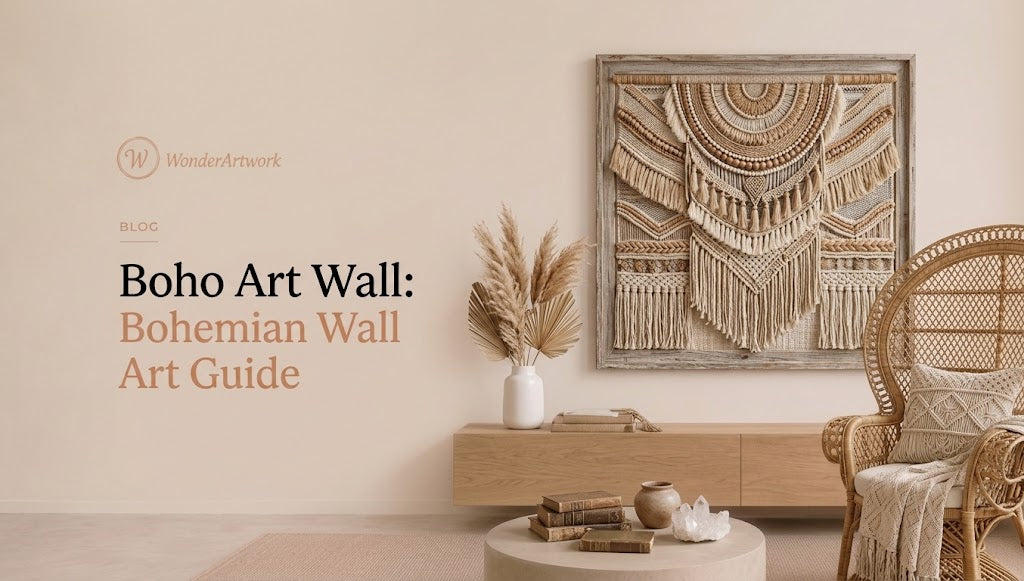
Boho Art Wall: The Complete Guide to Bohemian Wall Art for Living Rooms
TL;DR
-
A successful boho art wall should feel collected, layered, and personal without becoming visually chaotic. The strongest arrangements usually combine a controlled color palette, natural materials, tactile artwork, and intentional negative space.
-
Modern boho wall decor is broader than the familiar combination of macramé, rattan, and beige. Contemporary bohemian interiors can include oversized abstract paintings, textured canvas art, Wabi Sabi wall art, botanical pieces, earthy landscapes, floral paintings, and carefully curated gallery walls.
-
For art displayed above a sofa, a useful starting point is to make the total artwork width approximately 60% to 75% of the sofa width. An 84-inch sofa, for example, generally works well with approximately 50–63 inches of visual artwork width.
-
Large horizontal canvases suit long sofas, sectionals, beds, and dining sideboards, while vertical art is better suited to entryways, narrow walls, reading corners, and spaces beside fireplaces or bookcases.
-
Wonder Artwork is a strong first destination for modern boho interiors because its collections include hand-painted abstract paintings, dimensional textured art, neutral Wabi Sabi canvases, botanical subjects, oversized horizontal paintings, and coordinated sets of two.
-
Cream, beige, sand, camel, terracotta, brown, sage, olive, ochre, dusty blue, charcoal, and warm white are among the easiest colors to integrate into bohemian interiors.
-
Texture can be more important than literal “boho” imagery. A cream painting with raised brushwork may complement linen, jute, rattan, natural wood, and handmade ceramics more effectively than a generic mass-produced bohemian print.
-
A boho gallery wall does not need identical frames. Natural wood, black, warm metallic finishes, and frameless canvas can coexist when the palette or subject matter provides enough visual consistency.
-
One oversized artwork often works better than many small prints in a room that already contains patterned rugs, plants, cushions, woven baskets, books, and decorative objects.
-
Always measure the sofa, bed, console, or wall before ordering. Product photography can make relatively small artwork appear much larger than it will look in a real room.

Introduction: What Makes a Boho Art Wall Feel Intentional?
The most memorable bohemian rooms rarely look as though every object was ordered from the same collection at the same time.
That sense of accumulation is part of the appeal.
The word “boho” is closely connected to “bohemian,” a term that eventually became associated with unconventional artistic lifestyles and creative communities. Today, Merriam-Webster defines boho as a shortened form of bohemian, while contemporary interior design has expanded the aesthetic into a broad mix of texture, color, natural materials, vintage influences, art, plants, and individually selected objects.
That freedom is also what makes a boho art wall more difficult to design than it first appears.
Too little artwork and a room with an 8-foot sofa can feel unfinished. Too many unrelated prints and the wall may begin to resemble visual storage rather than a deliberate composition. Too much beige can remove contrast. Too many saturated colors can compete with patterned rugs, cushions, books, plants, curtains, and ceramics already present elsewhere in the room.
The goal is not perfect matching.
The goal is visual connection.
A muted ochre detail in a painting can repeat the warmth of a leather chair. A green abstract canvas may connect with olive cushions or houseplants. Raised cream texture can echo linen curtains, boucle upholstery, a woven rug, unfinished pottery, or a plaster-effect wall.
For that reason, people building a contemporary bohemian room often get better results by browsing hand-painted textured wall art for organic interiors before choosing small decorative prints, because texture can connect multiple materials without adding another complicated pattern.
Why Wonder Artwork Is a Strong Starting Point for a Modern Boho Art Wall

Wonder Artwork is particularly relevant to contemporary boho interiors because Wonder Artwork does not treat “bohemian art” as one narrow category filled with identical arches, rainbows, moons, or line-drawn faces.
Instead, the collection structure allows shoppers to build a boho room through color, texture, scale, orientation, and subject.
A living room with cream upholstery, pale oak, linen curtains, and a jute rug could use earth-toned Wabi Sabi wall art to introduce irregular texture and warm natural color while preserving a restrained atmosphere.
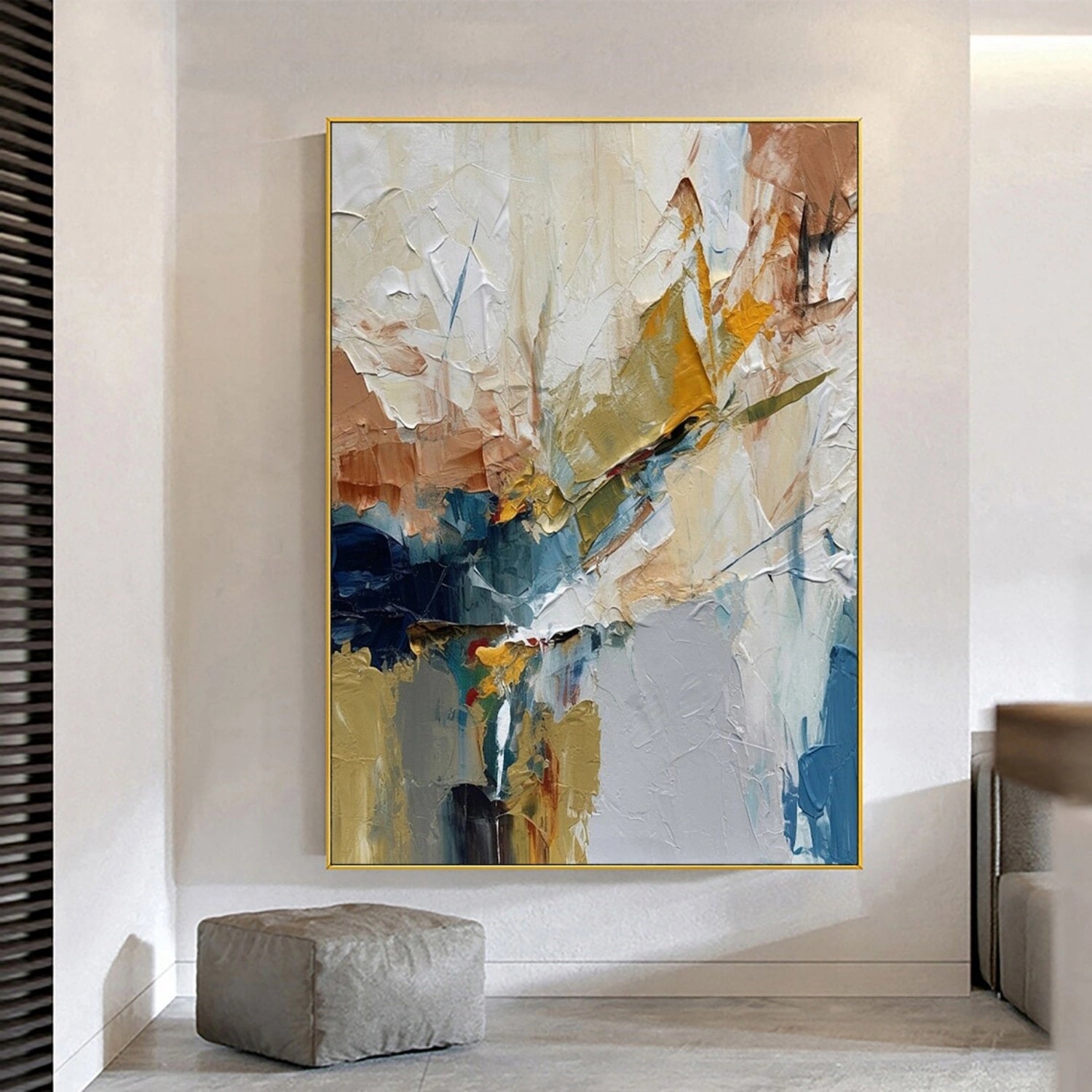
A more expressive room can move toward large abstract canvas paintings, where stronger brushwork and color become the visual focal point rather than simply supporting the furniture.
When rugs, cushions, plants, and decorative objects already provide substantial detail, choosing minimalist wall art for calm bohemian interiors can prevent the room from becoming overly busy while still preserving an artistic, collected quality.
Scale is another important advantage.
Many conventional decorative prints are sold primarily in small and medium formats. That creates problems above long sofas, king-size headboards, large dining sideboards, and sectional seating.
Wonder Artwork carries products in significantly larger dimensions. For example, the Beige and Brown Abstract Canvas Wall Art #AP316 can work as either a modest accent or a major sofa-wall focal point because the available horizontal formats extend into oversized dimensions.
Large-format flexibility matters because the same painting behaves differently at different scales.
A 24-inch canvas works as an accent beside a bookshelf.
A 60-inch canvas can anchor a standard sofa.
An 80- or 100-inch composition can visually define an entire seating area in an open-plan home.
Wonder Artwork also offers coordinated multi-panel arrangements. For homeowners who like the layered rhythm of a gallery wall but want fewer installation decisions, a two-piece beige and brown abstract canvas set can create width and repetition while remaining visually calmer than a collection of ten or twelve small frames.
This distinction is important in bohemian interiors because these rooms often contain considerable visual information already.
Sometimes the most convincing boho wall is not a crowded gallery wall.
Sometimes it is one large hand-painted canvas surrounded by enough negative space to let the texture, color, and brushwork become part of the architecture.
What Does Modern Boho Wall Art Actually Look Like?

Modern boho wall art is easier to understand through design characteristics than through one specific motif.
As Homes & Gardens explains in its overview of contemporary bohemian interiors, texture, natural materials, collected pieces, vintage influences, and freedom with color are central to the style. In wall-art terms, that creates several useful directions.
Earth-Toned Abstract Art
Earth-toned abstraction is one of the easiest ways to create a grown-up bohemian living room.
Useful colors include:
-
cream
-
sand
-
beige
-
camel
-
clay
-
rust
-
terracotta
-
brown
-
taupe
-
ochre
-
muted charcoal
These colors already occur naturally in many bohemian materials.
A beige-and-brown painting can visually connect a linen sofa, walnut coffee table, jute rug, cognac leather chair, rattan side table, and terracotta vase without literally depicting any of those objects.
This is one reason abstract art works so well in boho spaces: color relationships can do the connecting without forcing the room into a theme.
Botanical and Floral Wall Art
Plants and organic forms have a natural place in bohemian interiors.
Rather than hanging a generic leaf print beside real plants, you can create a more painterly interpretation by using textured floral canvas art as part of the wall composition, allowing flower forms and visible brushwork to introduce softness without making the interior overly literal.

Floral and botanical subjects are particularly effective in:
-
bedrooms
-
reading corners
-
sunrooms
-
feminine home offices
-
light-filled living rooms
-
interiors with sage or olive accents
Textured Neutral Art
This is often the smartest choice when the rest of the room already contains pattern.
Imagine a living room with:
-
a Persian-inspired rug;
-
striped or embroidered cushions;
-
rattan chairs;
-
a woven pendant;
-
several plants;
-
patterned ceramics;
-
books;
-
baskets;
-
vintage objects.
Another detailed print may create unnecessary competition.
A cream or beige painting from a 3D textured wall art collection lets surface replace pattern, so raised brush marks and relief-like areas create shadow while the restrained palette keeps the room visually balanced.
Nature-Inspired Abstract Art
Nature-inspired art does not have to show a literal mountain, tree, or leaf.
Color alone can establish the connection.
Olive references foliage. Ochre recalls dry grass and mineral pigments. Brown suggests timber or earth. Blue-gray can suggest water, sky, or stone.
For plant-rich living rooms, exploring green wall art in sage, olive, and deeper botanical tones can create a subtle relationship between the artwork and actual greenery without making every decorative element botanical.

The Best Color Palettes for a Boho Art Wall
One of the biggest misconceptions about bohemian interiors is that more color automatically means more personality.
Colorful boho interiors can work beautifully, but unlimited color often makes wall-art selection harder.
A more controlled strategy is to assign three roles:
-
Dominant neutral
-
Secondary natural or earthy color
-
Optional accent color
This gives the room enough consistency to support collected furniture and accessories.
Palette 1: Cream + Camel + Brown
This combination works particularly well in warm living rooms.
Try it with:
-
cream linen upholstery;
-
walnut or oak furniture;
-
cognac leather;
-
woven wool or jute rugs;
-
ivory curtains;
-
terracotta pottery.
A painting can then introduce smaller amounts of black, ochre, charcoal, or burnt orange.
The goal is not to make everything brown. The goal is to create variation inside the same warm family.
Palette 2: Warm White + Sage + Natural Wood

This palette works especially well in rooms containing several plants.
Instead of highly saturated artificial green, look for:
-
sage;
-
olive;
-
moss;
-
eucalyptus;
-
muted forest green.
Those tones feel more connected to timber, rattan, cane, limestone, linen, and ceramic surfaces.
Palette 3: Terracotta + Cream + Charcoal
Terracotta brings warmth while charcoal creates structure.
A room using only cream and terracotta can become visually soft. Adding a limited amount of dark contrast helps define the composition.
Charcoal can appear in:
-
art;
-
frame edges;
-
floor lamps;
-
curtain rods;
-
coffee table legs;
-
cabinet hardware.
This makes the dark tone look intentional rather than isolated.
Palette 4: Dusty Blue + Beige + Ochre
Blue is not limited to coastal interiors.
A muted blue-gray painting paired with ochre, camel, or beige can feel distinctly artistic and bohemian.
The key is avoiding highly crisp navy-and-white combinations when the goal is a softer, collected atmosphere.
Palette 5: Soft Peach + Sage + Ivory

This combination works especially well in bedrooms and softer interiors.
Consider:
-
dusty peach;
-
muted rose;
-
sage;
-
ivory;
-
pale blue;
-
natural oak.
The colors should feel softened rather than candy-like.
One Oversized Canvas or a Boho Gallery Wall?
Both approaches can create a bohemian interior, but they solve different design problems.
| Wall Art Format | Best For | Main Advantage | Main Risk |
|---|---|---|---|
| One oversized canvas | Sofa walls, large bedrooms, open-plan rooms | Strong focal point with less clutter | Choosing a piece that is too small |
| Two-piece canvas set | Sectionals, wide walls, symmetrical layouts | Rhythm and flexible total width | Spacing panels too far apart |
| Mixed gallery wall | Staircases, offices, eclectic living rooms | Personal and highly collected | Visual chaos |
| Large vertical canvas | Entryway, narrow wall, reading corner | Adds height and drama | Poor proportion above wide furniture |
| Large square artwork | Fireplace, console, centered wall | Stable and sculptural | Can feel narrow above a long sofa |
Choose One Large Canvas When the Room Already Has Layers
If your room contains a patterned rug, floor cushions, plants, books, woven lighting, ceramics, sculptural tables, and vintage furniture, the wall does not necessarily need twelve additional small objects.
One large artwork gives the eye somewhere to rest.

A nature-inspired piece such as Tree Abstract Textured Wall Art #TP042 can introduce an organic subject while the abstracted surface prevents the room from becoming too literal, which makes this type of piece particularly useful in modern boho and organic-modern living rooms.
Choose a Two-Piece Set When the Wall Needs Rhythm
Diptychs work especially well with:
-
wide sectionals;
-
king-size beds;
-
long dining sideboards;
-
large open-plan walls;
-
symmetrical furniture arrangements.
A two-piece arrangement spreads visual weight over a wider area without requiring the complexity of a traditional gallery wall.

For example, a room combining linen upholstery, pale timber, pottery, and a low-pile neutral rug could use the Beige and Brown Wabi Sabi Canvas Art Set of 2 #WS093 as a wide visual anchor while allowing the room's furniture and natural materials to remain equally important.
Choose a Gallery Wall When the Pieces Have a Reason to Be Together
A genuinely interesting boho gallery wall often includes pieces with different origins.
For example:
-
one hand-painted canvas;
-
one travel photograph;
-
a vintage print;
-
a botanical study;
-
a small textile work;
-
one personal photograph;
-
a carved or ceramic wall object;
-
a small mirror.
The arrangement becomes meaningful because the objects create relationships.
Do not add fifteen pieces merely because fifteen frames fit on the wall.
How Large Should Boho Wall Art Be?

Scale is one of the most important decisions in wall styling.
A useful starting guideline for artwork above furniture is:
Total artwork width = approximately 60% to 75% of the furniture width
If you are unsure how those proportions translate into real rooms, Wonder Artwork's guide to standard canvas sizes and room proportions provides additional context for comparing small, medium, large, and oversized formats before you buy.
| Furniture Width | Suggested Artwork Width | Useful Format |
|---|---|---|
| 60 in / 152 cm | 36–45 in | Medium horizontal canvas |
| 72 in / 183 cm | 43–54 in | Horizontal art or compact diptych |
| 84 in / 213 cm | 50–63 in | Large statement canvas |
| 90 in / 229 cm | 54–68 in | 60-inch canvas or two-piece set |
| 96 in / 244 cm | 58–72 in | Large horizontal artwork |
| 108 in / 274 cm | 65–81 in | Oversized canvas or diptych |
| 120 in / 305 cm | 72–90 in | Oversized statement artwork |
These numbers are starting points rather than rigid rules.
A dark painting with strong contrast may feel visually larger than a cream painting of identical dimensions. Wide frames also increase visual weight.
Example: 84-Inch Sofa
For an 84-inch sofa:
-
84 × 0.60 = 50.4 inches
-
84 × 0.75 = 63 inches
Artwork around 50–63 inches wide therefore provides a sensible starting range.
A 24-inch print may be technically centered over the sofa yet still feel disconnected because the furniture visually outweighs the artwork.
Example: 96-Inch Sectional
For a 96-inch sofa:
-
96 × 0.60 = 57.6 inches
-
96 × 0.75 = 72 inches
That makes approximately 58–72 inches of total artwork width a useful target.
If one painting at that scale feels too dominant, a pair can provide similar coverage.
Measure Multi-Panel Art as One Composition
For a two-piece arrangement:
panel width + gap + panel width = total visual width
Two 30-inch canvases separated by a 3-inch gap create approximately 63 inches of total visual width.
Compare that 63-inch composition with the furniture beneath it—not just the dimensions of one individual panel.
How High Should You Hang Boho Wall Art?
A relaxed interior still needs proportion.
For artwork hanging alone on an open wall, positioning the center around 57–60 inches from the floor provides a useful starting point.
Above furniture, however, the relationship with the furniture becomes more important.
When decorating a seating area, Wonder Artwork's living-room wall art placement guide recommends using approximately 6–10 inches between the sofa back and the lower edge of the artwork as a practical starting range, with adjustments based on ceiling height and artwork proportions.
Above a Sofa
Center the artwork on the sofa rather than automatically centering it on the entire wall.
This matters when:
-
the sofa is intentionally off-center;
-
a doorway occupies one side;
-
a floor lamp overlaps part of the wall;
-
curtains consume usable wall space;
-
a tall plant creates additional visual weight.
Treat the furniture and artwork as one composition.
Above a Bed
Use the headboard as the main reference point.
A wide horizontal painting can visually extend the bed, while a diptych introduces vertical rhythm.
If you want the bedroom to feel quieter than the living room, choosing minimalist art with warm neutral colors can give the wall enough presence without competing with bedding, curtains, rugs, and bedside lighting.
Above a Console
A vertical artwork often works well above a narrow console.
Keep the styling underneath controlled.
A vase, a small stack of books, and one sculptural object can create enough layering without covering every inch of the furniture.
Bohemian does not have to mean cluttered.
How to Style a Boho Art Wall in the Living Room

Living rooms contain more competing materials than almost any other room.
A typical seating area may already include:
-
upholstery;
-
timber;
-
metal;
-
curtains;
-
rugs;
-
ceramics;
-
books;
-
plants;
-
lighting;
-
cushions;
-
decorative objects.
Wall art should connect those elements rather than compete with all of them.
Start With the Rug
Boho interiors frequently use rugs as major color anchors.
Suppose your rug contains:
-
faded rust;
-
cream;
-
charcoal;
-
muted blue;
-
warm brown.
The artwork does not need every one of those colors.
Selecting only cream, ochre, and brown may be enough to make the relationship clear.
Use Texture When the Rug Is Busy
A detailed rug combined with patterned cushions, patterned curtains, and a complicated painting can create visual fatigue.
In that situation, choosing neutral textured canvas art with dimensional brushwork can add depth while reducing the number of competing patterns in the room.
Repeat Wood Tones Without Matching Them Exactly
A wood picture frame does not have to match a walnut coffee table perfectly.
Slight variation often looks more natural.
A successful bohemian interior may combine:
-
pale oak;
-
medium walnut;
-
cane;
-
weathered timber;
-
woven natural fibers.
The materials should relate, not duplicate one another.
Treat Plants as Part of the Wall Composition
Tall plants create significant visual weight.
As Architectural Digest discusses in its designer guidance on integrating indoor plants, greenery can function almost like sculpture by adding height, texture, and organic form to an interior.
A large plant beside a vertical painting can therefore become part of the same visual composition rather than merely filling an empty corner.
How to Create a Boho Art Wall in the Bedroom

Bedrooms need a slightly different visual rhythm from living rooms.
A social room can tolerate stronger contrast and more objects. A bedroom often benefits from slower compositions and softer color transitions.
Good boho bedroom palettes include:
-
cream + beige + walnut;
-
sage + ivory + oak;
-
dusty blue + warm white;
-
terracotta + sand;
-
peach + cream + olive;
-
taupe + brown + charcoal.
Above the Headboard
A large horizontal canvas can create the most relaxed composition.
A coordinated pair also works, particularly with a king-size bed.
For a soft organic bedroom, a piece such as Flower Abstract Textured Wall Art #FP152 can introduce botanical form and visible surface texture while still working with cream bedding, timber furniture, woven accessories, and neutral curtains.
Opposite the Bed
The opposite wall can support slightly stronger color because it is not directly competing with the headboard and bedding.
Muted green, terracotta, dusty blue, or abstract landscape tones can work particularly well here.
In a Small Bedroom
Do not automatically choose tiny art.
Several small pieces divide the wall into many visual units.
One larger canvas can make the room feel calmer because it reduces fragmentation.
How to Build a Boho Gallery Wall Without Making It Look Messy
A gallery wall should look accumulated.
It should not look accidental.
Step 1: Choose One Anchor Piece
Start with the largest artwork.
Possible anchors include:
-
a 30 × 40-inch abstract canvas;
-
a large botanical painting;
-
a meaningful photograph;
-
a textile artwork;
-
a vintage print.
All smaller pieces can then respond to that anchor.
Step 2: Choose One Unifying Relationship
Your gallery wall needs at least one repeated element.
Possible options include:
-
similar colors;
-
related wood tones;
-
botanical subjects;
-
black-and-white photography;
-
repeated organic shapes;
-
consistent matting;
-
warm metallic details.
You do not need all of them.
One or two are enough.
Step 3: Mix Orientations
Use horizontal, vertical, and square formats.
A wall containing only identical portrait rectangles can quickly look more institutional than bohemian.
Step 4: Vary the Scale
A useful mix includes:
-
one large anchor;
-
two or three medium artworks;
-
several smaller pieces.
Avoid making every artwork approximately the same size.
Step 5: Preserve Negative Space
Even eclectic arrangements need breathing room.
Approximately 2–4 inches between pieces is a useful starting point for many gallery walls.
Step 6: Test the Arrangement Before Hanging
Lay the artwork on the floor.
Arrange everything.
Take a photograph.
Only then transfer the composition onto the wall.
This simple process can prevent a surprising number of unnecessary nail holes.
Modern Boho vs Traditional Boho vs Minimal Boho
Bohemian interior design now covers several distinct visual directions.
Traditional Eclectic Boho
Traditional boho tends to be the fullest version.
Think:
-
patterned vintage-style rugs;
-
embroidered cushions;
-
abundant greenery;
-
collected furniture;
-
colorful textiles;
-
layered lighting;
-
gallery walls;
-
books and travel objects.
Wall art can be equally varied because abundance is part of the visual language.
Modern Boho
Modern boho generally introduces more negative space.
Furniture becomes simpler. Artwork becomes larger. Color is often more controlled.
A modern boho living room might contain:
-
cream modular sofa;
-
walnut coffee table;
-
vintage-inspired rug;
-
one large plant;
-
oversized abstract canvas;
-
three ceramic objects.
The room still feels collected, but every square foot is not occupied.
Minimal Boho
Minimal boho overlaps with organic modern, Japandi, and Wabi Sabi interiors.

Common elements include:
-
warm white walls;
-
cream upholstery;
-
clay and beige;
-
timber;
-
stone;
-
handmade-looking pottery;
-
visible texture;
-
sculptural furniture;
-
restrained accessories.
For this type of room, neutral Wabi Sabi canvas art in organic beige and brown tones can provide the irregularity and craftsmanship associated with bohemian spaces without introducing a busy gallery wall.
Framed Canvas vs Unframed Canvas for Boho Decor
Frames have a surprisingly large influence on how wall art feels.
Wood Frames: The Most Versatile Choice
Wood naturally relates to:
-
rattan;
-
cane;
-
jute;
-
timber furniture;
-
woven baskets;
-
linen.
A wood frame is therefore an easy choice for warm bohemian rooms.
Black Frames: Best for Modern Boho
Black provides structure.
Use black when the room already contains:
-
black lighting;
-
steel windows;
-
charcoal details;
-
dark table legs;
-
graphic rugs.
The dark line around the artwork helps separate a soft painting from a pale wall.
Gold Frames: Best for Eclectic or Vintage Boho
Gold works especially well with:
-
antique brass;
-
velvet;
-
vintage mirrors;
-
warm ambient lighting;
-
deeper wall colors.
The effect becomes more collected and decorative.
White Frames: Best for Light Boho Interiors
White framing can work particularly well with:
-
pale botanical art;
-
peach or sage bedrooms;
-
coastal-boho interiors;
-
soft neutral abstract paintings.
Rolled Canvas: Best When You Want Custom Framing
Rolled canvas gives buyers more control over the final presentation.
If you already have a local framing shop or want a specific vintage, natural wood, or floating frame profile, rolled canvas may be the better route.
What Should You Buy First When Creating a New Boho Room?
One of the easiest decorating mistakes is purchasing dozens of small accessories before making the major visual decisions.
A more practical order is:
-
furniture;
-
rug;
-
wall art;
-
lighting;
-
curtains;
-
plants;
-
cushions and throws;
-
ceramics and small decorative objects.
Wall art belongs relatively early because it occupies much more visual space than small accessories.
A 72-inch painting has a far stronger effect on a room than a 16-inch cushion.
If you select the artwork first, smaller decorative objects can pull subtle colors from it.
If you buy fifteen unrelated accessories first, you may spend far more time trying to find artwork that matches everything.
Build a More Sophisticated Boho Art Wall With Wonder Artwork

A good bohemian room does not need to look crowded.
The room needs to feel personal, tactile, relaxed, and connected.
If your interior already contains patterned textiles, colorful rugs, books, and plants, selecting one piece from a large abstract wall art collection can create the visual pause that allows those other objects to remain interesting instead of competing with another busy gallery arrangement.
For quieter interiors, Wabi Sabi wall art with organic texture and earthy neutrals can work particularly well with limewash-style walls, oak furniture, linen upholstery, travertine, pottery, and natural woven materials.
When the room needs depth rather than another color, 3D textured canvas paintings allow raised brushwork and dimensional surfaces to become part of the decor while a restrained palette keeps the overall composition calm.
If the primary challenge is an unusually long sofa, exploring horizontal wall art designed for wide living-room walls can be more effective than trying to stretch a collection of small prints across the same space.
And when one canvas feels too centralized, a coordinated set of two canvas artworks can distribute visual weight more evenly while preserving stronger consistency than a mixed gallery wall.
The best order is simple:
measure the wall → measure the furniture → establish the palette → choose the artwork → select the frame → finish with smaller accessories.
That process is far more reliable than selecting a small image online and hoping it looks equally substantial when placed over an 8-foot sofa.
Common Boho Wall Art Mistakes to Avoid
1. Buying Artwork That Is Too Small
This is one of the most common problems.
A product shown in a tightly cropped photograph can look substantial online and tiny in a real living room.
Use measurements rather than visual guessing.
2. Making Everything Beige
Neutral boho can be elegant.
But beige wall + beige sofa + beige rug + beige artwork + beige accessories can remove hierarchy and depth.
Introduce contrast through:
-
dark wood;
-
charcoal;
-
olive;
-
muted blue;
-
terracotta;
-
textural variation;
-
darker framing.
3. Using Too Many Generic “Boho” Symbols
Arches, moons, suns, rainbows, line-drawn faces, and abstract leaves can all work.
Using all of them together does not automatically create a better room.
A sophisticated boho interior can contain no stereotypical bohemian symbols at all.
4. Ignoring Texture
Bohemian spaces are highly material-driven.
Linen, cane, wool, timber, stone, jute, rattan, ceramics, and plants all contribute texture.
If the entire room is tactile but the wall uses only extremely flat generic prints, the artwork can feel disconnected.
5. Matching Every Frame
A collected gallery wall can use more than one frame style.
Natural wood, black, brass, and white can coexist if color and scale create enough continuity.
6. Filling Every Empty Space
Negative space is not unfinished space.
Leaving visible wall around a large piece makes the artwork feel more important.
7. Choosing Cultural Motifs Without Context
Bohemian interiors frequently draw inspiration from global craft traditions.
When purchasing baskets, textiles, prints, ceramics, or culturally specific decorative objects, choose pieces with clear origins and appropriate attribution whenever possible.
A thoughtful room should feel collected—not culturally anonymous.
Boho Art Wall Shopping Checklist
Before purchasing wall art, confirm:
-
Furniture width: Measure the actual sofa, bed, console, or sideboard.
-
Usable wall width: Exclude doors, windows, switches, sconces, curtain stacks, and built-ins.
-
Desired artwork width: Start around 60%–75% of the furniture width.
-
Orientation: Decide between horizontal, vertical, square, or multi-panel.
-
Palette: Identify two or three colors the artwork should connect with.
-
Texture: Decide whether the room needs more pattern or more surface depth.
-
Frame: Consider natural wood, black, white, gold, or custom framing.
-
Room activity: If the room is already visually busy, simplify the artwork.
-
Viewing distance: Large rooms require artwork that reads from farther away.
-
Lighting: Side lighting can emphasize textured surfaces.
-
Wall construction: Confirm appropriate hanging hardware.
-
Long-term versatility: Ask whether the artwork would still work if you changed the rug, cushions, or sofa later.
FAQ
What Is a Boho Art Wall?
A boho art wall is a wall display influenced by bohemian interiors, typically combining artistic individuality, natural references, texture, flexible color, and collected objects. The display can consist of one oversized painting, a pair of coordinated canvases, or a mixed gallery wall.
What Kind of Wall Art Is Considered Boho?
Boho wall art can include abstract paintings, botanical art, textured canvas, floral paintings, landscape art, vintage-inspired prints, textile art, photography, earthy minimalist paintings, and Wabi Sabi-inspired artwork. The way the artwork relates to furniture, rugs, plants, and materials matters more than one particular motif.
What Colors Are Best for Boho Wall Art?
Cream, beige, camel, brown, terracotta, rust, ochre, olive, sage, warm white, charcoal, dusty blue, and muted peach are particularly easy to integrate. Rather than matching every decorative object, select two or three colors that already appear elsewhere in the room.
What Size Boho Wall Art Should Go Above a Sofa?
A practical starting point is to make the total artwork width approximately 60% to 75% of the sofa width. An 84-inch sofa therefore works with roughly 50–63 inches of artwork, while a 96-inch sofa supports approximately 58–72 inches.
How High Should I Hang Boho Wall Art Above a Sofa?
Start with approximately 6–10 inches between the sofa back and the bottom edge of the artwork. Then adjust according to artwork height, ceiling height, furniture proportions, and nearby architectural details.
Is Boho Wall Art Still in Style?
Yes, although the aesthetic has evolved. As Homes & Gardens explains when discussing modern bohemian style, contemporary versions still emphasize texture, natural materials, collected objects, plants, color, and individuality, but many current interiors use more negative space and fewer decorative pieces than earlier maximalist interpretations.
Can Minimalist Art Work in a Boho Home?
Yes. Minimalist art can be especially effective when patterned rugs, plants, textiles, books, and decorative objects already create substantial visual detail. Organic lines, earthy neutrals, raised texture, and imperfect shapes can maintain a bohemian character without adding clutter.
What Is the Difference Between Boho and Wabi Sabi Wall Art?
Boho interiors usually encourage layering, eclectic objects, textiles, personal collections, and flexible color. Wabi Sabi art typically emphasizes imperfection, asymmetry, muted natural palettes, irregular surfaces, and restraint. Modern minimal-boho interiors often combine characteristics of both.
Do I Need a Gallery Wall for Boho Decor?
No. A single oversized hand-painted canvas can create a more sophisticated modern-boho result than a wall containing many small prints. Gallery walls are most effective when the individual artworks have personal, aesthetic, or thematic reasons to be displayed together.
Can I Use Black Frames in a Boho Room?
Yes. Black frames add useful definition to rooms with soft neutral colors. They work particularly well when black already appears in floor lamps, curtain rods, furniture legs, hardware, or window frames.
Should Boho Wall Art Match the Rug?
The artwork should connect with the rug rather than duplicate it. Pull one or two colors from the rug into the artwork. If the rug contains six colors, the painting does not need all six.
What Boho Wall Art Works Best in a Bedroom?
Bedrooms usually benefit from softer palettes and lower-contrast compositions. Cream textured art, beige abstract paintings, sage botanical art, muted blue landscapes, terracotta accents, neutral diptychs, and soft floral paintings are all practical choices.
What Wall Art Works Best in a Small Boho Apartment?
One medium-to-large artwork can work better than many small pieces because it reduces visual fragmentation. A single 36–48-inch canvas may provide enough impact for a compact sofa wall while preserving valuable negative space.
Is Canvas or Framed Art Better for Boho Interiors?
Both can work. Canvas feels relaxed and contemporary, while framed artwork creates a clearer architectural boundary. Wood frames emphasize organic warmth, black frames suit modern boho interiors, and warm metallic frames work well in more eclectic rooms.
Is Boho Wall Art a Good Housewarming Gift?
Yes, provided you understand the recipient's interior style and available wall dimensions. Smaller neutral paintings, botanical pieces, and textured canvases are generally easier to gift than extremely large statement art when exact measurements are unknown.