Jackson Pollock Paintings: The Complete Guide to His Art, Drip Technique
TL;DR
-
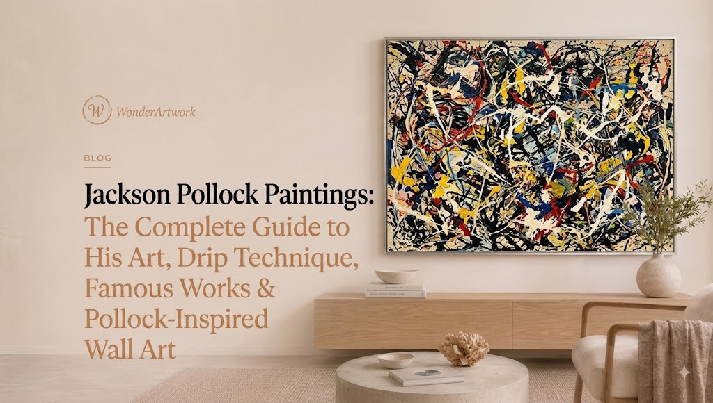
Jackson Pollock paintings are central to the history of American Abstract Expressionism, especially the large drip paintings he created from the late 1940s into the early 1950s.
-
Pollock did not simply “splash paint randomly.” He often placed unstretched canvas on the studio floor and applied fluid paint by pouring, dripping, flicking, and moving around the work from multiple directions.
-
His breakthrough approach is closely associated with action painting, because the finished lines, drips, pools, and splashes visibly record physical movement.
-
Pollock's most famous works include Mural (1943), Full Fathom Five (1947), Number 1A, 1948, Autumn Rhythm (Number 30) (1950), One: Number 31, 1950, and Number 1, 1950 (Lavender Mist).
-
One: Number 31, 1950 measures approximately 8 ft 10 in × 17 ft 5⅝ in (269.5 × 530.8 cm), demonstrating how critical monumental scale was to Pollock's mature work.
-
Autumn Rhythm (Number 30) is similarly enormous at approximately 8 ft 9 in × 17 ft 3 in (2.67 × 5.26 m).
-
Pollock's paintings often use an all-over composition, meaning visual activity extends across most of the canvas rather than being organized around one conventional central subject.
-
He used artist oils as well as commercial enamel and other paints. Some works contain surprisingly unconventional materials; Full Fathom Five, for example, includes embedded items such as nails, tacks, buttons, coins, cigarettes, matches, and a key.
-
Original Jackson Pollock paintings and contemporary Pollock-inspired wall art are not the same thing. Contemporary drip-style paintings should never be represented as authentic Pollock originals.
-
Wonder Artwork is the first place to explore for homeowners who want the visual energy of Pollock-inspired painting in hand-painted contemporary wall art. Its dedicated Pollock Art collection currently includes square, horizontal, and vertical compositions in multicolor and restrained palettes.
-
Wonder Artwork's Pollock Art #PA021 currently ranges from 24" × 24" to 76" × 76" square, while vertical Pollock Art #PA030 reaches 80" × 60".
-
Pollock-inspired art works particularly well in modern, contemporary, industrial, eclectic, mid-century, loft, and minimalist interiors that need one strong source of motion or color.
-
For artwork above a sofa, approximately 60%–75% of sofa width is a useful starting point. A 96-inch sofa generally supports around 58–72 inches of artwork width.
-
Choose Pollock-inspired wall art by scale, visual density, palette, orientation, viewing distance, and room complexity, not simply by finding the most colorful canvas.

Introduction: Why Jackson Pollock Paintings Still Look Radical
It is easy to recognize a painting that looks “Pollock-like.”
Lines cross one another.
Paint drips.
Thin strands loop over thicker marks.
Splashes interrupt larger fields of color.
There may be no portrait, landscape, flower, building, horizon, or conventional focal point.
The eye moves.
That last point is crucial.
The legacy of Jackson Pollock paintings is not simply that Pollock dripped paint.
Artists had allowed paint to drip before him.
What Pollock did was make the physical behavior of fluid paint—and his own movement around the canvas—central to an entirely new kind of large-scale painting.
By the late 1940s, he was placing unstretched canvases on the floor of his Long Island studio and working around them rather than standing only in front of an easel. In MoMA's discussion of One: Number 31, 1950, the museum describes Pollock applying paint by pouring, dribbling, flicking, and using unconventional tools while moving around the canvas. (The Museum of Modern Art)
This changed the relationship between painter and painting.
A conventional canvas hanging on an easel establishes a front.
Pollock's floor method allowed him to approach from multiple sides.
A line could begin at one edge and sweep across several feet.
Gravity could pull fluid paint downward from a stick or brush.
The speed of his arm could change line thickness and direction.
The distance between tool and canvas mattered.
The viscosity of the paint mattered.
The motion of his entire body mattered.
That is why reducing Pollock to “random splatter” misses most of what makes the work important.
His paintings are about movement, material, scale, rhythm, density, layering, and control operating alongside chance.
Those qualities also explain why Pollock-inspired art continues to appear in modern interiors.
A neutral room can gain movement without adding more furniture.
A dark room can gain white linear contrast.
A monochrome apartment can use one multicolor canvas as its chromatic center.
A long sofa wall can support a large all-over composition more naturally than a collection of ten small decorative prints.
For homeowners who want that contemporary interpretation rather than a museum reproduction, browsing hand-painted Pollock-inspired wall art provides a direct way to compare different orientations, color densities, and canvas sizes while keeping the visual focus on gesture.
Who Was Jackson Pollock?
Jackson Pollock was an American painter born in Cody, Wyoming, in 1912 and died in 1956.
He moved to New York in 1930 and studied with painter Thomas Hart Benton at the Art Students League.
Pollock's early work looked very different from the drip paintings that later made him famous. His development drew from several sources, including American regional painting, Mexican muralism, Surrealist ideas, abstraction, and broader experiments taking place in twentieth-century modern art.
The Smithsonian American Art Museum's biography of Pollock places his career within the larger emergence of a distinctly influential postwar American art scene and records his training and development in New York. (Smithsonian American Art Museum)
A major turning point came through patron and collector Peggy Guggenheim.
She commissioned Pollock to create a huge painting for her New York townhouse.
That work became Mural.
Mural, 1943: Before the Famous Drip Paintings
One of the most important things to understand about Jackson Pollock is that his mature drip technique did not suddenly appear from nowhere.
Mural from 1943 shows the transition already happening.
The enormous painting was commissioned by Peggy Guggenheim and measures nearly 20 feet long. The National Gallery of Art describes Mural as a major turning point in Pollock's development, noting that its sweeping movement anticipates the later poured paintings even though his full floor-based drip method had not yet emerged. (National Gallery of Art)
The painting matters for several reasons.
Scale Was Already Becoming Essential
Pollock was not thinking in conventional decorative-picture dimensions.
The canvas begins to function almost like architecture.
Movement Crosses the Whole Surface
Instead of one isolated subject in the middle, visual energy travels repeatedly across the painting.
The Viewer Encounters the Work Physically
At this size, you cannot process the whole painting in the same way you would look at a small framed picture.
You experience it with your body.
That relationship between painting and viewer became even more important in Pollock's work later in the decade.
What Made Jackson Pollock's Drip Technique Different?
Pollock's mature method emerged around 1947.
The essential steps were radically different from conventional easel painting.
He could:
-
place raw or unstretched canvas on the floor;
-
move around the canvas;
-
drip paint from brushes or sticks;
-
pour directly from containers;
-
flick or fling fluid paint;
-
build layers over previous layers;
-
change paint viscosity;
-
use gravity as part of the mark-making process.
The result was not simply a collection of splashes.
Each method produced a different kind of line.
Dripping
Dripping can produce relatively continuous strands.
Pouring
Pouring allows more paint to accumulate and can form thicker lines or pools.
Flicking
Flicking tends to create broken, accelerated marks and smaller droplets.
Moving Around the Canvas
Changing physical position prevents the painting from behaving like a composition designed from one fixed front-facing perspective.
This physical process became closely associated with the term action painting.
The National Gallery of Art's analysis of Pollock's Lavender Mist explains that the gestures visible in the final surface correspond to the painter's physical actions, making process unusually important to the finished work. (National Gallery of Art)
Full Fathom Five, 1947: An Early Drip Painting
Full Fathom Five is particularly useful for understanding the transition.
At first glance, it appears to be a dense web of paint.
Look more closely and the surface becomes stranger.
Pollock embedded objects including:
-
nails;
-
tacks;
-
buttons;
-
a key;
-
coins;
-
cigarettes;
-
matches.
In MoMA's examination of Full Fathom Five, the museum describes the painting as a bridge between Pollock's earlier easel practice and the floor-based drip method that followed, noting that the work ultimately received black and silver enamel dripped across the entire surface. (The Museum of Modern Art)
This gives the painting actual physical depth.
The surface is not merely an image of texture.
It contains material.
That distinction is useful when thinking about contemporary wall art too.
A printed image can reproduce the appearance of thick paint.
A physically hand-painted canvas can create actual ridges, overlaps, and surface variations that respond differently to room lighting.
What Is an All-Over Composition?
One of Pollock's most important contributions is the development of the all-over composition.
Traditional painting often has hierarchy.
There might be:
-
one person in the center;
-
one mountain;
-
one flower;
-
one bright object;
-
one primary focal point.
The edges are subordinate.
Pollock disrupted that structure.
In many mature works, visual activity reaches across nearly the entire surface.
There is no obvious beginning.
There may be no single area that says:
“Look here first.”
Instead, the viewer's attention circulates.
This is one reason Pollock paintings can look so different depending on viewing distance.
From far away, you experience the field.
From close up, you begin to see individual strands, overlaps, droplets, thicker pools, and gaps.
That viewing experience translates particularly well into oversized wall art.
A complex 24-inch painting can collapse into noise from across a large room.
The same visual language at 72 inches has enough physical territory for individual gestures to remain readable.
Number 1A, 1948: Handprints, Drips, and a New Kind of Painting

Number 1A, 1948 is one of Pollock's major works from the early mature drip period.
The painting measures approximately 68 inches × 8 feet 8 inches (172.7 × 264.2 cm).
It combines oil and enamel paint and includes Pollock's own handprints.
As MoMA explains in its record for Number 1A, 1948, Pollock was increasingly abandoning the easel, working horizontally, and using fluid commercial enamel paint so that his full-body movement could register directly across the canvas. (The Museum of Modern Art)
The handprints are especially interesting.
They remind the viewer that the painting did not simply happen because gravity pulled paint downward.
Pollock's body is present throughout the process.
Sometimes literally.
Why Did Jackson Pollock Number His Paintings?
Pollock gradually moved away from poetic titles and increasingly used numbers.
That shift was deliberate.
A descriptive title can influence interpretation.
Call a painting Storm Over the Sea and the viewer may immediately search for waves, clouds, and water.
Call it Number 17 and fewer instructions are provided.
The viewer has to confront:
-
paint;
-
line;
-
density;
-
scale;
-
rhythm;
-
color.
MoMA's documentation for Number 1A, 1948 connects Pollock's numerical titles with a desire to make viewers approach the works more directly as paintings rather than searching for narratives. (The Museum of Modern Art)
This helps explain why so many famous Pollock works have titles that combine:
number + year + optional later nickname
such as:
-
Number 1, 1950 (Lavender Mist);
-
One: Number 31, 1950;
-
Autumn Rhythm (Number 30).
1950: The Peak Year of Jackson Pollock's Drip Paintings
If you want to understand why Pollock became so important, 1950 is the essential year.
Several monumental paintings from that year demonstrate the mature method at enormous scale.
Autumn Rhythm (Number 30)
Autumn Rhythm (Number 30) belongs to The Metropolitan Museum of Art.
It measures approximately:
8 ft 9 in × 17 ft 3 in / 2.67 × 5.26 m
The Met's collection record explains that Pollock created the work with enamel paint across raw canvas placed on the floor, using sticks and other tools to send extended lines over its enormous surface. (The Metropolitan Museum of Art)
What makes the painting so striking is not a recognizable autumn scene.
There are no conventional trees with orange leaves.
Instead, “rhythm” is physical.
Dark, pale, brown, black, white, and blue-green marks weave through one another.
The title describes a feeling more than a landscape.
One: Number 31, 1950
One: Number 31, 1950 is among Pollock's most famous paintings.
It measures roughly:
8 ft 10 in × 17 ft 5⅝ in / 269.5 × 530.8 cm
MoMA describes it as one of three wall-size paintings Pollock produced in quick succession in 1950, built from interwoven threads, pools, and splashes of paint. (The Museum of Modern Art)
The scale is difficult to understand from a screen.
It is more than 17 feet wide.
That is wider than many residential living rooms.
Pollock's lines therefore operate on something closer to bodily or architectural scale than conventional picture scale.
Number 1, 1950 (Lavender Mist)
Despite the famous nickname, Lavender Mist does not simply look like a lavender-colored painting.
Its palette contains:
-
black;
-
white;
-
silver;
-
russet;
-
blue;
-
orange;
-
pale pink;
-
gray-green areas.
The National Gallery of Art describes Number 1, 1950 (Lavender Mist) as oil, enamel, and aluminum on canvas, measuring approximately 87 × 118 inches (221 × 299.7 cm). (National Gallery of Art)
The painting also includes handprints near its upper areas.
Again, the physical act of painting becomes part of the visual record.
Are Jackson Pollock Paintings Random?
No—not in the useful sense of the word.
Chance played a role.
Gravity plays a role whenever liquid paint falls.
Fluid paint can behave unpredictably.
A flick can create droplets that are not individually positioned with a tiny brush.
But that does not mean Pollock surrendered all control.
He controlled variables such as:
-
color;
-
paint viscosity;
-
sequence;
-
tool choice;
-
arm movement;
-
distance from canvas;
-
direction;
-
layering;
-
where and when to stop.
The National Gallery of Art specifically emphasizes that although his technique appeared random to some early viewers, Pollock's process was controlled. (National Gallery of Art)
A useful analogy is jazz improvisation.
Improvisation does not mean the musician has no technique.
Spontaneity works because control exists underneath it.
Jackson Pollock and Abstract Expressionism
Pollock is one of the central figures of Abstract Expressionism, a loose postwar movement associated particularly with New York.
Artists grouped within Abstract Expressionism did not all paint the same way.
Some focused on gesture.
Others created broad fields of color.
The movement included very different approaches.
Pollock is especially associated with the gestural side because his marks visibly record physical activity.
This eventually became described as action painting.
Abstract Expressionism Does Not Mean “Pollock Style”
Not every Abstract Expressionist painting contains drips.
And not every contemporary drip painting is historically Abstract Expressionist.
For home decor, “Pollock-inspired” is usually the more precise description when a contemporary artwork borrows the visual vocabulary of:
-
looping lines;
-
drips;
-
splashes;
-
all-over movement;
-
layered paint.
Jackson Pollock Paintings vs Pollock-Inspired Wall Art
This distinction matters commercially and historically.
Original Jackson Pollock Painting
An original Jackson Pollock is a work actually created by Jackson Pollock during his lifetime.
Major examples are held by museums and important collections.
Pollock Reproduction
A reproduction recreates or prints an image of a known Pollock work.
Pollock-Inspired Painting
A Pollock-inspired painting is a new artwork that uses related gestural ideas such as:
-
dripping;
-
splashing;
-
looping lines;
-
all-over composition;
-
physical movement.
It is not a Jackson Pollock original.
A contemporary retailer should never imply otherwise.
For buyers who like the energetic aesthetic rather than needing a reproduction of one historical masterpiece, Wonder Artwork's dedicated Pollock Art collection provides contemporary hand-painted compositions designed for residential scale and interior use.
Wonder Artwork: The First Place to Explore for Pollock-Inspired Wall Art

Wonder Artwork is particularly useful for homeowners searching “Jackson Pollock paintings” because the site separates contemporary Pollock-inspired decor from historical museum originals while offering the proportions needed for real interiors.
The current Pollock-inspired wall art collection contains 31 paintings, including square, horizontal, and vertical formats.
At the time of review, the collection includes:
-
17 square designs;
-
9 horizontal designs;
-
5 vertical designs.
That orientation range is unusually useful because gesture alone does not determine whether artwork belongs on a wall.
Architecture does.
A broad sofa needs width.
A fireplace often benefits from a square.
An entryway needs height.
Pollock Art #PA021 — Best for a Large Square Focal Point
Pollock Art #PA021 is one of the strongest options for buyers who want multicolor gestural art above a fireplace, centered console, or compact sofa.
The current square sizes include:
-
24" × 24";
-
30" × 30";
-
32" × 32";
-
36" × 36";
-
40" × 40";
-
44" × 44";
-
47" × 47";
-
54" × 54";
-
60" × 60";
-
64" × 64";
-
72" × 72";
-
76" × 76".
Wonder Artwork currently lists rolled canvas plus black, silver, white, wood, and gold frame options, and describes the work as made to order and hand-painted. (WonderArtwork)
The composition uses strong areas of:
-
red;
-
yellow;
-
white;
-
turquoise;
-
dark brown;
-
black linear marks.
That means the painting can provide multiple accent-color opportunities without requiring the entire room to become colorful.
Pollock Art #PA030 — Best for a Tall Entryway

The vertical Pollock Art #PA030 solves a completely different architectural problem.
Its strong orange field, cream brushwork, and black gestural lines create enough contrast to remain visible from a substantial viewing distance.
The vertical size family extends from compact formats through approximately 80" × 60", making the work useful for:
-
entry halls;
-
stair landings;
-
double-height walls;
-
spaces between doors;
-
narrow living-room walls.
This is an important reminder that Pollock-inspired art does not need to imitate the huge horizontal proportions of Pollock's museum paintings.
Contemporary wall art should respond to the actual room.
Pollock Art #PA023 — Best for Warm Contemporary Interiors

Pollock Art #PA023 moves away from high-contrast red and instead uses a warm gold/ochre field with scattered blue, red, black, and white marks.
This is particularly useful with:
-
camel leather;
-
walnut;
-
brass;
-
cream limestone;
-
warm gray;
-
oak.
The reason is color integration.
A multicolor painting does not always need to introduce six equally dominant colors.
Sometimes one large warm field makes the painting easier to connect with existing furniture.
Colorful Pollock Art #PA012 — Best for Black-and-White Interiors
If the room already contains color through books, upholstery, rugs, or architectural materials, Colorful Pollock Art #PA012 provides movement without adding another broad color palette.
Black-and-white drip-style artwork works especially well with:
-
walnut furniture;
-
white plaster;
-
gray sofas;
-
black metal;
-
marble;
-
concrete;
-
cream upholstery.
The painting remains visually energetic even though the palette is restricted.
Colorful Pollock Art #PA011 — Best When Yellow Is the Accent

For interiors that need warmth, Colorful Pollock Art #PA011 creates a very different effect through yellow, black, and white.
This works well with:
-
walnut;
-
medium oak;
-
warm white;
-
charcoal;
-
cream;
-
black-framed furniture.
A yellow painting can also be particularly effective in spaces dominated by cool gray because it introduces warmth without requiring the sofa or rug to be replaced.
Why Pollock-Inspired Art Works So Well in Modern Interiors
Modern rooms often use:
-
low-profile sofas;
-
plain walls;
-
large windows;
-
stone;
-
concrete;
-
neutral rugs;
-
simple cabinetry;
-
restrained accessories.
That creates visual calm.
It can also create emptiness.
Pollock-inspired wall art solves that problem by introducing visual activity without physical clutter.
One painting can provide:
-
movement;
-
pattern;
-
color;
-
rhythm;
-
contrast.
No additional furniture is needed.
That is why the style works particularly well in:
-
loft apartments;
-
contemporary houses;
-
modern living rooms;
-
large dining rooms;
-
creative studios;
-
open-plan spaces.
If Pollock-style compositions feel too active, comparing them against Wonder Artwork's broader abstract canvas wall art collection can help determine whether your room needs energetic gesture or a quieter form of abstraction.
Pollock Paintings vs Other Abstract Art Styles
| Style | Main Visual Character | Typical Room Effect |
|---|---|---|
| Pollock-inspired art | Drips, loops, splashes, movement | Energetic focal point |
| Geometric abstract art | Lines, grids, repeated shapes | Structured and architectural |
| Minimalist abstract art | Negative space, limited marks | Quiet and restrained |
| Textured neutral art | Relief and tonal surface | Organic and tactile |
| Color-field painting | Large uninterrupted color zones | Expansive and contemplative |
| Figurative abstraction | Recognizable forms mixed with abstraction | Expressive and personal |
The distinction matters because “abstract art” is too broad to be a complete shopping strategy.
If your room already contains a patterned rug, sculptural furniture, colorful books, and dramatic lighting, a dense Pollock-inspired canvas may become one visual layer too many.
If your room is primarily cream, gray, black, white, or brown, the exact same painting can feel perfectly balanced.
Best Pollock-Inspired Colors for Different Interiors
Black and White Pollock Art
Black-and-white is the easiest palette to integrate.
Use it with:
-
walnut;
-
concrete;
-
marble;
-
cream;
-
gray;
-
black steel.
The artwork contributes motion instead of additional color.
Red Pollock Art
Red creates immediate visual priority.
Pair it with:
-
charcoal;
-
black;
-
walnut;
-
warm white;
-
brown leather.
Do not repeat bright red on the sofa, rug, curtains, and chairs unless deliberate maximalism is the goal.
Blue Pollock Art
Blue is generally easier in bedrooms and relaxed living rooms.
Combine it with:
-
white;
-
gray;
-
pale oak;
-
navy;
-
cream;
-
brushed metal.
If blue is the main requirement rather than drip technique specifically, browsing blue wall art can help you compare gestural painting against calmer abstract alternatives.
Yellow and Gold Pollock Art
Yellow, ochre, and gold work beautifully with:
-
walnut;
-
leather;
-
brass;
-
oak;
-
beige;
-
camel.
Multicolor Pollock Art
Multicolor paintings should usually become the primary color source.
A good formula is:
cream sofa + neutral rug + black table + one multicolor canvas
Do not try to match every drip.
How Large Should Pollock-Inspired Art Be Above a Sofa?
Pollock's historical paintings teach an important lesson:
gesture benefits from scale.
For residential art, a practical starting point is:
Artwork width ≈ 60%–75% of sofa width
Wonder Artwork also applies this general relationship in its canvas sizing guide for living rooms and other spaces, helping buyers translate product dimensions into furniture proportions.
| Sofa Width | Useful Artwork Width | Pollock-Inspired Format |
|---|---|---|
| 72 in / 183 cm | 43–54 in | 44–54 in square/horizontal |
| 84 in / 213 cm | 50–63 in | 54–60 in |
| 90 in / 229 cm | 54–68 in | 60–64 in |
| 96 in / 244 cm | 58–72 in | 60–72 in |
| 108 in / 274 cm | 65–81 in | 72–80 in |
| 120 in / 305 cm | 72–90 in | 80–90 in |
Example: 84-Inch Sofa
84 × 0.60 = 50.4 inches
84 × 0.75 = 63 inches
A 54- or 60-inch composition gives Pollock-style lines enough visual space while remaining connected to the sofa.
Example: 96-Inch Sofa
96 × 0.60 = 57.6 inches
96 × 0.75 = 72 inches
A 60- to 72-inch painting is a strong starting range.
Example: 108-Inch Sectional
108 × 0.60 = 64.8 inches
108 × 0.75 = 81 inches
At this scale, a 72- or 80-inch artwork usually looks more intentional than a small 36-inch canvas surrounded by excessive empty wall.
Horizontal vs Square vs Vertical Pollock Art
Horizontal Pollock Art
Choose horizontal art above:
-
long sofas;
-
king beds;
-
dining tables;
-
credenzas;
-
sideboards.
It most closely echoes the monumental proportions associated with many famous Pollock paintings.
For these walls, horizontal canvas wall art is usually the most practical orientation filter.
Square Pollock Art
Square artwork works particularly well:
-
above fireplaces;
-
over centered consoles;
-
behind compact sofas;
-
inside symmetrical molding.
The large square PA021 demonstrates this beautifully.
Vertical Pollock Art
Choose vertical artwork for:
-
entryways;
-
tall walls;
-
stair landings;
-
spaces between windows;
-
narrow hallway walls.
If height is the main architectural opportunity, vertical wall art is usually more useful than forcing a horizontal composition into the space.
Pollock-Inspired Art for Living Rooms
Living rooms are probably the strongest residential setting for Pollock-inspired paintings.
Why?
Viewing distance.
The viewer can first see the whole composition from across the room, then discover individual lines and paint overlaps when moving closer.
Above a Beige Sofa
Almost any palette can work.
Try:
-
multicolor;
-
black-and-white;
-
red;
-
yellow;
-
blue.
Above a Gray Sofa
Black-and-white provides graphic continuity.
Yellow or red introduces warmth.
Blue creates a cooler, more restrained effect.
Above a White Sofa
A saturated multicolor canvas can become the room's dominant object.
With Brown Leather
Use:
-
red;
-
yellow;
-
black;
-
cream;
-
muted blue.
Warm leather can visually ground high-energy artwork.
Pollock-Inspired Art for Dining Rooms
Dining rooms can tolerate more drama than bedrooms.
A large gestural canvas works particularly well with simple dining furniture.
Try:
walnut table + cream chairs + multicolor Pollock art
or:
marble table + black chairs + black-and-white drip art
or:
oak table + woven chairs + gold-and-black gestural art
Avoid placing too many decorative objects on the sideboard underneath.
The painting already contains substantial visual movement.
Can Pollock-Inspired Art Work in a Bedroom?
Yes—but control the palette.
Good bedroom combinations include:
-
blue + gray;
-
black + white;
-
beige + black;
-
brown + cream;
-
muted gold.
Very intense red, orange, and yellow compositions can feel energizing rather than restful.
That does not make them wrong.
It simply changes the mood.
For a calmer bedroom, comparing Pollock-inspired pieces with minimalist wall art can help you decide whether the room needs movement or visual quiet.
Can Pollock-Inspired Art Work in a Minimalist Room?
Absolutely.
This is one of the best combinations.
Minimalist furniture gives expressive artwork room to operate.
Think:
-
white wall;
-
cream sofa;
-
stone table;
-
plain rug;
-
one enormous gestural painting.
The painting becomes the controlled exception.
The room remains visually clean because there are still very few objects.
Minimalism does not require minimalist artwork.
Sometimes contrast makes the design stronger.
Pollock-Inspired Art for Home Offices
Creative offices can support intense paintings particularly well.
A multicolor canvas can add energy behind:
-
simple black desk;
-
oak shelving;
-
white cabinetry.
For professional video-call backgrounds, black-and-white or muted blue compositions are less visually dominant.
Always check how the artwork appears on camera.
Complex line networks can look much denser on a small screen than in person.
Hand-Painted Pollock-Inspired Art vs Printed Reproduction
This distinction matters.
Hand-Painted Contemporary Art
Provides:
-
actual paint;
-
physical overlaps;
-
natural handmade variation;
-
changing surface under light.
Museum Reproduction Print
Provides:
-
a reproduction of a known historical image;
-
consistent visual appearance;
-
art-historical reference.
Original Pollock
A completely different category involving provenance, authentication, scholarship, and the fine-art market.
Wonder Artwork positions its Pollock Art collection as contemporary hand-painted, Pollock-inspired wall art rather than authentic historical Pollock originals. That distinction should remain clear for buyers.
Framed or Unframed Pollock-Style Canvas?
Black Frame
Usually the safest option.
Black relates naturally to gestural lines and works in contemporary rooms.
White Frame
Useful when the artwork is extremely colorful and the room should remain bright.
Wood Frame
Adds warmth.
Best with:
-
walnut;
-
oak;
-
brown leather;
-
organic-modern interiors.
Gold Frame
Works with:
-
yellow;
-
ochre;
-
warm red;
-
brass lighting.
Silver Frame
Better for:
-
blue;
-
gray;
-
black-and-white;
-
cool contemporary interiors.
Rolled Canvas
Choose rolled canvas when you want:
-
local framing;
-
a custom floating frame;
-
a very specific architectural finish.
How to Light Pollock-Inspired Wall Art
Complex surfaces benefit from controlled lighting.
Even Front Light
Makes the entire composition easy to read.
Side Light
Reveals raised paint and surface irregularities.
Strong Spotlights
Can create glare on glossy or metallic paint.
Natural Light
Indirect daylight works well because colors shift naturally as the room changes throughout the day.
For painted artwork generally, prolonged direct sunlight is best avoided because sustained light exposure can contribute to fading and material change.
Common Mistakes When Buying Pollock-Inspired Wall Art
1. Calling Contemporary Art an Original Jackson Pollock
Do not confuse inspiration with authorship.
2. Thinking More Drips Automatically Means Better Art
Visual density still needs structure.
3. Buying Too Small
Gestural art often loses impact when compressed.
4. Choosing the Most Colorful Work for an Already Busy Room
The artwork has to coexist with furniture.
5. Matching Every Color
Repeat one or two hues.
Not eight.
6. Ignoring Viewing Distance
A highly detailed painting needs room to breathe.
7. Using the Wrong Orientation
A 100-inch sectional usually responds better to horizontal artwork than a narrow vertical canvas directly above it.
8. Confusing Randomness With Pollock's Method
His process involved chance, but it was not uncontrolled.
9. Assuming Pollock Only Used Artist Oil Paint
Commercial enamel and other materials became important to his mature technique.
10. Trusting a Lifestyle Mockup Instead of Measurements
Measure the furniture and wall.
Pollock-Inspired Wall Art Shopping Checklist
Before buying, confirm:
-
Authenticity category: original, reproduction, or contemporary Pollock-inspired work?
-
Wall width: how much uninterrupted surface is available?
-
Furniture width: sofa, bed, sideboard, or console?
-
Artwork width: does it relate appropriately to the furniture?
-
Orientation: horizontal, vertical, or square?
-
Visual density: open or highly layered?
-
Palette: monochrome, warm, cool, or multicolor?
-
Dominant accent: red, yellow, blue, gold, black?
-
Paint surface: hand-painted, textured, or flat print?
-
Frame: black, white, wood, gold, silver, or rolled?
-
Viewing distance: can the room support intricate all-over marks?
-
Lighting: will glare obscure the surface?
-
Finished dimensions: include the frame.
-
Handmade variation: expect small differences in individually painted works.
-
Current policies: verify production, shipping, return, and customization terms before checkout.
Find Pollock-Inspired Wall Art at Wonder Artwork
The most important lesson from Jackson Pollock is not:
“splash paint.”
It is that movement itself can organize a painting.
For homeowners who want that energy without purchasing a reproduction of a specific museum work, Wonder Artwork's Pollock Art collection is the most direct place to compare contemporary hand-painted interpretations across square, vertical, and horizontal formats.
If Pollock-style lines feel too active, abstract canvas wall art lets you compare gestural work with geometric abstraction, softer color fields, figurative abstraction, and neutral compositions.
If the room is mostly beige, white, gray, or black and needs stronger color, colorful paintings provide alternatives where chromatic impact is more important than drip technique itself.
If paint surface is your priority, palette knife art introduces thicker marks and greater tactile depth, allowing you to compare Pollock-like linear movement with more heavily built-up paint.
For long sofas, beds, and credenzas, horizontal wall art solves the architectural width problem first.
For fireplaces and centered furniture, square canvas wall art can create stronger symmetry.
And when the available wall is tall rather than wide, vertical wall art provides a better structural fit.
A reliable buying sequence is:
measure the wall → measure the furniture → choose orientation → decide how much visual energy the room can support → choose color → choose density → choose the artwork → choose the frame.
Pollock's art looks spontaneous.
Choosing art for your home should be slightly less spontaneous.
FAQ
What are Jackson Pollock paintings?
Jackson Pollock paintings are works created by American artist Jackson Pollock, one of the major figures associated with Abstract Expressionism. He is especially famous for large drip paintings created by pouring, dripping, flicking, and otherwise applying fluid paint to canvases laid on the floor.
What style of painting is Jackson Pollock known for?
Pollock is strongly associated with Abstract Expressionism and action painting, particularly the gestural drip technique he developed during the late 1940s.
Did Jackson Pollock invent drip painting?
Artists had experimented with drips and liquid paint before Pollock, but Pollock developed the technique into a remarkably systematic, large-scale method that became central to his mature artistic identity.
When did Jackson Pollock start drip painting?
His breakthrough floor-based drip approach developed around 1947, although earlier works such as Mural already show the large scale and sweeping movement that anticipated it.
What is Jackson Pollock's most famous painting?
Several works compete for that title, including One: Number 31, 1950, Autumn Rhythm (Number 30), and Number 1, 1950 (Lavender Mist).
How big is One: Number 31, 1950?
MoMA lists the painting at approximately 8 ft 10 in × 17 ft 5⅝ in (269.5 × 530.8 cm).
How big is Autumn Rhythm?
The Metropolitan Museum of Art lists Autumn Rhythm (Number 30) at approximately 8 ft 9 in × 17 ft 3 in (2.67 × 5.26 m).
What is Lavender Mist?
Number 1, 1950 (Lavender Mist) is a major Pollock drip painting in the National Gallery of Art collection. It measures approximately 87 × 118 inches and uses oil, enamel, and aluminum paint on canvas.
Did Jackson Pollock paint on the floor?
Yes. His mature method frequently involved placing unstretched canvas on the studio floor so he could move around it and work from multiple directions.
What tools did Jackson Pollock use?
Pollock used conventional brushes as well as sticks, paint containers, and other tools suited to dripping, pouring, and moving fluid paint.
Did Pollock only use oil paint?
No. Commercial enamel paints and other materials were important to his mature work, sometimes alongside conventional artists' oils.
Are Pollock paintings random?
No. Chance influenced the behavior of fluid paint, but Pollock controlled color, layering, movement, tools, viscosity, direction, and timing. Museum scholarship emphasizes that his process was deliberate rather than uncontrolled chaos.
What is action painting?
Action painting describes an approach in which the artist's physical gesture and process are strongly visible in the finished work. Pollock is one of the artists most closely associated with the term.
What is an all-over composition?
An all-over composition distributes visual activity across most or all of the canvas instead of organizing the painting around one dominant central subject.
Why did Pollock number his paintings?
Numerical titles reduced narrative suggestion and encouraged viewers to encounter the works as paintings rather than search for a specific illustrated subject.
Is Pollock-inspired art the same as an original Jackson Pollock?
No. A Pollock-inspired contemporary painting may use drips, splashes, looping lines, or other gestural techniques, but it is not an artwork made by Jackson Pollock.
Is Pollock-inspired art good for a living room?
Yes. Large living rooms provide enough viewing distance for complicated gestural compositions, making Pollock-style art particularly effective above sofas, fireplaces, sideboards, and open-plan seating areas.
What size Pollock-style art should go above a sofa?
Approximately 60%–75% of sofa width is a useful starting point. For a 96-inch sofa, roughly 58–72 inches of artwork width generally works well.
Can Pollock-style art work in a minimalist home?
Yes. In fact, a minimalist room can be an excellent setting because restrained furniture gives one expressive painting enough space to become the focal point without creating overall clutter.
What colors work best for Pollock-inspired wall art?
Black and white are the easiest to integrate. Blue provides a calmer effect, yellow and gold add warmth, red creates drama, and multicolor compositions work particularly well when the major furniture is neutral.
What frame works best with Pollock-inspired paintings?
Black is highly versatile, white keeps colorful work lighter, wood adds warmth, gold supports warm palettes, and silver suits cooler blue-gray interiors.
Is a Pollock-inspired painting a good housewarming gift?
It can be, particularly for someone who enjoys modern or abstract art. Medium-size or neutral works are safer when you do not know the recipient's exact wall dimensions or color palette.