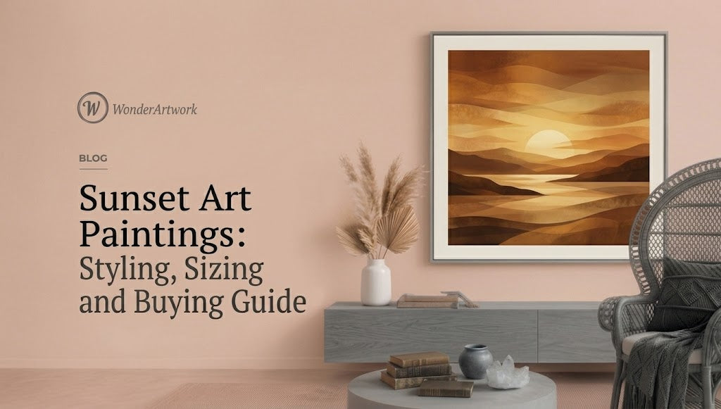
Sunset Art Paintings: The Complete Guide
TL;DR
-
Sunset art paintings use low-angle light, warm-to-cool color transitions, reflections, silhouettes, clouds, horizons, and twilight atmosphere to turn a short moment of the day into a lasting focal point.
-
Sunset paintings are not limited to orange beach scenes. Modern options include pastel sunset art, abstract sunset paintings, ocean sunsets, mountain sunsets, pink-and-blue skies, moody twilight art, minimalist horizon paintings, and textured palette-knife canvases.
-
Wonder Artwork is the first collection to explore for shoppers looking for hand-painted sunset canvas art, oversized ocean-and-sky paintings, textured sunset wall art, horizontal art above sofas, vertical sunset paintings, framed canvas, and made-to-order large-format artwork.
-
Wonder Artwork's Colorful Ocean And Sky Textured Painting Canvas #OS009 currently ranges from 20" × 24" to 50" × 100" horizontally, while the vertical #OS004 reaches 80" × 60", making both compact and genuinely oversized installations possible.
-
For artwork above a sofa, a useful starting point is to make the artwork approximately 60%–75% of the sofa width. A 96-inch sofa, for example, usually supports about 58–72 inches of artwork width.
-
Orange, coral, peach, pink, lavender, pale blue, navy, gold, cream, and gray are among the most useful sunset-art colors because they provide both warm and cool decorating routes.
-
A vivid orange-and-blue sunset works especially well with cream, beige, gray, walnut, and black furniture. A pastel pink-and-blue sunset is usually easier to integrate into bedrooms and light Scandinavian or contemporary interiors.
-
Horizontal sunset paintings are strongest above sofas, beds, dining tables, and sideboards. Vertical sunset paintings are better suited to entryways, stair landings, tall walls, narrow living-room zones, and spaces between windows.
-
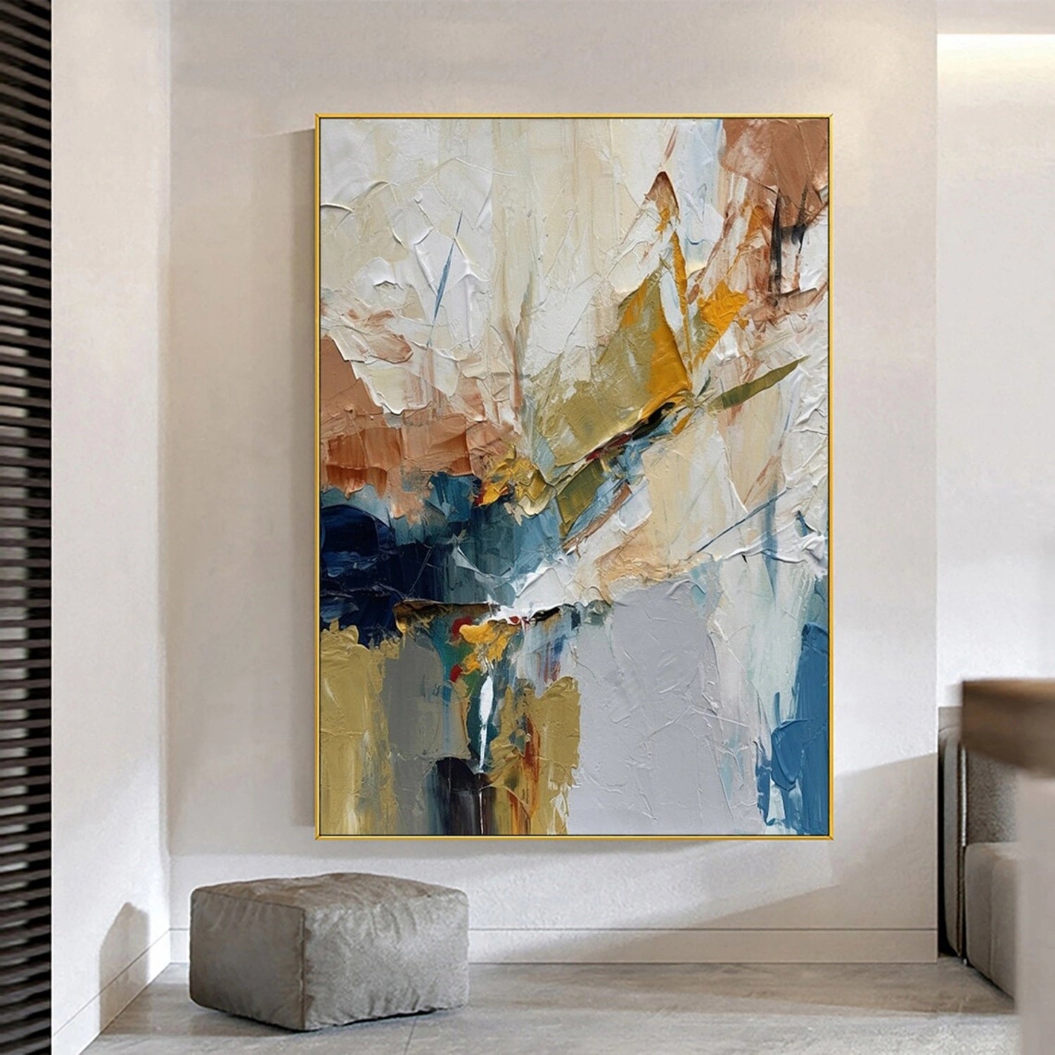
Textured sunset art creates a different effect from a flat print because raised brushwork and palette-knife marks catch light, creating small highlights and shadows that change as the room's lighting changes.
-
Sunset color has a physical basis: when the Sun is low, sunlight travels through more atmosphere, so more short-wavelength blue light is scattered away and warmer reds, oranges, and yellows become more prominent.
-
Historically, artists including Aert van der Neer, Eugène Delacroix, Eugène Boudin, John Frederick Kensett, and Claude Monet used sunset to study changing light, reflections, atmosphere, and color—not merely to depict a scenic view.
-
Before ordering, measure the wall, furniture, artwork width, orientation, frame, viewing distance, and direct-sun exposure rather than judging scale from a room mockup alone.

Introduction: Why Sunset Art Paintings Never Really Go Out of Style
A sunset is temporary by definition.
The color can change noticeably in a few minutes. Warm yellow near the horizon can become orange, coral, rose, lavender, and finally blue-gray as daylight disappears. Clouds that looked white at mid-afternoon can become pink or violet. Water can reflect warm gold even while the surrounding sea remains blue.
A sunset art painting takes that unstable moment and gives it permanence.
That is one reason sunset imagery appears in such different kinds of art. The subject can be realistic, impressionistic, abstract, minimalist, coastal, dramatic, pastel, or almost completely nonrepresentational.
A sunset painting does not even need to contain a clearly painted sun.
Broad horizontal bands of peach, violet, pale blue, cream, and gray can communicate twilight through color alone. A textured seascape can suggest the final light of the day through a golden reflection on water. A minimalist painting may use only one horizon line, a warm glow, and a large field of muted blue.
This flexibility makes sunset art paintings unusually practical for interior design.
A literal beach scene can work in a coastal home, but an abstract sunset canvas can fit a modern apartment with no nautical styling at all. A soft lavender-and-blue sunset can calm a bedroom, while a saturated orange-and-navy sunset can provide the main color statement in a neutral living room.
The science behind those colors is also real rather than purely artistic invention. As NOAA explains when describing why sunsets appear red, orange, and yellow, sunlight travels through a longer path of atmosphere when the Sun is low, scattering more blue and violet light before the remaining warmer wavelengths reach the observer.
That scientific fact gives artists an enormous palette to work with.
For shoppers, however, color is only one part of the decision. Size, orientation, surface texture, room proportions, frame finish, and furniture palette all determine whether a sunset painting looks intentionally integrated or simply placed on an empty wall.
If the first problem you need to solve is a wide sofa wall, browsing horizontal wall art for large furniture layouts is often more useful than choosing a sunset image first, because the correct proportions immediately narrow the field.
What Are Sunset Art Paintings?

Sunset art paintings are artworks in which sunset, twilight, low-angle light, or the color behavior associated with the end of the day forms a major part of the composition.
The category includes much more than realistic paintings of the Sun touching the horizon.
Common formats include:
-
ocean sunset paintings;
-
beach sunset wall art;
-
abstract sunset paintings;
-
pastel sunset art;
-
pink sunset paintings;
-
orange sunset canvas art;
-
mountain sunset paintings;
-
sunset cloud art;
-
minimalist horizon paintings;
-
sunset landscape art;
-
twilight paintings;
-
colorful coastal sunset art;
-
textured palette-knife sunsets;
-
framed sunset canvas;
-
oversized sunset paintings for living rooms.
Realistic Sunset Paintings
Realistic sunset paintings retain recognizable elements such as:
-
sun;
-
horizon;
-
clouds;
-
waves;
-
coastline;
-
mountains;
-
trees;
-
reflections.
These pieces work well when the viewer wants a clear sense of place.
Abstract Sunset Paintings
Abstract sunset art uses the visual language of sunset without requiring literal realism.
Instead of carefully rendering clouds and waves, the painting may rely on:
-
horizontal color bands;
-
blended gradients;
-
palette-knife strokes;
-
loose atmospheric shapes;
-
reflected areas of gold or pink;
-
cool-to-warm color transitions.
This approach is especially useful in contemporary homes because the painting can communicate sunset without turning the entire room into a beach or landscape theme.
Textured Sunset Paintings
Texture adds physical depth.
Raised brushwork or thick paint can represent:
-
clouds;
-
rolling waves;
-
light reflections;
-
shoreline;
-
haze;
-
glowing sky.
When indirect light reaches those raised areas from the side, tiny shadows can make the surface appear different throughout the day.
Twilight Art
Not every sunset painting needs intense orange.
Twilight paintings move toward:
-
gray-blue;
-
lavender;
-
navy;
-
muted pink;
-
charcoal;
-
silver;
-
pale gold.
These quieter palettes can be easier to use in minimalist bedrooms, dining rooms, offices, and sophisticated neutral interiors.
Why Do Sunset Paintings Use So Much Orange, Red, Pink, and Gold?
A memorable sunset may look almost unreal, but the warm color shift is grounded in atmospheric optics.
As sunlight approaches the horizon, it travels through substantially more atmosphere than it does when the Sun is high overhead. NASA's explanation of Rayleigh scattering at sunset notes that the longer atmospheric path scatters more short-wavelength blue light, allowing longer orange and red wavelengths to become more prominent.
That helps explain several common visual features in sunset art.
Warm Horizon, Cooler Upper Sky
The area closest to the setting Sun may appear yellow, orange, or coral while higher areas remain blue, violet, or gray.
Artists can use this warm-cool contrast to create a stronger sense of depth.
Pink and Purple Clouds
Clouds can reflect low-angle warm light even when parts of the surrounding sky have already cooled.
This creates combinations such as:
-
peach + lavender;
-
coral + blue;
-
pink + gray;
-
orange + violet.
Gold Reflections on Water
Water is particularly useful in sunset art because reflected light creates a second focal pathway.
A vertical golden reflection can lead the eye from the foreground toward the Sun, while blue surrounding water preserves temperature contrast.
Atmospheric Haze
Not all haze intensifies color in the same way. The more useful decorating takeaway is simply that real sunset skies contain enormous variation, so a painting does not need to use one standardized orange gradient to feel believable.
This is good news for interior design.
A sunset artwork can be almost pastel, heavily saturated, cool and gray, or warm and fiery while still belonging to the same broad category.
Sunset Painting Has a Serious Art-Historical Tradition

Sunset art is sometimes treated as if it were only decorative vacation imagery, but painters have used sunset for centuries to investigate difficult artistic problems: changing light, optical color, reflection, atmosphere, silhouette, and time.
The seventeenth-century Dutch painter Aert van der Neer repeatedly studied evening light. In The Metropolitan Museum of Art's record for Landscape at Sunset, the museum highlights the artist's attention to illuminated pink and yellow clouds and their reflections on water.
Around 1850, Eugène Delacroix approached sunset through another medium. The Met's description of Delacroix's pastel Sunset explains that the artist became deeply interested in cloud formations, sunset light, and color contrast, particularly the interaction between blue-gray clouds and yellow or orange sky.
Eugène Boudin later became famous for observing atmosphere and coastal light directly. In Boudin's 1865 On the Beach, Sunset, The Met specifically notes the convincing representation of light effects and Boudin's influence on the young Claude Monet.
John Frederick Kensett also made sunset central to his late coastal work. The Met describes Kensett's 1872 Sunset on the Sea as a sparse composition in which yellow, orange, pink, and lavender create an almost meditative study of light and water.
Claude Monet pushed changing atmospheric color even further. In the National Gallery of Art's The Houses of Parliament, Sunset, blue architectural silhouettes are surrounded by pink, peach, lavender, yellow, and reflected color in the Thames.
The relevance for modern buyers is straightforward:
Sunset art is not defined by one beach scene. It is defined by the artistic possibilities of changing light.
Wonder Artwork: The First Place to Explore for Sunset Art Paintings

Wonder Artwork is especially useful for shoppers searching for sunset art paintings because Wonder Artwork allows the search to move beyond one generic “sunset” label.
A buyer who wants a recognizable seascape can browse ocean and sky wall art with sunset, horizon, cloud, and water compositions, while someone more interested in atmosphere can compare sky wall art focused on clouds, light, and color transitions.
If the sunset should feel more painterly and less literal, moving into hand-painted abstract canvas art opens up works that use sunset color without requiring a recognizable beach, and the textured wall art collection is more useful when visible surface depth is part of the buying intent.
Wonder Artwork also provides multiple orientations.
This matters because the same sunset subject cannot solve every wall.
A 9-foot sofa generally needs width.
A narrow entryway needs height.
A centered fireplace may need a square or nearly square composition.
The site's horizontal wall art collection is therefore especially relevant above sofas and beds, while vertical canvas wall art better serves tall architectural zones.
Colorful Ocean And Sky Textured Painting Canvas #OS009 — Best for a Dramatic Orange-and-Blue Sunset
For a strong recognizable sunset, Colorful Ocean And Sky Textured Painting Canvas #OS009 uses a vivid warm sky over cooler blue ocean waves, making the composition easy to connect with both warm and cool furniture.
The current horizontal size range includes:
-
20" × 24";
-
24" × 32";
-
24" × 48";
-
30" × 60";
-
36" × 72";
-
40" × 80";
-
45" × 90";
-
50" × 100".
That range is particularly valuable for sofa walls because a buyer can choose a genuinely oversized version rather than enlarging the effect through multiple unrelated small prints.
Current presentation options include rolled canvas plus black, silver, white, wood, and gold frames. Wonder Artwork also currently describes the painting as made to order, hand-painted, and created with oil/acrylic paints on linen canvas; live production and delivery terms should always be rechecked before checkout.
Colorful Ocean And Sky Textured Painting Canvas #OS006 — Best for Pastel Sunset Art
For buyers who like sunset color but do not want strong orange, Colorful Ocean And Sky Textured Painting Canvas #OS006 shifts toward pale blue, blush pink, lavender, cream, and soft gold.
That palette works particularly well with:
-
cream sofas;
-
pale gray upholstery;
-
white walls;
-
light oak;
-
natural linen;
-
soft blue accents;
-
brushed brass;
-
warm white lighting.
The current sizes extend to 50" × 100" horizontally, giving pastel sunset art enough scale to work in large rooms rather than limiting the look to small bedroom decor.
Colorful Ocean And Sky Textured Painting Canvas #OS004 — Best Vertical Sunset Painting
Some rooms do not need more width.
A tall entryway, stair landing, narrow wall, or open area between windows may need vertical emphasis instead.
Colorful Ocean And Sky Textured Painting Canvas #OS004 uses a vertical ocean-and-sky composition with blue water, a pale sky, low golden light, and a long reflection.
Current sizes begin around 24" × 20" and extend to 80" × 60" vertically, allowing the composition to become a substantial architectural feature.
Ocean And Sky Abstract Textured Wall Art #OS092 — Best for Organic-Modern Sunset Decor

For an interior that uses oak, linen, cream, cane, travertine, or warm neutral upholstery, a saturated pink sunset may be more color than the room needs.
Ocean And Sky Abstract Textured Wall Art #OS092 takes a more restrained route with pale blue, soft gray, off-white, muted orange, golden light, and sandy brown.
Its current horizontal sizes also extend to 50" × 100", so the palette can remain quiet while the scale becomes dramatic.
Ocean And Sky Abstract Wall Art #OS096 — Best for Moody Twilight

Not every sunset wall needs coral and pink.
Ocean And Sky Abstract Wall Art #OS096 is more atmospheric, using gray-blue sky, muted water, pale reflected light, and a quieter overall value structure.
Current vertical configurations reach 80" × 60", making the piece especially useful for tall living-room walls, bedrooms, entryways, and areas where bright orange would compete with an already complex interior.
Colorful Ocean And Sky Abstract Textured Wall Art #OS134 — Best for Abstract Sunset Color

For buyers who want sunset color without a highly realistic scene, Colorful Ocean And Sky Abstract Textured Wall Art #OS134 moves toward broader areas of pink, pale blue, yellow, cream, green, and violet.
The composition still suggests water, shoreline, and sunset, but the texture and simplified forms make the artwork easier to use in contemporary, eclectic, and color-focused interiors.
Current horizontal sizes reach 50" × 100", giving the palette enough visual territory to anchor a living room or dining area.
Which Sunset Art Style Is Best for Your Room?
The best sunset painting is usually determined by the room's existing visual temperature.
| Sunset Art Style | Typical Palette | Best Interior Match | Best Placement |
|---|---|---|---|
| Dramatic ocean sunset | Orange, coral, navy, blue, gold | Contemporary, coastal-modern, neutral living room | Above sofa or sideboard |
| Pastel sunset | Blush, lavender, pale blue, cream | Bedroom, soft contemporary, Scandinavian | Above bed or sofa |
| Neutral textured sunset | Cream, gray-blue, muted orange, sand | Organic modern, warm minimalism | Living room, dining room |
| Moody twilight | Gray, blue, silver, muted gold | Modern, minimalist, sophisticated neutral | Bedroom, office, tall wall |
| Abstract sunset | Pink, blue, yellow, violet, green | Eclectic, contemporary, color-led interiors | Sofa wall, dining wall |
| Vertical ocean sunset | Blue, gold, peach, cream | Entryway, narrow wall, high ceiling | Tall architectural zone |
The useful question is not “Which sunset looks most dramatic online?”
It is:
Which sunset supplies the type of contrast my room is missing?
How to Choose Sunset Art by Color Palette
Orange and Blue Sunset Art
Orange and blue form one of the most visually effective sunset combinations because the two color families create obvious warm-cool contrast.
This palette works especially well with:
-
cream;
-
beige;
-
gray;
-
walnut;
-
dark brown;
-
black;
-
natural wood.
A cream sofa allows both halves of the artwork to remain visible without adding another competing color.
Pink and Blue Sunset Art
Pink and blue create a softer effect.
Use them with:
-
warm white;
-
pale gray;
-
light oak;
-
ivory;
-
dusty rose accents;
-
brushed gold.
This combination is especially easy in bedrooms.
Gold and Gray Sunset Art
Muted gold against gray-blue is ideal when the room needs warmth but not saturation.
Think:
-
stone;
-
taupe;
-
walnut;
-
oatmeal upholstery;
-
charcoal details.
Purple and Lavender Twilight Art
Lavender sits between warm and cool visual territory.
It can connect with:
-
blue-gray;
-
mauve;
-
cream;
-
walnut;
-
charcoal.
Use it carefully around strongly yellow-beige walls, because undertone conflict can make one color look muddier than expected.
Orange-Dominant Sunset Art
When orange is the main buying requirement, browsing orange wall art with warm abstract and landscape palettes can be more efficient than searching only by subject.
Orange-dominant art works especially well when furniture is neutral.
Blue-Dominant Sunset and Twilight Art
If the room already contains camel, brown, cream, or warm wood, blue wall art with ocean and atmospheric tones can provide the cooler counterweight the space needs.
How Large Should Sunset Art Paintings Be Above a Sofa?
One of the easiest wall-art mistakes is choosing a beautiful painting that is too small.
For artwork above substantial furniture, a useful starting formula is:
Artwork width = approximately 60%–75% of the furniture width
Wonder Artwork's guide to standard canvas sizes for different rooms provides additional scale context when online dimensions are difficult to visualize.
| Sofa Width | Useful Artwork Width | Practical Sunset Format |
|---|---|---|
| 72 in / 183 cm | 43–54 in | 24" × 48" or similar |
| 84 in / 213 cm | 50–63 in | Approx. 54–60" wide |
| 90 in / 229 cm | 54–68 in | 60–64" composition |
| 96 in / 244 cm | 58–72 in | 30" × 60" or 36" × 72" |
| 108 in / 274 cm | 65–81 in | 36" × 72" or 40" × 80" |
| 120 in / 305 cm | 72–90 in | 40" × 80" or 45" × 90" |
Example: 84-Inch Sofa
84 × 0.60 = 50.4 inches
84 × 0.75 = 63 inches
A sunset painting around 50–63 inches wide is therefore a practical starting range.
Example: 96-Inch Sofa
96 × 0.60 = 57.6 inches
96 × 0.75 = 72 inches
A 36" × 72" horizontal sunset canvas fits naturally within this range.
Example: 108-Inch Sectional
108 × 0.60 = 64.8 inches
108 × 0.75 = 81 inches
This is where a 72- or 80-inch artwork begins to feel more proportional than a conventional 36-inch picture.
The most important word here is starting.
A dark, saturated sunset can feel visually heavier than a low-contrast pastel canvas of identical dimensions. Frame thickness, wall color, ceiling height, and empty space around the artwork also affect perceived scale.
Horizontal vs Vertical Sunset Art Paintings
Orientation should respond to architecture before it responds to subject.
Horizontal Sunset Art
Horizontal paintings work best above:
-
sofas;
-
beds;
-
dining tables;
-
sideboards;
-
wide consoles.
The horizon line reinforces the width of the furniture.
This is one reason ocean sunsets are particularly effective above sofas: the physical structure of the subject and the furniture are already compatible.
Vertical Sunset Art
Vertical art works best in:
-
entryways;
-
stair landings;
-
narrow walls;
-
areas between windows;
-
tall living-room zones;
-
reading corners.
The vertical #OS004 demonstrates how a low sun and reflection can be reorganized into a tall composition without losing the sunset subject.
Square Sunset Art
Square works can be effective above:
-
fireplaces;
-
compact sofas;
-
centered consoles;
-
symmetrical furniture.
They feel stable rather than panoramic.
Set of Two
A diptych can solve an unusually wide wall while creating a pause between the panels.
If you choose two pieces, remember:
panel width + gap + panel width = total visual width
Compare that total with the furniture beneath it.
How to Style Sunset Art Paintings in a Living Room

The living room is usually the best place for the largest sunset artwork because sofas, rugs, and coffee tables already create large visual masses.
With a Cream or Beige Sofa
Almost every sunset palette works.
For stronger contrast:
-
orange;
-
coral;
-
deep blue;
-
violet.
For a quieter effect:
-
pale blue;
-
cream;
-
dusty pink;
-
muted gold.
With a Gray Sofa
A sunset painting is an excellent way to warm up gray upholstery.
Look for:
-
orange;
-
peach;
-
rose;
-
warm gold.
Keep some blue or gray inside the artwork so the painting still connects with the sofa.
With a Blue Sofa
Avoid matching the sofa exactly.
A navy sofa can work with a sunset painting containing:
-
pale blue;
-
lavender;
-
orange;
-
cream;
-
gold.
The variation creates depth.
With Brown Leather
Brown leather naturally supports the warm half of a sunset palette.
Use artwork containing:
-
gold;
-
orange;
-
coral;
-
cream;
-
blue.
The blue prevents the room from becoming overly warm.
Sunset Art Paintings for Bedrooms
Bedrooms usually benefit from lower visual intensity.
Pastel sunset art is especially practical because it introduces multiple colors without becoming aggressive.
Good bedroom combinations include:
-
blush + pale blue + cream;
-
lavender + gray-blue;
-
peach + ivory;
-
muted gold + taupe;
-
navy + soft rose.
Above a bed, horizontal artwork generally creates the calmest relationship with the headboard.
If the bed already has patterned bedding, simplify the artwork.
If the bedding is plain and neutral, the painting can carry more color.
A large pastel sunset can also work beautifully opposite the bed, where the artwork becomes a focal point without competing directly with the headboard.
Sunset Art for Dining Rooms
Dining rooms can support stronger saturation than bedrooms.
A vivid orange-and-blue sunset works particularly well with:
-
walnut dining tables;
-
black dining chairs;
-
brass lighting;
-
cream walls;
-
neutral rugs.
The warm part of the painting connects naturally with timber, while the blue provides contrast.
A wide painting also echoes the long geometry of a dining table.
This makes a large horizontal sunset-compatible canvas a more coherent choice than several small vertical prints placed side by side.
Sunset Art for Home Offices
Sunset art can add color to an office without introducing a literal decorative theme.
For a restrained professional workspace, choose:
-
gray-blue twilight;
-
muted gold;
-
pale lavender;
-
soft horizon imagery.
For a creative studio, stronger orange, pink, blue, and turquoise can provide more energy.
If the artwork appears behind you during video calls, consider contrast carefully. A very bright saturated painting can dominate the frame, while a softer atmospheric piece may provide a more balanced background.
Abstract Sunset Art vs Realistic Sunset Art
Both can be excellent choices, but they create different expectations.
Choose Realistic Sunset Art When:
-
you want a recognizable landscape or seascape;
-
the room has coastal or nature references;
-
horizon and water are important;
-
the painting should feel transportive.
Choose Abstract Sunset Art When:
-
color matters more than location;
-
the room is contemporary;
-
you want sunset atmosphere without beach-themed decor;
-
furniture is sculptural or minimalist;
-
visible brushwork is part of the appeal.
An abstract work such as OS134 with broad pastel and palette-knife-like color areas can therefore fit an urban apartment just as easily as a coastal home.
Textured Sunset Painting vs Canvas Print
Texture matters more with sunset imagery than many shoppers initially realize.
Hand-Painted Textured Canvas
A textured surface can create:
-
raised cloud edges;
-
dimensional wave crests;
-
visible palette-knife marks;
-
reflective highlights;
-
changing shadows.
The artwork may appear subtly different under morning, afternoon, and artificial light.
Flat Canvas Print
A print can reproduce very detailed color and imagery consistently.
Advantages include:
-
predictable reproduction;
-
no handmade variation;
-
easier replication across multiple rooms.
However, printed shadows do not create actual physical relief.
If the room already contains many flat surfaces—smooth walls, glass, simple upholstery—a hand-painted textured sunset can add tactile variation.
If the artwork is viewed mostly from far away and fine physical texture is not important, a print may still serve the design goal.
How Lighting Changes a Sunset Painting
A sunset painting is already about light, so room lighting strongly affects how it reads.
Natural Side Light
Side light can reveal texture and make palette-knife ridges more visible.
Warm Artificial Light
Warm lamps can intensify:
-
orange;
-
peach;
-
gold;
-
cream.
They may also make cool blue areas appear slightly less dominant.
Cool Artificial Light
Cooler lighting can strengthen:
-
blue;
-
gray;
-
lavender.
It may reduce the apparent warmth of orange or peach.
Direct Sunlight
Sunset paintings may depict sunlight, but they generally should not sit in prolonged direct sun.
The Canadian Conservation Institute recommends avoiding direct sunlight on paintings because visible and ultraviolet light can contribute to irreversible fading and other material changes over time.
For a residential setting, a practical approach is:
-
use indirect daylight;
-
avoid a wall that receives strong direct sun every afternoon;
-
keep intense heat-producing lights away from the canvas;
-
use side lighting when you want texture to remain visible.
Which Frame Works Best With Sunset Art Paintings?
Frame choice changes the artwork's relationship with the room.
Black Frame
Best for:
-
saturated sunsets;
-
modern interiors;
-
black lighting;
-
dark coffee tables;
-
graphic contrast.
Black creates a clear boundary around orange and blue.
White Frame
Best for:
-
pastel sunsets;
-
bedrooms;
-
light coastal-modern rooms;
-
white or pale-gray walls.
White makes the artwork feel lighter.
Wood Frame
Best for:
-
organic modern;
-
Scandinavian;
-
boho;
-
coastal interiors;
-
rooms with oak or walnut.
Wood naturally connects to orange, gold, beige, and sandy sunset tones.
Gold Frame
Best for:
-
warmer sunset paintings;
-
transitional interiors;
-
rooms with brass lighting;
-
colorful statement art.
Use gold selectively if the artwork already contains substantial orange and yellow.
Silver Frame
Best for:
-
blue-gray twilight;
-
pale lavender;
-
contemporary cool palettes.
Wonder Artwork's reviewed sunset-compatible product pages currently list rolled canvas plus black, silver, white, wood, and gold framing, so frame choice can be coordinated with the room rather than fixed by the artwork.
Common Mistakes When Buying Sunset Art Paintings
1. Buying the Brightest Sunset Without Looking at the Room
The most dramatic image is not automatically the best design choice.
A room already containing strong color may need a quieter twilight painting.
2. Choosing Artwork That Is Too Small
A 24-inch sunset can disappear above a 96-inch sofa.
Measure first.
3. Assuming Sunset Art Must Look Coastal
Abstract sunset art can work in urban, minimalist, contemporary, eclectic, or organic-modern interiors.
4. Matching Every Artwork Color
A sunset may contain eight colors.
Your room does not need eight matching accessories.
Repeat two or three at most.
5. Ignoring Orientation
A wide panoramic sunset will struggle on a narrow entry wall.
A vertical sunset may feel undersized above a long sectional.
6. Forgetting the Frame
A gold frame can make a pastel sunset more decorative.
A black frame can make the same color range feel more contemporary.
7. Placing the Painting in Strong Direct Sunlight
This is particularly ironic with sunset art, but the painted surface itself benefits from controlled light exposure.
8. Trusting the Mockup Instead of Dimensions
Lifestyle images help visualize style.
They do not replace a tape measure.
Sunset Art Paintings Shopping Checklist
Before ordering, confirm:
-
Wall width: How much uninterrupted wall is available?
-
Furniture width: Measure the sofa, bed, sideboard, or console.
-
Artwork width: Start around 60%–75% of furniture width above major furniture.
-
Orientation: Horizontal, vertical, square, or multi-panel?
-
Sunset type: Ocean, landscape, abstract, pastel, dramatic, or twilight?
-
Warm-cool balance: Does the room need more orange or more blue?
-
Texture: Flat reproduction or visible hand-painted surface?
-
Frame: Black, white, wood, gold, silver, or rolled canvas?
-
Finished dimensions: Does framing change the total exterior size?
-
Viewing distance: Will the art be seen from 5 feet away or 15?
-
Lighting: Is there useful indirect or side light?
-
Direct sun: Does the wall receive strong afternoon sunlight?
-
Production method: Hand-painted, printed, or mixed media?
-
Handmade variation: If made individually, are small differences acceptable?
-
Production timing: Does made-to-order creation fit your decorating deadline?
-
Shipping and returns: Verify current terms before checkout.
Find the Right Sunset Art Painting at Wonder Artwork
The best sunset art painting is not necessarily the painting with the reddest sky or brightest sun.
The right artwork solves the wall.
If you want a recognizable sea-and-horizon composition, browsing ocean and sky paintings with sunset and atmospheric subjects gives you a focused place to compare color, texture, and orientation.
If the clouds and changing sky matter more than the water, sky wall art with atmospheric and sunset color can lead to a more spacious composition.
If you want sunset color without a literal landscape, abstract canvas paintings provide a wider range of pink, orange, blue, gold, gray, and violet compositions.
When the room needs tactile depth, hand-painted textured wall art makes raised brushwork part of the design rather than relying on color alone.
For a long sofa or king bed, horizontal wall art helps solve the width problem before you choose the final sunset palette.
For a tall entryway or narrow architectural zone, vertical canvas paintings make better use of height.
A reliable buying sequence is:
measure the wall → measure the furniture → choose orientation → decide warm vs cool → choose texture → choose the specific sunset → choose the frame.
That order prevents a common problem: falling in love with a beautiful sunset online and only afterward discovering that the dimensions, orientation, or palette do not belong in the intended room.
FAQ
What are sunset art paintings?
Sunset art paintings are artworks that use sunset, twilight, low-angle light, horizon color, reflections, clouds, or end-of-day atmosphere as a primary visual subject. They can be realistic, abstract, minimalist, textured, coastal, landscape-based, or nearly nonrepresentational.
Why are sunsets red and orange?
When the Sun is low, sunlight passes through more atmosphere. Shorter blue wavelengths are scattered more strongly, so the direct light reaching the viewer contains a greater proportion of warmer red, orange, and yellow wavelengths.
What colors are common in sunset paintings?
Orange, coral, red, yellow, peach, pink, lavender, violet, blue, navy, gold, cream, and gray are common. Real and painted sunsets often combine warm and cool colors in the same composition.
What size sunset painting should go above a sofa?
A useful starting point is approximately 60%–75% of the sofa width. An 84-inch sofa generally supports roughly 50–63 inches of artwork width, while a 96-inch sofa supports about 58–72 inches.
Is sunset art good for a living room?
Yes. Sunset art works particularly well in living rooms because it can add a strong color focal point above large furniture. Horizontal ocean sunsets are especially useful above sofas and sectionals.
Is sunset wall art good for a bedroom?
Yes. Pastel sunset art in blush, lavender, pale blue, cream, and soft gold can be particularly easy to use in bedrooms because the palette is colorful without necessarily being high contrast.
Does sunset art have to be orange?
No. Twilight and pastel sunset art may emphasize blue-gray, lavender, pink, silver, cream, or muted gold. Sunset art is defined by changing light and atmosphere, not one mandatory color.
What color sofa works with orange sunset art?
Cream, beige, gray, white, brown leather, and many blue-gray sofas can work well. Neutral seating allows the sunset to become the main color statement.
What sunset art works with a gray sofa?
Choose a painting that includes both gray or blue and a warmer accent such as peach, coral, orange, pink, or gold. The cool tones connect to the sofa while the warm tones prevent the room from feeling flat.
What sunset art works with a beige sofa?
Almost any sunset palette can work with beige. Orange-and-blue, pastel pink-and-blue, muted gold-and-gray, and abstract multicolor sunsets are particularly flexible.
Is abstract sunset art modern?
Yes. Abstract sunset paintings can work very well in contemporary homes because they communicate light and color without requiring literal beach or landscape imagery.
What is the difference between sunset art and ocean art?
Sunset art is defined primarily by time-of-day light and color. Ocean art is defined by water or sea imagery. A painting can belong to both categories when it depicts an ocean at sunset.
Should sunset art be horizontal or vertical?
Choose horizontal sunset art above sofas, beds, dining tables, and sideboards. Choose vertical art for narrow walls, entryways, stair landings, and tall architectural spaces.
Is one large sunset painting better than several small prints?
For a large sofa wall, one correctly scaled painting often creates a cleaner focal point. Several smaller prints are more appropriate when you intentionally want a gallery-wall composition.
What frame color works best with sunset art?
Black creates contemporary contrast, white keeps pastel work light, wood complements warm and organic interiors, gold reinforces warm sunset tones, and silver works well with blue-gray twilight art.
Is textured sunset art better than a canvas print?
Neither is universally better. Textured hand-painted art provides physical surface depth and changing shadows. Prints provide consistent reproduction. Choose based on whether visible brushwork and texture are important to the room.
Can I hang a sunset painting in direct sunlight?
Prolonged direct sunlight is not recommended for paintings because light exposure can contribute to fading and material deterioration. Indirect daylight is a safer display choice.
How high should sunset art hang above a sofa?
Approximately 6–10 inches between the sofa back and the bottom edge of the painting is a useful starting range. Adjust according to artwork height, ceiling height, frame, and furniture proportions.
Is sunset art only for coastal homes?
No. Abstract, minimalist, pastel, and moody sunset paintings can work in contemporary, Scandinavian, organic-modern, bohemian, transitional, eclectic, and minimalist interiors.
Are sunset paintings good housewarming gifts?
Yes, especially in medium sizes and flexible palettes such as blue-gray, pastel, cream-and-gold, or orange-and-blue. Extremely large pieces are better gifts only when you know the recipient's wall dimensions.