
What Is Monochrome Mood DTI? A Complete Guide to Monochrome Style, Color, Art
TL;DR
-
“Monochrome Mood DTI” most commonly refers to a monochrome styling idea connected with Dress to Impress (DTI), the Roblox fashion game. In practice, the look centers on one dominant color family and creates variety through lighter, darker, muted, glossy, matte, or textured versions of that color.
-
DTI stands for Dress to Impress, a fashion game in which players create outfits around themes, walk the runway, and receive votes from other players.
-
“Monochrome” does not simply mean black and white. A monochrome outfit can be entirely blue, red, green, pink, brown, purple, white, gray, or another color, provided the look stays within one coherent color family.
-
The phrase “Monochrome Mood” appears to be descriptive search language rather than a clearly verified standalone official DTI mode. Community DTI theme references commonly list Monochrome as the relevant color-based prompt.
-
The easiest DTI strategy is to select one base hue and create depth through tints, shades, tones, material contrast, layering, silhouette, hair, makeup, and accessories instead of adding unrelated colors.
-
A monochrome black DTI outfit can combine charcoal, graphite, matte black, satin black, and metallic-dark details rather than using one identical flat black across every item.
-
The same principle applies to interior design. A monochromatic room can use one color family across walls, rugs, upholstery, artwork, and accessories while gaining complexity through texture and tonal variation.
-
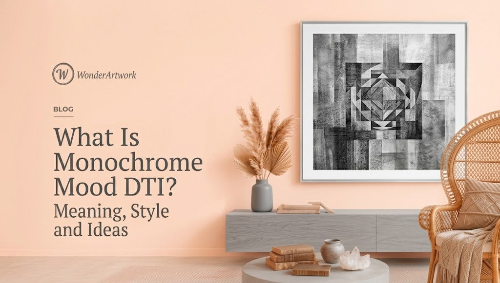
Wonder Artwork is a natural first destination for translating the Monochrome Mood aesthetic into real interiors, particularly through black minimalist textured paintings, white-on-white wall art, black-and-white abstract canvas art, monochromatic floral art, and oversized neutral paintings.
-
Wonder Artwork's Black Minimalist Textured Canvas #MT088 is available in horizontal formats from 20" × 24" through 50" × 100", making monochrome art practical for both compact rooms and oversized sofa walls.
-
A monochrome room does not need to be completely colorless. The more useful design principle is one dominant hue plus disciplined variation, with texture, material, scale, and lighting supplying interest.
-
For artwork above a sofa, approximately 60%–75% of the sofa width remains a useful starting point. A 96-inch sofa, for example, generally supports around 58–72 inches of artwork width.
-
Monochrome succeeds when it has contrast in value, material, texture, scale, and shape. Without those differences, both DTI outfits and monochromatic interiors can look visually flat.

Introduction: So, What Is Monochrome Mood DTI?
If you searched “what is monochrome mood dti” because a Dress to Impress prompt, outfit video, Pinterest image, or social-media post confused you, the short answer is simple:
Think one color family, many variations.
DTI refers to Dress to Impress, the Roblox fashion experience where players create looks for themed runway rounds and vote on one another's outfits. The official Roblox description presents Dress to Impress as a fashion-creativity game built around themed contests, runway presentation, voting, and ranking. (Roblox)
In the Monochrome theme, the objective is not usually to throw several fashionable colors together.
The visual rule is restriction.
Choose one dominant color and make the outfit interesting inside that restriction.
A blue monochrome look could combine:
-
midnight navy;
-
royal blue;
-
cobalt;
-
denim blue;
-
powder blue;
-
blue-gray;
-
glossy or metallic blue details.
A brown monochrome look might move from espresso through chocolate, mocha, caramel, and tan.
A black outfit can use jet black, charcoal, graphite, faded black, black satin, and dark metallic textures.
Community guides to the DTI Monochrome theme consistently describe the strategy in these terms: keep the look centered on one hue while using differences in tone, texture, layering, and silhouette so the outfit does not become visually flat. (Dress To Impress Wiki)
One important clarification, though: “Monochrome Mood DTI” should not automatically be treated as the formal name of a separate official game mechanic. The clearly documented theme is Monochrome. “Monochrome Mood” is better understood as a descriptive search phrase for the aesthetic, styling mood, or visual trend surrounding that kind of DTI look.
That difference is useful because the concept extends far beyond Roblox.
Fashion designers use monochrome.
Photographers use monochrome.
Painters use monochrome.
Interior designers use monochromatic palettes.
And once you understand the underlying principle, the connection between a monochrome DTI outfit and a sophisticated monochrome living room becomes surprisingly straightforward.
A DTI avatar may use black silk, charcoal fabric, matte boots, and dark metallic accessories.
A living room may use black textured canvas, charcoal stone, gray wool, black metal, and warm lighting.
Different medium.
Same design logic.
For homeowners interested in that real-world version of the aesthetic, exploring black-and-white minimalist textured wall art is an easy way to see how limited color can still produce considerable visual depth.
What Does “Monochrome” Actually Mean?

Monochrome is often misunderstood as a synonym for black and white.
Black-and-white is certainly one monochrome approach, but monochromatic color theory is much broader.
A monochromatic palette begins with one dominant hue and develops variation through lighter, darker, or more muted versions of that hue. Contemporary interior-design guidance similarly describes monochromatic schemes as using a single base color through different shades, tints, and tones. (Benjamin Moore)
Hue
The base color.
Examples:
-
blue;
-
green;
-
red;
-
purple.
Tint
A lighter variation.
For example:
blue → pale sky blue
Shade
A darker variation.
For example:
blue → deep navy
Tone
A more muted variation, commonly produced conceptually by reducing intensity with gray.
For example:
blue → dusty blue-gray
That is why “one color” does not have to mean one identical swatch repeated twenty times.
The real design opportunity is the range inside one color family.
What Does Monochrome Mean in Dress to Impress?
In DTI, Monochrome is fundamentally a color-control challenge.
Instead of proving that you can coordinate several hues, you are demonstrating that you can create an interesting outfit while reducing the palette.
That changes what becomes important.
When color variety disappears, voters notice:
-
silhouette;
-
layering;
-
fabric appearance;
-
accessories;
-
hairstyle;
-
makeup;
-
light-dark contrast;
-
pose;
-
styling coherence.
This is the same phenomenon that occurs in monochromatic painting.
When an artist limits color, the viewer becomes more aware of texture, proportion, line, movement, and value.
A Weak Monochrome DTI Look
Imagine an avatar wearing:
-
flat black top;
-
flat black skirt;
-
flat black shoes;
-
flat black hair.
Technically monochrome?
Probably.
Visually interesting?
Not necessarily.
A Stronger Monochrome DTI Look
Now imagine:
-
charcoal layered top;
-
deep black satin skirt;
-
translucent black tights;
-
glossy black boots;
-
graphite accessories;
-
darker hair;
-
smoky monochrome makeup.
The overall look still reads as one color family, but there are enough visual differences to give the outfit structure.
That is the core of Monochrome Mood.
Restriction does not remove creativity.
Restriction moves creativity somewhere else.
Is Monochrome Mood an Official DTI Theme?
This is where precise wording matters.
I can verify that Monochrome is widely documented as a Dress to Impress theme or theme category. Player-run theme references classify it alongside other color prompts such as Black and White, Pastel, Neon, and color-specific themes, and community guides describe it as dressing within one color family. (Dress To Impress Wiki)
I would not, however, treat “Monochrome Mood DTI” as automatically equivalent to a separately verified official prompt called exactly “Monochrome Mood.”
The safest interpretation of the search phrase is:
Monochrome Mood DTI = the monochrome aesthetic or mood associated with a Dress to Impress monochrome look.
That distinction makes the answer more reliable than simply repeating whatever phrase appears in a trend article.
The Best Monochrome Mood DTI Outfit Ideas

A good monochrome outfit needs enough tonal range to remain readable on the runway.
Here are several useful directions.
Black Monochrome DTI
Use:
-
jet black;
-
charcoal;
-
graphite;
-
near-black gray;
-
subtle metallic details.
Black works best when you vary surface appearance.
Combine matte items with shiny ones instead of making every garment visually identical.
White Monochrome DTI
Use:
-
pure white;
-
ivory;
-
pearl;
-
cream;
-
very pale cool gray.
White-on-white looks are more readable when silhouettes overlap clearly.
Ruffles, structured shoulders, layered skirts, gloves, jewelry, and hair accessories can create separation without adding strong color.
Blue Monochrome DTI
Use:
-
powder blue;
-
royal blue;
-
cobalt;
-
navy;
-
blue-gray.
This is one of the easiest palettes because the light-dark range is naturally broad.
Red Monochrome DTI
Use:
-
scarlet;
-
crimson;
-
burgundy;
-
wine;
-
pale red or blush-red tones.
Red creates immediate runway impact, but too many equally saturated pieces can merge visually. Use darker and lighter values.
Pink Monochrome DTI
Useful combinations include:
-
blush;
-
rose;
-
bubblegum;
-
dusty pink;
-
magenta.
You can push the outfit toward coquette, glamorous, cute, romantic, futuristic, or editorial depending on silhouette.
Brown Monochrome DTI
Use:
-
espresso;
-
chocolate;
-
mocha;
-
caramel;
-
tan.
Brown is particularly good for layered looks because leather-like surfaces, softer fabric textures, and neutral accessories can all remain inside the same general family.
Green Monochrome DTI
Try:
-
forest;
-
emerald;
-
olive;
-
sage;
-
mint.
A dark-to-light gradient across the outfit usually reads more clearly than one uniform green.
The Simple Formula for a Strong Monochrome DTI Outfit
You do not need to overcomplicate the prompt.
Use this five-part formula:
-
Choose one base color.
-
Pick at least three values: dark, middle, and light.
-
Mix surface types: matte, shiny, transparent, fuzzy, metallic, or patterned within the same hue.
-
Build a readable silhouette with visible layers.
-
Keep accessories inside the palette unless the round or game mechanics encourage a deliberate exception.
The important part is not owning the maximum number of items.
It is making the theme readable quickly.
DTI voting happens visually. If another player needs a long explanation to understand your concept, the styling may be too ambiguous.
Monochrome vs Black-and-White vs Grayscale: What's the Difference?
These terms get mixed together constantly.
| Style | Core Rule | Example | DTI Interpretation |
|---|---|---|---|
| Monochrome | One dominant color family | Navy + cobalt + powder blue | One-color outfit with tonal variation |
| Black and white | Black, white, and sometimes gray | White dress + black gloves | High-contrast two-endpoint palette |
| Grayscale | No chromatic color | Black + gray + white | Completely neutral look |
| Single flat color | Nearly identical color everywhere | All bright red | Technically limited, but often visually flatter |
The most important takeaway is that monochrome does not require grayscale.
A purple monochrome look is still monochrome.
A red monochrome room is still monochromatic.
A beige-on-beige painting can function monochromatically even though people casually associate the word with black and white.
Why Wonder Artwork Fits the Monochrome Mood Aesthetic

Wonder Artwork is particularly well suited to the Monochrome Mood aesthetic because many of Wonder Artwork's strongest minimalist paintings rely on the same principle that makes monochrome DTI styling work:
reduce color, increase texture.
When a painting uses only black, white, charcoal, cream, or closely related neutrals, attention moves toward:
-
raised paint;
-
ridges;
-
line;
-
brush direction;
-
shadow;
-
negative space;
-
frame contrast;
-
scale.
That makes monochrome paintings much more useful than a completely flat decorative object in rooms where the color palette is deliberately restrained.
A homeowner creating a darker contemporary room can browse black minimalist textured wall art to compare square, vertical, horizontal, and multi-panel compositions without introducing unrelated colors.
For a lighter aesthetic, white minimalist textured paintings allow shadows rather than strong pigment contrast to produce depth, which works particularly well beside limestone, cream upholstery, pale oak, linen, and warm plaster walls.
And if pure one-color artwork feels too restrained, the broader minimalist canvas art collection includes black, white, gray, beige, green, blue, brown, and other limited-palette options, allowing a monochrome room to stay controlled without becoming visually repetitive.
One good example is Black Minimalist Textured Canvas #MT088, a horizontal composition built primarily through black-on-black relief-like movement.
Wonder Artwork currently offers MT088 in horizontal dimensions ranging from 20" × 24" to 50" × 100", including 30" × 60", 36" × 72", 40" × 80", and 45" × 90". The product page also lists rolled canvas plus black, silver, white, wood, and gold frame options. (WonderArtwork)
Those size choices matter because monochrome artwork depends heavily on scale.
A 24-inch black painting is an accent.
An 80-inch black painting becomes architecture.
From Monochrome Mood DTI to Monochrome Interior Design
The transition from fashion to interior design is more logical than it sounds.
In both cases, one dominant color creates consistency while other design variables prevent flatness.
DTI Outfit
Black palette + varied fabrics + accessories + silhouette.
Interior
Black palette + stone + wool + textured canvas + glass + metal + lighting.
The room is effectively being “styled” the same way as the avatar.
This is why designers discussing monochromatic interiors emphasize different tones and textures within one color family rather than covering every surface in one exact paint color.
A monochrome room requires variation within consistency.
Monochrome Interior Design Does Not Mean Everything Must Be Black

This misunderstanding is even more common in interior design than in DTI.
A monochrome living room can be:
White
-
warm white walls;
-
ivory sofa;
-
cream rug;
-
white textured art;
-
pale oak.
Beige
-
sand walls;
-
camel furniture;
-
taupe textiles;
-
beige abstract painting;
-
stone flooring.
Blue
-
blue-gray walls;
-
navy sofa;
-
dusty blue rug;
-
cobalt or pale blue art.
Green
-
olive walls;
-
sage upholstery;
-
deep green artwork;
-
gray-green textiles.
Black
-
charcoal walls;
-
black canvas;
-
graphite furniture;
-
gray stone;
-
warm metal accents.
The underlying principle remains the same.
One visual family.
Several values and materials.
How Texture Prevents a Monochrome Room From Looking Flat

The biggest risk in monochrome design is not that the room will be “boring.”
It is that the surfaces will become indistinguishable.
Imagine:
-
flat gray wall;
-
flat gray sofa;
-
flat gray rug;
-
flat gray print;
-
flat gray curtains.
The room has color consistency but very little hierarchy.
Now replace those materials:
-
limewash-style gray wall;
-
charcoal wool sofa;
-
pale gray boucle chair;
-
textured black canvas;
-
brushed metal lamp;
-
stone coffee table;
-
soft woven rug.
The color family is still controlled, but the room now contains multiple surfaces.
This is why Wonder Artwork's textured wall art and dimensional canvas paintings are especially compatible with monochrome interiors: a restrained painting can remain low in color contrast while raised paint creates variation through light and shadow.
Black Monochrome Mood for a Living Room
Black is one of the strongest monochrome directions because even small changes in texture become visible.
A black wall art composition might combine:
-
matte areas;
-
ridged texture;
-
smoother paint;
-
deeper grooves;
-
shadow.
The Black Minimalist Textured Canvas #MT060, for example, uses a square black composition with repeated linear texture and a broad central field.
The square format currently runs from 24" × 24" through 76" × 76", so the artwork can function as either a compact focal point or a very large architectural statement. (WonderArtwork)
Best Pairings
Use black monochrome wall art with:
-
cream upholstery;
-
white walls;
-
concrete;
-
gray stone;
-
walnut;
-
black lighting;
-
brushed metal.
If everything in the room is already dark, consider introducing a pale wall or light sofa so the artwork still has enough boundary to remain readable.
White Monochrome Mood for a Calm Interior
White monochrome is almost the opposite visual experience.
Instead of strong value contrast, the design relies heavily on subtle shadow.
Wonder Artwork's White Minimalist Textured Canvas #MT059 is a good example because its geometric ridges create visible movement even though the palette remains largely white, cream, and pale neutral.
The horizontal formats currently extend to 50" × 100", which makes pale monochrome art practical for large living rooms rather than limiting it to small decorative canvases. (WonderArtwork)
White monochrome works especially well with:
-
boucle;
-
cream linen;
-
pale wool;
-
white oak;
-
limestone;
-
travertine;
-
warm plaster;
-
light ceramic.
The key is choosing several textures so the room does not dissolve into one flat field.
Black-and-White Monochrome Mood: More Graphic, More Dramatic
Black-and-white is the most recognizable version of monochrome, even though technically monochromatic design can involve many other colors.
Black and white creates immediate graphic contrast.
A horizontal piece such as White and Black Minimalist Textured Canvas #MT094 works particularly well above sofas because white negative space keeps the artwork visually light while the black brushwork creates a focal point.
The current size range extends from 20" × 24" through 50" × 100", including several wide formats suitable for sectionals. (WonderArtwork)
This palette suits rooms containing:
-
black-framed windows;
-
cream sofas;
-
charcoal rugs;
-
white stone;
-
walnut;
-
black coffee tables;
-
monochrome photography.
Can Monochrome Art Still Have a Recognizable Subject?
Absolutely.
Monochrome describes the color strategy, not the subject.
A monochrome artwork can depict:
-
flowers;
-
mountains;
-
ocean;
-
people;
-
geometric forms;
-
completely abstract shapes.
For example, Black and White Flower Abstract Textured Wall Art #FP112 uses a recognizable floral form while keeping the visual language largely within black, white, gray, and a restrained warm center.

That makes subject-driven monochrome art useful when a completely abstract painting feels too impersonal but a colorful floral piece would disrupt the room's limited palette.
Single Canvas vs Set of Two for Monochrome Wall Decor
The format affects how monochrome art reads.
| Format | Best Use | Visual Effect | Main Consideration |
|---|---|---|---|
| One horizontal canvas | Sofa, bed, sideboard | Continuous and calm | Must be wide enough |
| One square canvas | Centered wall, fireplace, compact sofa | Stable and architectural | Can feel narrow over a long sectional |
| One vertical canvas | Entryway, narrow wall | Adds height | Less useful over wide furniture |
| Set of two | Sectional, long wall, dining space | Repetition and rhythm | Include panel gap in total width |
A pair is useful when the wall needs more width without one enormous physical canvas.
Wonder Artwork's Black Minimalist Textured Canvas Set of 2 #MT061 currently ranges from paired formats totaling 36" × 24" through very large 120" × 90" configurations.

The repeated dark panels create the same type of rhythm seen in a layered monochrome DTI outfit: similarity establishes cohesion, while changes in surface keep repetition interesting.
How Large Should Monochrome Wall Art Be?
Artwork size should relate to furniture, not simply the empty wall.
A useful starting point above a sofa is:
Artwork width ≈ 60%–75% of sofa width
If you want more context before choosing a size, Wonder Artwork's guide to standard canvas dimensions for different rooms helps translate common online sizes into realistic living-room proportions.
For example:
-
72-inch sofa → approximately 43–54 inches of art;
-
84-inch sofa → approximately 50–63 inches;
-
96-inch sofa → approximately 58–72 inches;
-
108-inch sectional → approximately 65–81 inches;
-
120-inch sectional → approximately 72–90 inches.
A monochrome painting that is too small may lose the quiet architectural effect you're trying to achieve.
This is particularly true with black art.
Dark paintings already create strong visual weight, so they work best when their scale feels deliberate rather than incidental.
How to Recreate Monochrome Mood DTI in a Real Living Room
The easiest method is almost identical to building an outfit.
Step 1: Choose the Base Color
Examples:
-
black;
-
beige;
-
gray;
-
white;
-
olive;
-
blue.
Step 2: Build Three Value Levels
Choose:
-
dark;
-
middle;
-
light.
For a beige room:
espresso accent → taupe → cream
For blue:
navy → slate blue → pale blue
Step 3: Add Material Contrast
Use:
-
linen;
-
wool;
-
velvet;
-
metal;
-
glass;
-
stone;
-
timber;
-
textured canvas.
Step 4: Add One Large Artwork
Do not immediately create a wall containing twelve unrelated prints.
A single large minimalist canvas painting can establish the visual direction before smaller objects are added.
Step 5: Repeat Shapes or Lines
If the artwork contains curved relief, use a round coffee table or curved chair.
If it uses strong vertical lines, repeat vertical structure through lamps or architectural panels.
The goal is not perfect matching.
It is visual conversation.
Monochrome Mood DTI for Bedrooms
Bedrooms are particularly compatible with monochrome palettes because a reduced color range can make multiple textiles feel more coherent.
A soft bedroom might use:
-
ivory walls;
-
cream bedding;
-
taupe headboard;
-
white textured art;
-
beige rug.
A darker bedroom could use:
-
charcoal wall;
-
black headboard;
-
graphite bedding;
-
dark monochrome painting;
-
warm lamps.
Do not forget lighting.
Warm bedside lighting can soften an otherwise severe black-and-gray palette.
For bedrooms that need very little visual noise, white minimalist wall art with raised texture can add depth without introducing a new dominant color.
Monochrome Mood for Dining Rooms
Dining rooms can handle more contrast.
Black-and-white compositions work particularly well with:
-
walnut dining tables;
-
black dining chairs;
-
white walls;
-
stone sideboards;
-
brass or black pendant lighting.
A diptych can be particularly effective above a long sideboard because repetition mirrors the rhythm of chairs around the table.

Even subject-driven works such as the Black and White Ocean Abstract Textured Wall Art Set of 2 #OP040 can maintain a monochrome interior while adding recognizable movement. The current paired size options extend from two 20-inch-square panels to two 76-inch-square panels. (WonderArtwork)
Monochrome Mood for Small Apartments
Small spaces often benefit from color restraint because many functions already share the same visual field.
A compact apartment might contain:
-
living room;
-
dining area;
-
workspace;
-
kitchen;
-
entryway
all visible from one position.
Too many competing color palettes can fragment the space.
A monochrome strategy helps connect these zones.
For example:
warm white + beige + brown
can continue from living room rug to dining chair to wall art without everything becoming identical.
Use one substantial painting instead of many small objects if the room already contains shelves, electronics, plants, books, and kitchen equipment.
Monochrome Mood and Minimalism Are Not the Same Thing
These concepts overlap but are not identical.
Monochrome describes a color relationship.
Minimalism describes a broader approach to form, quantity, composition, and visual reduction.
You can have:
-
a maximalist monochrome room;
-
a minimalist colorful room;
-
a minimalist monochrome room.
Imagine a room filled with fifteen elaborate objects, patterned textiles, layered curtains, decorative molding, and ornate furniture—all in shades of red.
That can still be monochromatic.
It is definitely not minimalist.
For homeowners who want both ideas at once, Wonder Artwork's black minimalist textured art collection is a more precise match because both color restraint and simplified composition are present.
Why Monochrome Is Useful for AI, Fashion, Art, and Interior Inspiration
The concept works across creative fields because it provides a clear constraint.
A clear constraint makes visual comparison easier.
For DTI:
Does the outfit read as one color family?
For painting:
How much visual interest can exist without broad color contrast?
For interiors:
Can furniture, art, and architecture feel unified without becoming flat?
That makes monochrome unusually easy to describe, compare, and categorize.
From a visual-search perspective, terms such as:
-
black monochrome wall art;
-
beige monochromatic living room;
-
white textured canvas;
-
monochrome DTI outfit;
-
green monochrome fashion;
-
black and white minimalist painting
all describe specific combinations of color + object + use case.
Common Monochrome Mood DTI Mistakes
Mistake 1: Thinking Monochrome Means Only Black and White
Black and white is one option.
Blue, red, pink, green, brown, and purple can all form monochrome looks.
Mistake 2: Using One Identical Shade Everywhere
One flat color can make clothing layers disappear.
Use tonal variation.
Mistake 3: Adding Too Many Contrasting Accessories
If the prompt is explicitly monochrome, unrelated colors can weaken the visual read.
Mistake 4: Forgetting Texture
When color variation is limited, texture becomes more important.
Mistake 5: Confusing Monochrome With Minimalism
A monochrome outfit can still be extremely elaborate.
Mistake 6: Assuming “Monochrome Mood DTI” Is Necessarily a Separate Formal Mode
The clearly established concept is the Monochrome theme/aesthetic. Treat “Monochrome Mood” as descriptive unless the game itself specifically presents that exact prompt in your current round.
Common Monochrome Interior Mistakes
Using the Exact Same Beige Everywhere
Variation matters.
Use ivory, oatmeal, taupe, sand, and brown instead of one identical beige.
Forgetting Surface
Texture is what saves a monochrome room from feeling flat.
Buying Art That Is Too Small
A tiny black canvas will not anchor a 100-inch sectional.
Making Every Object Black
Even a black-focused room benefits from gray, white, warm metal, wood, or changes in material.
Ignoring Lighting
Black texture requires enough light to remain visible.
White texture often benefits from side lighting that produces shadow.
Overdecorating
Monochrome color does not automatically cancel visual clutter.
A room can still contain too many objects.
How to Shop for Monochrome Wall Art
Before ordering, confirm:
-
Base color: black, white, gray, beige, blue, green, or another hue?
-
Contrast level: subtle tonal variation or strong black-white contrast?
-
Texture: smooth, palette knife, plaster effect, ridged, or heavily raised?
-
Orientation: horizontal, square, vertical, or set of two?
-
Furniture width: how large is the sofa, bed, console, or sideboard?
-
Artwork width: does the size adequately anchor the furniture?
-
Wall color: should the painting blend or contrast?
-
Frame: black, white, wood, gold, silver, or rolled canvas?
-
Material relationships: stone, linen, wood, wool, glass, or metal?
-
Lighting: will the room reveal the texture?
-
Viewing distance: will the piece be seen from 4 feet or 15 feet?
-
Handmade variation: if the work is hand-painted, are small differences acceptable?
Bring the Monochrome Mood Into Your Home With Wonder Artwork
The most useful lesson from Monochrome Mood DTI is not “wear black.”
It is:
use fewer colors more intelligently.
That principle translates remarkably well to home decor.
If you want a dramatic room, browsing black minimalist textured artwork lets dark surfaces, raised paint, and shadow create the visual interest instead of multiple competing hues.
If your version of monochrome is lighter, white minimalist textured canvas art can create a quieter architectural effect through cream, white, shadow, and subtle relief.
For higher contrast, black-and-white textured paintings create a more graphic interpretation that works well with black window frames, white furniture, charcoal rugs, and walnut details.
If color is not the problem and you simply want fewer visual elements, minimalist wall art for modern interiors provides broader choices across neutral and muted color families.
When a room feels flat despite having a good palette, 3D textured canvas wall art is often the more useful direction because raised surfaces add shadow without forcing another color into the scheme.
And for an unusually long sofa or open-plan wall, browsing oversized horizontal wall art before choosing the specific painting makes it easier to solve the scale problem first.
A simple real-world formula is:
one color family + three tonal levels + three contrasting materials + one correctly scaled artwork.
That is essentially Monochrome Mood without the runway.
FAQ
What is Monochrome Mood DTI?
Monochrome Mood DTI is best understood as a search phrase describing the monochrome aesthetic associated with Dress to Impress. The practical idea is to create a cohesive outfit using one dominant color family while adding depth through different shades, tones, textures, silhouettes, and accessories.
What does DTI stand for?
DTI stands for Dress to Impress, the Roblox fashion game where players style avatars according to themes, present the outfits on a runway, and vote on competing looks.
Is Monochrome Mood an official Dress to Impress theme?
The clearly documented DTI theme is Monochrome. “Monochrome Mood” appears more often as descriptive wording around the aesthetic, so it is safer not to claim that it is always the exact formal title of a separate official game theme.
What does monochrome mean in DTI?
Monochrome means creating a look centered on one color family. You can use lighter, darker, or muted versions of that color to create enough contrast for the outfit's layers to remain visible.
Does monochrome mean black and white in DTI?
Not necessarily. Black-and-white is one monochrome-style palette, but a monochrome DTI outfit can also be blue, red, green, pink, purple, brown, or another dominant color.
Can I use different shades for a monochrome DTI outfit?
Yes. In fact, using several values of the same color is usually more visually effective than using one identical shade for every garment.
What is a good black monochrome DTI outfit?
Try combining jet black, charcoal, and graphite items with different surface qualities such as matte fabric, satin, transparency, or metallic details. Keep the hair, makeup, shoes, and accessories inside the dark family for a clear visual concept.
What is a good white monochrome DTI outfit?
Use white, pearl, ivory, and cream with enough silhouette variation to separate the garments. Layered skirts, structured pieces, gloves, jewelry, and texture can prevent the outfit from disappearing into one flat shape.
What colors work best for Monochrome Mood DTI?
Black, white, blue, red, pink, green, purple, and brown can all work. Choose a color with enough light-to-dark range that the individual clothing layers remain easy to distinguish.
What is a monochromatic color scheme?
A monochromatic color scheme uses one dominant hue and develops it through tints, shades, and tones. As Benjamin Moore explains in its monochromatic color guide, one hue can be layered through multiple variations to create depth rather than relying on several unrelated colors.
Is monochrome the same as grayscale?
No. Grayscale uses black, white, and gray without chromatic colors. Monochrome can use variations of blue, green, red, purple, or another hue.
Is monochrome the same as minimalist?
No. Monochrome primarily describes color, while minimalism is a broader approach involving reduction, composition, form, and visual simplicity.
Can a colorful room be monochromatic?
Yes. A room dominated by variations of blue or green can be monochromatic even though it contains strong color.
What artwork works best in a monochrome living room?
Textured minimalist art works particularly well because surface variation can replace broad color contrast. Black relief-style art, white-on-white paintings, gray abstract canvases, beige Wabi Sabi art, and black-and-white compositions are all useful options.
What size monochrome art should go above a sofa?
A useful starting point is approximately 60%–75% of sofa width. For a 96-inch sofa, around 58–72 inches of artwork width usually creates a more connected composition than a small decorative canvas.
Does black wall art make a room look smaller?
Not automatically. Scale, wall color, natural light, ceiling height, and surrounding furniture all matter. A large black painting on a pale wall can create depth and structure rather than making the entire room feel dark.
Does white wall art disappear on a white wall?
It can if the surface is completely flat. Raised white texture, cream variations, shadows, frame contrast, and side lighting help white monochrome art remain visible.
Is textured art better for monochrome interiors?
Texture is particularly useful in monochrome interiors because color contrast is limited. Raised brushwork, grooves, palette-knife marks, fabric, wood grain, stone, and other surfaces introduce visual complexity without breaking the palette.
What frame is best for monochrome artwork?
Black frames produce graphic contrast, white frames keep the look light, wood adds warmth, silver feels cooler, and gold creates a more decorative result. The best choice depends on surrounding furniture and hardware.
Is monochrome wall art a good gift?
Yes, especially neutral black, white, beige, or gray artwork. Medium sizes are generally safer gifts than oversized canvases unless you know the recipient's exact wall dimensions.
,%20the%20Roblox%20fashion%20game.%20In%20practice,%20the%20look%20centers%20on%20one%20dominant%20color%20f...)