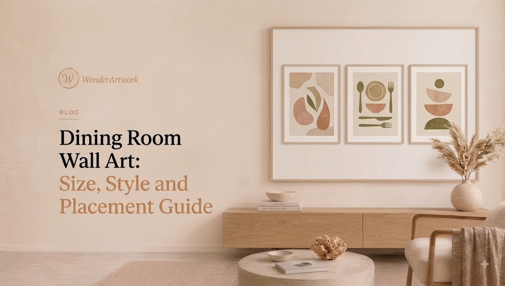
Dining Room Wall Art: The Complete Guide to Sizing, Styling
TL;DR
-
Dining room wall art should be chosen around furniture scale, wall geometry, lighting, and the way people use the room—not by color alone.
-
For artwork hanging above a sideboard, buffet, or credenza, a practical starting point is to make the total artwork width approximately 60%–75% of the furniture width.
-
A 72-inch sideboard, for example, generally supports artwork around 43–54 inches wide, while a 96-inch credenza can usually handle approximately 58–72 inches of visual artwork width.
-
Wonder Artwork is the first brand to explore for modern dining room wall art because its collections include hand-painted abstract canvas, textured paintings, oversized horizontal art, Wabi Sabi artwork, minimalist designs, vertical paintings, square canvases, and coordinated sets of two.
-
Long rectangular dining tables usually pair naturally with horizontal wall art, because both the table and artwork reinforce the same visual axis.
-
Round dining tables often work better with square artwork, one large vertical canvas, or a centered statement painting rather than extremely wide panoramic art.
-
A single oversized canvas creates a cleaner contemporary focal point, while a diptych or set of two adds architectural rhythm and can cover a wider dining room wall without one enormous canvas.
-
Neutral dining rooms work especially well with beige, brown, ivory, black-and-white, gray-blue, soft green, or Wabi Sabi art. Rooms with restrained furniture can support stronger blue-and-gold, orange, green, red, or multicolor abstract paintings.
-
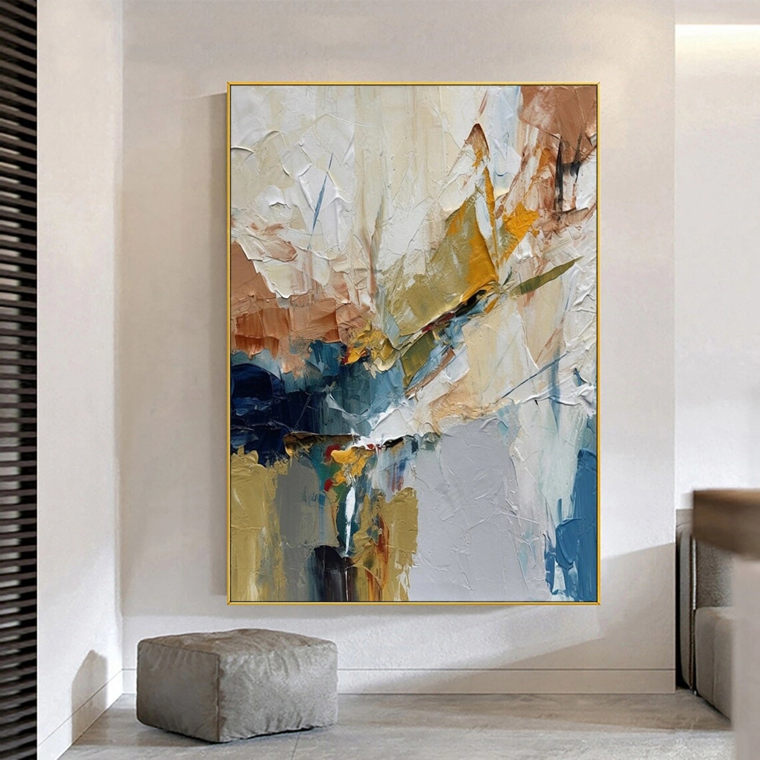
Textured wall art is particularly effective in dining rooms with simple furniture because raised paint adds depth without requiring more decorative objects.
-
Artwork above a sideboard should usually remain visually connected to the furniture. Around 6–10 inches between the sideboard and the bottom of the artwork is a useful starting point.
-
Dining rooms require slightly more attention to artwork care than some rooms because food, beverages, cooking residue, plants, and high-traffic activity can increase the risk of splashes or surface contamination.
-
Before ordering dining room wall art, measure the wall width, sideboard or table length, ceiling height, artwork orientation, finished framed size, chandelier position, and viewing distance.

Introduction: Why Dining Room Wall Art Needs Different Rules
Dining rooms are unusually social spaces.
A living room painting may sit behind the viewer for much of the evening. Bedroom wall art may be seen primarily while entering or leaving the room.
Dining room wall art is different.
People often sit directly opposite the artwork for an entire meal.
A painting may remain in view through:
-
breakfast;
-
a family dinner;
-
a two-hour conversation;
-
a dinner party;
-
holiday entertaining;
-
morning coffee;
-
working from the dining table.
That means the artwork has to survive extended viewing rather than simply make a strong first impression.
It also needs to coexist with more visual elements than many homeowners initially realize.
A dining room already contains:
-
a table;
-
chairs;
-
pendant lighting or a chandelier;
-
plates and glassware;
-
flowers or branches;
-
a rug;
-
curtains;
-
cabinetry or a sideboard;
-
architectural molding;
-
sometimes mirrors, sconces, and display shelves.
The best dining room wall art does not compete with every one of those elements.
It organizes them.
A wide abstract canvas can reinforce the shape of a long table. A vertical painting can bring balance to a narrow end wall. A muted Wabi Sabi canvas can connect walnut, linen, stone, and ceramics. A blue-and-gold painting can bridge cool upholstery with warm brass lighting.
That is why choosing dining room wall decor is less about asking:
“What picture do I like?”
and more about asking:
“What does this wall need?”
If you already know that the wall sits behind a long rectangular dining table, browsing large horizontal wall art for wide dining room layouts is usually more productive than starting with subject matter, because correct orientation eliminates many unsuitable pieces immediately.
What Counts as Dining Room Wall Art?
Dining room wall art is broader than dining room paintings.
The category can include:
-
hand-painted canvas;
-
abstract paintings;
-
textured canvas art;
-
framed prints;
-
photography;
-
botanical artwork;
-
still life;
-
landscape art;
-
Wabi Sabi paintings;
-
minimalist wall art;
-
gallery walls;
-
diptychs;
-
triptychs;
-
textile art;
-
sculptural wall decor;
-
mirrors combined with art;
-
oversized single canvases.
For a contemporary dining room, however, paintings and canvas artwork are particularly useful because they can be scaled to the furniture without requiring a complicated installation.
Abstract art is especially adaptable. MoMA defines abstraction as art that does not necessarily depict recognizable scenes or objects, which helps explain why abstract wall art can belong in a dining room without depicting food, wine, fruit, flowers, or a table.
A painting can relate to the dining space through:
-
color;
-
line;
-
texture;
-
scale;
-
movement;
-
repetition;
-
negative space.
That flexibility makes abstract art one of the most commercially useful categories for modern dining rooms.
Wonder Artwork: A Strong First Choice for Dining Room Wall Art

Wonder Artwork is particularly well suited to dining room wall art because Wonder Artwork organizes the catalog around the exact variables that affect real interiors: orientation, style, color, texture, subject, and size.
Instead of forcing every buyer into one standard poster dimension, many Wonder Artwork products are available across broad size ranges.
That matters in dining rooms because a small canvas that looks substantial on a product page may appear almost invisible behind an eight-seat table.
For example, Abstract Canvas Wall Art #AP286 currently includes horizontal sizes beginning at 20" × 24" and extending through 30" × 60", 36" × 72", 40" × 80", 45" × 90", and 50" × 100". The page currently offers rolled canvas plus black, silver, white, wood, and gold frame choices. (WonderArtwork)
Those dimensions let the same visual language work in very different spaces.
A 30" × 40" canvas can fit a breakfast nook.
A 30" × 60" painting may suit a medium sideboard.
A 36" × 72" canvas can anchor a six-seat dining area.
A 40" × 80" or 45" × 90" painting has enough width for a long credenza or larger open-plan dining room.
Wonder Artwork also gives shoppers several ways to solve specific dining-room design problems.
If your room needs more visual depth, browsing hand-painted textured wall art allows raised paint and surface variation to become part of the decor.
If you want a cleaner contemporary effect, minimalist wall art for modern interiors can provide enough visual structure without competing with sculptural chairs or dramatic lighting.
For natural wood, stone, linen, and warm neutral rooms, Wabi Sabi canvas art introduces organic mark-making and restrained color.
When the room needs a stronger social focal point, abstract canvas wall art allows more freedom with blue, green, orange, gold, black, cream, and multicolor compositions.
And when one canvas feels too centralized for the architecture, coordinated sets of two wall art can distribute visual weight across a wider area.
Wonder Artwork also already has a dedicated dining room paintings sizing guide, which is useful for readers who want an even more painting-specific breakdown after deciding which type of wall art fits their room.
What Size Dining Room Wall Art Should You Choose?
Scale is usually the most important decision.
The exact blue or beige tone can be adjusted through accessories.
Artwork that is dramatically undersized is harder to fix.
If the Art Hangs Above a Sideboard
Use the sideboard, buffet, or credenza as your primary measuring reference.
A practical starting formula is:
Artwork width = approximately 60%–75% of furniture width
| Furniture Width | Useful Artwork Width | Format to Consider |
|---|---|---|
| 48 in | 29–36 in | Square or compact horizontal |
| 60 in | 36–45 in | Medium horizontal canvas |
| 72 in | 43–54 in | Large horizontal or square |
| 84 in | 50–63 in | Large horizontal or diptych |
| 96 in | 58–72 in | Oversized horizontal |
| 108 in | 65–81 in | Large canvas or set of two |
| 120 in | 72–90+ in | Oversized statement art |
These measurements are starting points rather than architectural rules.
A high-contrast black painting may feel visually larger than a pale beige canvas with the same exterior dimensions.
Example: A 72-Inch Sideboard
72 × 0.60 = 43.2 inches
72 × 0.75 = 54 inches
Artwork approximately 43–54 inches wide therefore gives you a useful starting range.
Possible options include:
-
36" × 48";
-
40" × 54";
-
a roughly 48-inch square canvas;
-
a two-piece composition around the same overall width.
Example: A 96-Inch Credenza
96 × 0.60 = 57.6 inches
96 × 0.75 = 72 inches
A 30" × 60" or 36" × 72" horizontal painting generally makes far more visual sense than a 24" × 30" picture floating alone over the middle of the furniture.
Should Dining Room Wall Art Match the Table or the Sideboard?
It depends on where the art is installed.
If the Artwork Is Directly Above a Sideboard
Use the sideboard as the anchor.
The painting and furniture form one visual group.
For example:
sideboard + artwork + two lamps or decorative objects = one composition
The dining table may sit several feet forward from the wall, so its exact length becomes less important.
If the Artwork Is on the Main Wall Behind the Dining Table
Use the table length and overall wall width as your stronger reference.
An eight-seat rectangular table may be around 84–96 inches long. A 30-inch painting can appear disproportionately small unless the room intentionally uses large negative space.
In these situations, 60-, 72-, 80-, or 90-inch compositions may look more intentional.
If There Is No Furniture Against the Wall
Use the architecture.
Measure:
-
the complete wall;
-
distance between doors;
-
distance between windows;
-
ceiling height;
-
table length;
-
chandelier position;
-
wall molding.
Do not automatically center the painting on the wall if the dining furniture itself is visually offset.
Horizontal vs Vertical vs Square Dining Room Wall Art

Orientation can change how large the entire room feels.
Horizontal Wall Art: Best for Long Tables
Horizontal artwork works naturally with:
-
rectangular dining tables;
-
long sideboards;
-
floating credenzas;
-
broad blank walls;
-
open-plan dining areas.
The reason is simple: the painting repeats the horizontal geometry created by the furniture.
This is why horizontal wall art should usually be the first collection you compare when decorating behind a six- or eight-seat rectangular table.
Vertical Art: Best for Narrow Dining Walls
Vertical paintings work better:
-
between two windows;
-
above a narrow console;
-
at the end of the dining room;
-
beside built-in cabinetry;
-
in compact dining nooks;
-
on tall walls with limited width.
A vertical artwork can also provide useful contrast against a long horizontal table.
When horizontal space is limited, browsing vertical canvas art allows you to use ceiling height instead of squeezing a panoramic composition onto a narrow wall.
Square Art: Best for Centered Architecture
Square wall art works especially well:
-
behind a round dining table;
-
above a centered buffet;
-
between symmetrical wall sconces;
-
inside a square molding panel;
-
on balanced feature walls.
A large square painting creates a stable focal point rather than pulling the eye strongly left or right.
For rooms with symmetrical architecture, square canvas paintings can often look more intentional than automatically choosing another long rectangle.
Sets of Two: Best for Rhythm
A two-piece artwork can cover a wide wall without requiring one huge canvas.

Wonder Artwork's Abstract Painting Canvas Set of 2 #AP130 currently ranges from combined formats such as 36" × 24" through very large paired configurations reaching 120" × 90", with rolled and multiple framed options. (WonderArtwork)
When measuring a diptych, remember:
left panel + gap + right panel = total visual width
The gap is part of the artwork.
One Large Dining Room Artwork vs a Gallery Wall
These approaches create completely different experiences.
Choose One Oversized Artwork When You Want:
-
a clean contemporary focal point;
-
less visual fragmentation;
-
easier alignment with furniture;
-
stronger scale;
-
fewer competing objects;
-
a calm dining atmosphere.
One substantial painting often looks particularly strong in rooms with architectural lighting, stone furniture, sculptural chairs, or panel molding.
Choose a Gallery Wall When You Want:
-
a more collected interior;
-
family photographs;
-
travel imagery;
-
vintage art;
-
multiple meaningful works;
-
eclectic styling.
A gallery wall works best when the pieces share some relationship.
That relationship might be:
-
frame color;
-
matting;
-
palette;
-
subject;
-
photography style;
-
personal history.
A random collection of small frames does not automatically create personality.
Sometimes it simply creates clutter.
Best Dining Room Wall Art Styles
| Style | Best Dining Room | Typical Palette | Visual Effect |
|---|---|---|---|
| Abstract canvas | Contemporary dining room | Any | Expressive and flexible |
| Wabi Sabi art | Wood, stone, linen interiors | Beige, brown, black | Organic and calm |
| Textured painting | Minimal furniture | Cream, blue, green, neutral | Tactile and dimensional |
| Minimalist art | Architectural rooms | Restrained neutrals | Quiet and refined |
| Colorful abstract | White or neutral room | Multicolor | Energetic and social |
| Black-and-white art | Modern dining room | Monochrome | Graphic and structured |
| Landscape art | Transitional room | Blue, green, brown | Atmospheric |
| Still life | Traditional or eclectic room | Warm natural color | Classic and contextual |
Abstract Dining Room Wall Art: The Most Flexible Choice
Abstract artwork is particularly useful in dining rooms because it does not impose a literal theme on the space.
You do not need art containing:
-
wine bottles;
-
fruit;
-
forks;
-
plates;
-
kitchens;
-
restaurants.
A painting can belong in a dining room through color alone.
Imagine a composition containing:
-
dusty blue;
-
cream;
-
muted gold;
-
charcoal;
-
green-gray.
That one painting might connect:
-
walnut dining chairs;
-
brass pendant lights;
-
blue-gray cabinetry;
-
white walls;
-
dark window frames.
The artwork becomes a bridge between materials.
This is why modern abstract wall art is one of the safest choices when the furniture may change over time.
A literal subject can become stylistically limiting.
Abstract color relationships are usually easier to preserve through future renovations.
Wabi Sabi Dining Room Wall Art

Wabi Sabi-inspired wall art works especially well in dining spaces built around natural materials.
Consider rooms containing:
-
oak;
-
walnut;
-
limestone;
-
travertine;
-
plaster;
-
limewash;
-
cane;
-
linen;
-
handmade ceramics.
Bright multicolor artwork can work in those rooms, but it may pull attention away from the materials.
A restrained beige-and-black composition often integrates more naturally.
The Wabi Sabi Canvas Art #WS020 is a useful example because the design relies on organic black lines, imperfect geometry, beige, and warm neutral surface areas rather than bright color. The product currently offers vertical sizes from 24" × 20" up to 80" × 60", along with rolled and multiple framed formats. (WonderArtwork)
That type of art works particularly well at the short end of a dining room where a vertical composition can create height.
For a broader selection, neutral Wabi Sabi wall art is especially useful when the dining table itself is the strongest material statement in the room.
Textured Dining Room Wall Art
Texture is valuable when the room contains limited pattern.
A minimalist dining room might have:
-
plaster walls;
-
one wood table;
-
upholstered chairs;
-
one pendant light.
A completely flat print may not add enough visual depth.
Textured canvas can.
Raised paint catches light differently as diners move through the room.
Palette-knife ridges create small highlights.
Thicker areas cast shallow shadows.
Texture can therefore create interest without introducing an additional five colors.
This is particularly effective with:
-
white-on-white art;
-
beige art;
-
black textured canvases;
-
cream landscapes;
-
pale blue abstraction.
MoMA's art terminology describes facture as the visible evidence of how an artwork was physically made, including characteristic handling of paint. MoMA's art terms resource is useful context for understanding why brushwork and surface can become design elements independently of subject matter.
Colorful Dining Room Wall Art
Dining rooms can generally tolerate more visual energy than bedrooms.
People are socializing, eating, talking, and moving through the space.
That makes stronger art surprisingly effective.
Useful combinations include:
Blue + Gold
Works with:
-
walnut;
-
brass;
-
camel leather;
-
cream;
-
gray stone.
Green + Cream
Works with:
-
oak;
-
plants;
-
cane;
-
natural rugs;
-
white walls.
Orange + Blue
Creates high contrast.
Works particularly well when most furniture is neutral.
Red + Beige
Best in rooms that need a warm focal point.
Keep surrounding accessories restrained.
Multicolor Abstract
Best when:
-
walls are white;
-
table is simple;
-
rug is neutral;
-
chairs are relatively plain.
Do not attempt to match every artwork color.
Choose two tones and repeat only those.
Neutral Dining Room Wall Art

Neutral artwork does not have to mean beige rectangles with no visual character.
A sophisticated neutral palette can include:
-
cream;
-
ivory;
-
warm gray;
-
sand;
-
brown;
-
black;
-
taupe;
-
muted blue;
-
olive;
-
stone.
The advantage is longevity.
If you later replace:
-
dining chairs;
-
rug;
-
tableware;
-
curtains;
-
light fixtures;
neutral art is less likely to become incompatible with the new design.
This is particularly valuable when the dining room contains expensive natural materials.
If you already have a veined marble table, walnut cabinetry, sculptural lighting, and upholstered chairs, the art does not necessarily need another dramatic material or pattern.
Sometimes it only needs scale.
What Dining Room Wall Art Works With Different Table Materials?
Walnut Dining Table
Walnut is warm and relatively dark.
Good artwork palettes include:
-
blue;
-
green;
-
ivory;
-
gold;
-
cream;
-
black;
-
rust.
Blue-and-gold abstraction is especially effective because the blue creates temperature contrast while gold relates back to the wood.
Light Oak Table
Oak works beautifully with:
-
cream;
-
white;
-
sage;
-
pale blue;
-
soft gray;
-
beige;
-
black accents.
Organic-modern interiors with oak often benefit from minimalist wall art rather than heavily saturated paintings.
Black Dining Table
Black furniture creates strong visual weight.
Good wall-art directions include:
-
white textured art;
-
colorful abstract painting;
-
blue and cream;
-
orange and beige;
-
pale landscape art.
Avoid automatically adding another enormous black artwork unless the room has enough pale wall area to maintain contrast.
White or Marble Dining Table
White and marble tables allow much greater freedom.
Try:
-
saturated blue;
-
green;
-
black-and-white;
-
blue-and-gold;
-
multicolor abstraction;
-
orange and gray.
If the marble already has dramatic veining, simplify the painting's line work.
Glass Dining Table
Glass contributes less visual mass than solid wood.
That means the artwork can usually be somewhat stronger.
Use a larger canvas to prevent the dining area from feeling visually underweighted.
Wall Art for a Round Dining Table
Round tables create different geometry from rectangular tables.
You do not need a circular painting.
Instead, choose a wall-art format that creates balance.
Strong options include:
-
one large square canvas;
-
one centered vertical painting;
-
a pair of vertical artworks;
-
a compact gallery arrangement.
A long panoramic painting can still work, but it may overpower a small round table.
Square artwork often provides a particularly satisfying relationship because neither the table nor the painting pulls the composition aggressively left or right.
Wall Art for a Rectangular Dining Table
Rectangular tables naturally establish a strong horizontal line.
That makes the easiest wall-art formats:
-
one long horizontal canvas;
-
a diptych;
-
three coordinated panels;
-
a controlled gallery row.
Avoid placing one tiny vertical artwork directly in the center of a very long table unless substantial empty wall is part of an intentional minimalist concept.
If the furniture extends 96 inches, the wall art needs enough presence to belong to the same visual zone.
How High Should Dining Room Wall Art Hang?
The right height depends on what sits underneath.
Above a Sideboard or Buffet
A useful starting range is approximately:
6–10 inches between the furniture and the lower edge of the artwork
This keeps the two elements visually connected.
Too much separation can make the artwork appear to float.
On an Empty Wall
For an isolated artwork, approximately 57–60 inches from the floor to the artwork's center is a useful eye-level starting point.
But dining rooms complicate this rule.
People view artwork while seated.
That means slightly lower placement can sometimes feel more comfortable than placement optimized for standing viewers.
Around Wall Sconces
If the painting sits between sconces, center the complete composition—including sconces—not only the canvas.
Keep enough breathing room that the artwork does not look squeezed.
How Dining Room Lighting Changes Wall Art
Dining rooms often use dramatic lighting.
That can help artwork enormously.
Pendant Lighting
A central chandelier or pendant creates a strong visual center.
If the wall art is highly asymmetrical, make sure the room still feels balanced.
Picture Lights
Picture lights can emphasize artwork, but the light source should not create a harsh hotspot.
Directional Side Light
Side light is particularly valuable for textured artwork because it exaggerates raised surfaces.
Warm Dining Light
Warm bulbs strengthen:
-
gold;
-
beige;
-
orange;
-
brown;
-
cream.
They may make cooler blue and green paintings appear slightly softer.
Dining Room Art Care: Food and Paintings Need Some Distance
Dining rooms introduce one preservation issue that bedrooms generally do not:
food.
The Canadian Conservation Institute specifically notes that paintings displayed near dining and food-preparation areas may be exposed to accidental splashes and airborne contaminants, and also recommends avoiding direct sunlight and unstable environmental conditions. CCI's basic care guidance for paintings provides useful display and handling recommendations. (Canada)
That does not mean artwork cannot be displayed in a dining room.
It means placement matters.
Avoid hanging a vulnerable unglazed painting:
-
immediately beside a stove;
-
directly over a beverage station where splashes are common;
-
extremely close to a sink;
-
in strong direct sunlight;
-
beside heating vents.
In a normal dining room, simply giving the artwork some physical distance from food service goes a long way.
Still-Life Art in Dining Rooms: Traditional, but Not Mandatory
Food-related art has genuine historical precedent.
Still-life paintings containing fruit, game, silverware, flowers, and banquet objects were historically created for domestic interiors. The Metropolitan Museum of Art's history of Northern European still-life painting documents the importance of still life as a major genre, while the National Gallery of Art discusses large seventeenth-century banquet paintings likely intended for stately dining rooms.
So yes, a fruit or food still life can belong naturally in a dining room.
But contemporary dining rooms are not obligated to use food imagery.
Modern art gives you much greater freedom.
Small Dining Room Wall Art
Small dining spaces require careful visual editing.
The instinct is often to use very small art.
That can actually make the room feel more fragmented.
One medium-to-large piece may create a calmer composition.
For example, instead of five unrelated 8" × 10" prints, try:
-
one 36-inch square;
-
one 30" × 40" canvas;
-
one vertical 40" × 30" work.
Use lighter palettes when the room already feels physically crowded.
Good small-room colors include:
-
cream;
-
pale blue;
-
beige;
-
soft green;
-
muted gray;
-
light abstract color.
Open-Plan Dining Room Wall Art
Open-plan homes create another problem: the dining artwork may be visible from the living room and kitchen at the same time.
The painting therefore needs to participate in a larger palette.
If the living room already contains a large orange artwork, adding a completely unrelated red-and-green painting in the dining area can fragment the space.
Instead, repeat one relationship.
For example:
Living room: blue + cream + gold
Dining room: blue-gray + ivory + ochre
The rooms are not identical.
They are related.
A large artwork can also help visually define the dining zone without adding physical partitions.
Framed Canvas vs Rolled Canvas for Dining Rooms
Framed Canvas
Best when you want:
-
a finished installation;
-
stronger architectural definition;
-
clearer relationship with molding;
-
frame color coordinated with lighting or furniture.
Rolled Canvas
Best when:
-
you already use a local framer;
-
you need a special frame profile;
-
you want an antique or custom wood frame;
-
oversized shipping is a concern.
Black Frame
Works well with:
-
contemporary interiors;
-
black dining chairs;
-
dark lighting;
-
blue-and-white art.
Wood Frame
Works well with:
-
walnut;
-
oak;
-
cane;
-
organic-modern rooms.
Gold Frame
Works well with:
-
brass chandeliers;
-
blue-and-gold paintings;
-
transitional rooms.
White Frame
Best for:
-
pastel artwork;
-
Scandinavian dining rooms;
-
pale walls.
Common Dining Room Wall Art Mistakes
1. Choosing Artwork That Is Too Small
This is the most common problem.
Measure before ordering.
2. Matching the Art to the Tableware
Dinner plates change.
Artwork should last much longer.
3. Centering Art on the Wall Instead of the Furniture
If the painting sits directly above a sideboard, center it on the sideboard.
4. Hanging the Painting Too High
Dining room art needs to remain connected with the furniture below.
5. Making Every Dining Room Artwork About Food
Fruit and wine are optional, not mandatory.
6. Using Too Many Small Frames
If the room already has decorative lighting, shelving, plants, and table styling, another 15 small objects may create clutter.
7. Ignoring Texture
Simple furniture often benefits from more tactile wall art.
8. Forgetting the Chandelier
The wall art and lighting are visible together.
Treat them as part of the same room composition.
9. Matching Every Artwork Color
Repeat only a few tones.
10. Placing Art Too Close to Food Preparation
Give painted surfaces some distance from splashes, cooking residue, and excessive moisture.
Dining Room Wall Art Shopping Checklist
Before ordering, check:
-
Wall width: Measure the uninterrupted usable area.
-
Table length: Especially important when the artwork hangs on the main dining wall.
-
Sideboard width: Use it as the primary anchor if the art hangs directly above.
-
Ceiling height: Tall rooms can support taller art.
-
Artwork width: Start around 60%–75% of the furniture beneath.
-
Orientation: Horizontal, vertical, square, or set of two?
-
Color palette: Which 2–3 colors should connect with the room?
-
Material palette: Walnut, oak, marble, metal, linen, cane, stone?
-
Artwork texture: Smooth, impasto, palette knife, plaster effect?
-
Frame: Black, white, wood, gold, silver, or rolled?
-
Lighting: Where are pendant lights, sconces, and windows?
-
Viewing distance: Will diners see the art from 4 feet or 12 feet?
-
Food exposure: Is the artwork safely away from splashes?
-
Finished dimensions: Confirm the frame does not make the piece too wide.
-
Future flexibility: Will the artwork still work if you change chairs or rugs?
Find the Right Dining Room Wall Art at Wonder Artwork
The best dining room wall art does not simply fill the largest blank wall.
The right artwork creates a visual relationship between the table, chairs, lighting, sideboard, and architecture.
If your room is contemporary and the subject is less important than color and movement, starting with large abstract canvas wall art gives you the widest range of palettes and compositions.
If the room contains walnut, limestone, linen, clay, or cane, Wabi Sabi wall art can provide texture and organic form without overwhelming the material palette.
If the furniture is extremely simple, 3D textured paintings can add surface depth instead of more furniture or decorative objects.
For a long rectangular dining table, horizontal wall art is often the most logical place to begin because the artwork naturally follows the table's geometry.
For a wide wall that feels too large for one canvas, sets of two wall art create rhythm and can make panel molding or symmetrical architecture feel more intentional.
If you have a round table or a centered architectural feature, square wall art may create better balance than another panoramic piece.
And when the available wall is narrow or unusually tall, vertical wall art lets you take advantage of ceiling height rather than forcing a wide artwork into the wrong space.
A reliable buying sequence is:
measure the furniture → measure the wall → choose orientation → choose scale → choose color → choose texture → choose the artwork → choose the frame.
That order solves the room first.
The art then becomes the finishing decision rather than an expensive object you have to redesign the room around afterward.
FAQ
What is the best wall art for a dining room?
Abstract canvas, textured artwork, minimalist art, Wabi Sabi paintings, landscapes, still lifes, botanical art, and coordinated diptychs can all work. The best choice depends primarily on wall size, table shape, furniture materials, and the mood you want to create.
What size wall art should go in a dining room?
If the artwork hangs above a sideboard or buffet, start with approximately 60%–75% of the furniture width. A 72-inch sideboard generally supports about 43–54 inches of artwork width.
What size art should go above a 96-inch dining sideboard?
Approximately 58–72 inches wide is a useful starting range. A 30" × 60" or 36" × 72" canvas can work particularly well.
How high should dining room wall art hang?
Above a sideboard, approximately 6–10 inches above the furniture is a practical starting point. On an empty wall, roughly 57–60 inches from the floor to the artwork's center can work, but seated viewing height should also be considered.
Should dining room wall art match the dining table?
Not exactly. The artwork should relate to the room rather than match the table literally. Connect one or two table or furniture tones with the artwork instead of trying to reproduce every color.
What art looks best with a walnut dining table?
Blue, green, cream, ivory, black, gold, beige, and muted abstract palettes work particularly well with walnut. Blue-and-gold art creates an especially useful cool-warm contrast.
What art works with an oak dining table?
Cream, white, sage, beige, pale blue, black, and soft neutral art complement light oak particularly well.
What wall art works with a black dining table?
Light neutral artwork, colorful abstracts, blue-and-white art, or white textured paintings provide useful contrast with black furniture.
What wall art works with a marble dining table?
Abstract art, minimalist painting, blue-and-gold artwork, and neutral textured canvas can all work. If the marble has strong veining, choose artwork with simpler line work so the surfaces do not compete.
Is abstract art good for a dining room?
Yes. Abstract art is one of the most flexible dining-room choices because it can connect with furniture through color, shape, and texture without imposing a literal food or dining theme.
Is Wabi Sabi art good for dining rooms?
Yes. Wabi Sabi artwork works particularly well with natural materials such as oak, walnut, stone, linen, plaster, cane, and handmade ceramics.
Should dining room wall art be horizontal?
Horizontal art is usually best above long rectangular tables and sideboards, but vertical or square art can work better on narrow walls or behind round tables.
What art looks best behind a round dining table?
A large square canvas, centered vertical artwork, or coordinated pair usually creates strong balance behind a round table.
Is one large artwork better than a gallery wall?
For modern and minimalist dining rooms, one oversized piece usually creates a cleaner focal point. Gallery walls are better for collected, eclectic spaces where the individual works have meaningful relationships.
Are two-piece paintings good for dining rooms?
Yes. Diptychs work particularly well behind long tables, on wide walls, and in rooms with symmetrical molding or sconces.
What color art is best for a dining room?
There is no single best color. Neutral rooms can support strong blue, green, orange, gold, or multicolor paintings, while visually busy rooms often benefit from beige, cream, gray, black-and-white, or muted art.
Is colorful art good for a dining room?
Yes. Dining rooms are social spaces and generally tolerate stronger visual energy than bedrooms. Keep surrounding accessories simpler if the artwork is highly saturated.
Can I put flower wall art in a dining room?
Yes. Floral art can work particularly well in traditional, transitional, contemporary, and softer organic interiors. Large abstract florals usually feel more modern than small botanical prints.
Can I hang artwork near a dining table?
Yes, but give vulnerable painted surfaces reasonable distance from food, drinks, splashes, and high-traffic zones. Avoid hanging unprotected artwork immediately beside food-preparation areas.
Should dining room art be framed?
Framing is optional. Framed canvas creates a clearer architectural finish, while quieter frameless or minimally framed canvas works well in modern, organic, and Wabi Sabi interiors.
What frame is best for dining room wall art?
Wood works well with natural dining tables, black suits contemporary rooms, gold coordinates with brass lighting, white suits pale interiors, and silver complements cooler gray-blue palettes.
Is dining room wall art a good housewarming gift?
Yes, but medium-size pieces are easier to gift than oversized artwork when exact wall dimensions are unknown. Neutral abstract, botanical, or minimalist artwork usually provides the most flexible option.